objectives for this activity
During this activity, you will:
- Compare the mean and median of groups by examining a histogram.
- Use a data analysis tool to calculate the mean and median for multiple groups at once.
Click on a skill above to jump to its location in this activity.
Feeling Sleepy!
In Forming Connections in Displaying Categorical Data: 3A, we explored data from a study that asked college students whether they identified as owls, larks, or neither and collected other pieces of data related to academics, lifestyle, stress, and sleep . Recall that owls were defined as night people while larks represented morning people. In that activity, you used the dataset from the study to visualize categorical data via pie charts and bar graphs. Now, let’s use the same dataset to explore distributions of quantitative variables. In this activity, you’ll see the mean and median as numerical measures of the “center” of quantitative data.

Before we begin, consider the following question, which asks about differences between larks and owls with respect to factors contributing to quality of sleep.
question 1
How might the quality of sleep differ among these groups? In particular, do you think one of these groups might consume more alcoholic drinks each week when compared to the others?
video placement
[Intro: Recall using histograms to estimate mean and median as well as using technology to calculate them. Recall lark = morning person, owl = night person, and neither responses. Let’s discuss the variables of interest briefly: alcoholic drinks per week is self-explanatory. Poor sleep quality score: the higher the score, the worse the sleep quality. We want to use the tool to interpret graphs and compare centers. A highlight of the tool will be helpful]
Before we compare each of the groups (owl, lark, neither), let’s consider two variables of interest for all college students in this study:
- Poor Sleep Quality Score – a score indicating the average quality of sleep for the participants; the greater the score, the worse the quality of sleep.
- Alcoholic Drinks per Week – the average number of alcoholic drinks consumed by the participants each week.
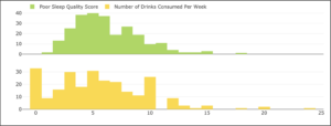
The following histograms display the frequency of the participants’ poor sleep quality scores and the number of alcoholic drinks consumed each week. Use the histograms to estimate the mean and median for each dataset.
question 2
Fill in the table below with your estimations based only on the graphs of the distributions.
| Mean | Median | |
| Poor Sleep Quality Score | ||
| Number of Drinks Consumed Per Week |
Now let’s go to the technology to calculate the precise values for mean and median.
Go to the Describing and Exploring Quantitative Variables tool at https://dcmathpathways.shinyapps.io/EDA_quantitative/.
Step 1) Select the Single Group tab.
Step 2) Locate the drop-down menu under Enter Data and select From Textbook.
Step 3) Locate the drop-down menu under Dataset and select Sleep Study: Poor Sleep Quality Score. If desired, select Histogram under Choose Type of Plot. Under Select Binwidth for Histogram, use 1 to emulate the histogram in the image above.
The tool will display descriptive statistics and a distribution for the quantitative variable PoorSleepQuality from the study’s dataset. Recall that this variable records individual responses to a measure of sleep quality, with higher numbers indicating poorer sleep.
Record the calculated values for mean and median of Poor Sleep Quality Score in the table in Question 3 below.
question 3
Fill in the table below with the calculations from the data analysis tool.
| Mean | Median | |
| Poor Sleep Quality Score | ||
| Number of Drinks Consumed Per Week |
question 4
How did the estimations you made in Question 2 compare with the actual calculations?
question 5
In a few sentences, interpret your findings. What do the calculations for the mean and median suggest about the students’ poor sleep quality scores and consumption of alcohol each week?
video placement
[sub-summary: surfaces only after Q 2 – 5 have been answered. “Did you find it difficult to estimate the centers of the data using the histograms? If your estimations compared well with the calculations from the tool, you may have instinctively used visual estimations of “weight” to estimate the mean or estimations of frequency counts to estimate the median. Show an analysis using these ideas on the two graphs to model the behavior of estimation for the students. Show the analysis of mean and median calculated by the tool. ]
Let’s now compare quality of sleep and alcohol consumption habits between those who identified as owls, larks, or neither.
Compare the mean and median of groups by examining a histogram.
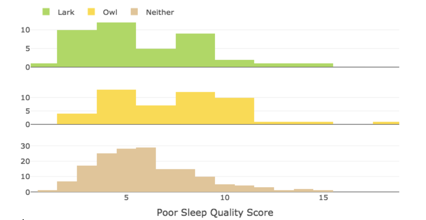
The following histograms illustrate the distributions of the Poor Sleep Quality Score variable based on whether the participants identified as owls, larks, or neither.
question 6
What do you notice in these histograms? In particular, based on their estimated means and medians, does it appear one group has a worse quality of sleep than the other groups? (Remember, the greater the score, the worse the quality of sleep.)
[Feedback for Question 6 –” that was a tricky analysis since the centers of all three groups were similar. We see that Larks and Neither reported a greater percentage of low scores and Owls appear to have reported a few extreme high scores”]
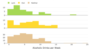
The following histograms illustrate the distributions of the Alcoholic Drinks per Week variable based on whether the participants identified as owls, larks, or neither.
question 7
What do you notice in these histograms? In particular, based on their estimated means and medians, does it appear one group consumes more alcoholic drinks each week?
[Feedback for Question 7 –” that was a tricky analysis since the centers of all three groups were similar. We see that all three histograms show students reported consuming 0 – 15 drinks per week with a few outliers in the larks and owls groups. The means appear quite similar but the median for the lark group may be less than the others.”]
Use a data analysis tool to calculate the mean and median for multiple groups at once
Go to the Describing and Exploring Quantitative Variables tool at https://dcmathpathways.shinyapps.io/EDA_quantitative/.
Step 1) Select the Several Groups tab.
Step 2) Locate the drop-down menu under Enter Data and select From Textbook.
Step 3) Locate the drop-down menu under Dataset and select Sleep Study: Poor Sleep Quality Score. You may change the display to show histograms as desired.
The tool will display descriptive statistics and a distribution for the quantitative variable PoorSleepQuality categorized by whether a respondent identified as a lark, an owl, or as neither. Using information from “Descriptive Statistics,” fill in the table in Question 8 below for Poor Sleep Quality Score.
question 8
Follow the steps above to complete the table.
| Poor Sleep Quality Score | Alcoholic Drinks Per Week | |||
| Mean | Median | Mean | Median | |
| Owl | ||||
| Lark | ||||
| Neither | ||||
question 9
How do your calculations relate to the comments and estimations you provided in Questions 3 – 5? Is there anything that surprised you?
question 10
Reflect back on your interpretations, estimations, and calculations from Questions 2–9. What might you conclude about the quality of sleep and drinking habits of those who identified as owls, larks, or neither? Explain.
video placement
[wrap-up:
- Provide a model answer for Question 10 to use statistical language for students to mimic: Let’s consider the conclusions, if any, we can draw from this analysis. When you try to make statements drawing conclusions in a statistical analysis, take care not to make assumptions or statements of fact. Instead, use language that includes phrases such as, “this suggests …,” or “this group tends to… .”
- Reflect back to your response to Question 1 — were you surprised by what you discovered from the data?
- Reflect on the use of the histograms in the activity. Address the challenge of estimating the mean using the histograms. Encourage students to think about why they found it challenging. “Do you think it is possible to look at a histogram and guess whether the mean or median might be larger? If so, what characteristics or features of a histogram might suggest that the mean is larger? What characteristics or features of a histogram might suggest that the median is larger?”]
