Objectives for this activity
During this activity, you will:
- Use the correlation coefficient to describe the strength in the linear relationship between variables.
What’s in My Sandwich?
In this activity, we’re going to extend the skills you obtained learning to read and interpret scatterplots in the previous page into an understanding of how the correlation coefficient describes the strength and direction of the linear relationship between two quantitative variables. Let’s begin by picking up here where the previous page left off.
In the What to Know page for this activity, you examined the relationship between the energy content and carbon footprint of 24 readily-made sandwiches. This relationship is illustrated in the following scatterplot:
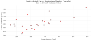
Previously, you identified the the bivariate data represented in the scatterplot and learned how to identify and describe any apparent trend in the data. You also made note of a particular value, called the Pearson Correlation Coefficient. If you don’t have that value available, you can obtain from a classmate or redisplay the graph in the data analysis tool at https://dcmathpathways.shinyapps.io/Association_Quantitative/ by choosing the Dataset Carbon Footprint.
Question 1 below asks you to consider the scatterplot of energy content and carbon footprint. Read the question individually first before discussing it with a classmate. Consider all the information available to you in the scatterplot. Then you’ll work in pairs to answer it, using what you learned in the What to Know page to write a thorough description of the relationship between the variables.
question 1
Describe the relationship between energy content and carbon footprint. Include details about the direction and overall shape of the scatterplot.
Continue to work in pairs or move into groups of four for the remainder of this activity. In Question 2, you’ll consider the possible implications of the correlation coefficient. Rather than memorizing a definition, let’s build up understanding by identifying connections between the graph and the correlation coefficient. How do you think the value of the measure you obtained from the tool connects to any trend that might be apparent in the scatterplot?
question 2
Recall from the preview assignment that the correlation coefficient measures the strength of the linear relationship between two variables. Discuss the value of the correlation coefficient, [latex]r[/latex], that you were asked to bring to class. How do you think this connects to the description of the scatterplot in Question 1?
Guidance
[Intro: Did you identify a positive or negative trend in Question 1? Was the value of [latex]r[/latex] a positive or negative number? What was the shape of the plot in general? Were the points closely associated with a clear line or nonlinear shape or did they loosely describe a shape?
It can be difficult to ascertain a trend if the plot seems ambiguous. By obtaining the value of [latex]r[/latex], we can make stronger statements about what we suspect in the plot. Perhaps you noted that the carbon footprint appears to increase as kcals increase. Did you observe that a positive trend seemed associated with a positive [latex]r[/latex] value? What do you think the value of [latex]r[/latex] would be, though, it that increase were perfect — if all the points lay unambiguously on or very tightly near a clear line? How about if a plot showed a near perfect decrease? Would the value of [latex]r[/latex] ever need to be larger in magnitude than positive or negative [latex]1[/latex]? Keep these kinds of questions in mind as you work through the remainder of this activity.]
Correlation Coefficient
Let’s look at a different situation now as we attempt to understand more fully what the correlation coefficient tells us about the relationship between the variables.
The following table displays four variables collected on 18 animals. Refer to the data dictionary below the table for details. In a moment, you’ll look at three scatterplots that each compare two of the four variables from the table. Some of the plots will indicate a negative trend, some positive, and in some the data will be more tightly or loosely associated. You’ll be given three possible [latex]r[/latex] values and asked to match each to the scatterplot that is most likely associated with it.
| Animal | Gestation Period | Longevity | Heart Rate (b/m) | Weight (lbs) |
| Bear | 220 | 22 | 80 | 600 |
| Cat | 61 | 11 | 130 | 8 |
| Cow | 280 | 11 | 66 | 1800 |
| Deer | 249 | 13 | 45 | 125 |
| Dog | 63 | 11 | 110 | 50 |
| Donkey | 365 | 19 | 41 | 450 |
| Fox | 57 | 9 | 120 | 7 |
| Giraffe | 450 | 20 | 65 | 1800 |
| Goat | 151 | 12 | 75 | 60 |
| Groundhog | 31 | 7 | 80 | 9 |
| Horse | 336 | 23 | 34 | 1400 |
| Kangaroo | 35 | 5 | 36 | 120 |
| Lion | 108 | 10 | 60 | 350 |
| Monkey | 205 | 14 | 192 | 25 |
| Pig | 115 | 10 | 95 | 200 |
| Sheep | 151 | 12 | 75 | 200 |
| Squirrel | 44 | 8 | 120 | 1 |
| Wolf | 62 | 11 | 70 | 80 |
Below is the data dictionary for the four variables collected on these animals:
Gestation Period (days): length of pregnancy
Heart Rate (beats/minute): average resting heart rate
Weight (pounds): average weight of an adult
Longevity (years): average lifespan
Continue to work in groups (or pairs) to answer the remaining questions about this data.
Question 3
Plots A through C display the relationships between two of the four variables collected on the 18 animals. The correlation coefficients for Plots A through C are:
[latex]-0.351, 0.575, 0.823[/latex]
Match each of the following scatterplots with the correct correlation coefficient to fill in the Correlation Coefficient column in the table following the plots. Leave the Description of Strength column empty for now.
PLOT A: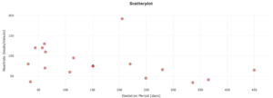
PLOT B: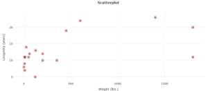
PLOT C: 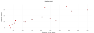
| Variables | Correlation Coefficient | Description of Strength
|
| Gestation Period, Heart Rate | ||
| Weight, Longevity | ||
| Gestation Period, Longevity |
Strength of Relationship
Now that you are hopefully feeling more comfortable with the sign of the correlation coefficient and its association to a positive or negative trend, let’s confirm what we have begun to understand about the strength of the relationship.
Recall in the scatterplot showing carbon footprint and energy content that the [latex]r[/latex]-value was [latex]0.621[/latex] and the points in the graph appeared to be only moderately associated. Now imagine what the graph would have looked like if [latex]r[/latex] had been closer to [latex]1[/latex]. Do you think the points would have been placed more closely together along a more clearly defined line?
The following table contains general guidelines for describing the strength of a linear relationship based on the value of the associated correlation coefficient.
| Correlation Coefficient, | General Interpretation |
| -1 to -0.7 | Strong negative linear relationship |
| -0.7 to -0.3 | Moderate negative linear relationship |
| -0.3 to -0.1 | Weak negative linear relationship |
| -0.1 to 0.1 | Negligible or no linear relationship |
| 0.1 to 0.3 | Weak positive linear relationship |
| 0.3 to 0.7 | Moderate positive linear relationship |
| 0.7 to 1 | Strong positive linear relationship |
Question 4
Use the guidelines to describe the strength of the linear relationships shown in Question 3. Fill in the “Description of Strength” column in the table in Question 3.
Question 5
Describe what the scatterplot of a perfect linear relationship looks like. Sketch a scatterplot with at least 10 points.
Question 6
What is the value of the [latex]r[/latex] coefficient for the graph you sketched in Question 5?
Just give any value that would be reasonable based on your sketch. This question does not require a fully correct answer, but it should be reasonable.
Question 7
What do you think a scatterplot looks like if [latex]r=0[/latex] or [latex]r\approx 0[/latex] ([latex]r[/latex] is approximately [latex]0[/latex])? Sketch a scatterplot with at least 10 points.
Guidance
[Wrap-up: What did your graph look like in answer to Question 7? Consider that for a “perfect” positive trend [latex]r=1[/latex] and for a perfect negative trend [latex]r=-1[/latex]. So, for [latex]r=0[/latex] or [latex], we think there must be “no relationship.” But that doesn’t mean there is a “non-linear relationship.” A nonlinear relationship is different and carries different measures of strength of than a linear relationship does. For now, let’s just focus on linear relationships. We can say, for [latex]r=0[/latex] that there is no linear relationship between the variables. There may or may not be another type of relationship, but knowing that will take a different types of analysis.
The correlation coefficient measures the strength of a linear relationship between two quantitative variables. We understand that means we are interested in what happens to [latex]y[/latex] as [latex]x[/latex] increases. But if there is no linear relationship, we can’t tell what happens to [latex]y[/latex]. The values are all over the place, in a random scatter.
How about the situation in which [latex]y[/latex] remains the same as [latex]x[/latex] increases? This would describe a horizontal line (or nearly so). Again, we are interested in how [latex]y[/latex] changes. If [latex]y[/latex] does not change, there isn’t a possibility for a positive or negative trend, and no linear relationship exists.
The chart below provides a nice summary of the various descriptions of strength possible when discussing the correlation coefficient [latex]r[/latex].
insert the image given in the Instructor Page wrap-up/transition showing description of strength examples.]
