Objectives for this activity
During this activity you will:
- Interpret [latex]R^2[/latex] values and determine their utility in different tasks (gauging prediction strength vs. determining a causal relationship).
In the What to Know assignment leading to this activity, you developed an intuition about how [latex]R^{2}[/latex] is related to the shape of a scatterplot and practiced using technology to calculate and interpret [latex]R^{2}[/latex] for a dataset. In this activity, you’ll utilize these skills to examine a real world situation in which linear analysis plays a role in educational policy decision-making. You’ll also gain experience attempting to determine a causal relationship between variables during this activity. As you complete the questions below, you’ll gain understanding of [latex]R^{2}[/latex] as a measure of prediction strength in a linear relationship by seeing how [latex]R^{2}[/latex] can be interpreted as the percentage of variation in the response explained by the linear relationship. You’ll also see that a high [latex]R^{2}[/latex] value does not indicate a causal relationship.
Thinking About Education
You will approach this in-class activity from the perspective of the secretary of education in your state. You notice that many public school students in your state are not showing good results on their high school math exams. You’d like to introduce a policy change that will lead to better results. Your first step is to collect data about high school students to see what factors best predict their math performance.

Guidance
[Intro: Note that the dataset used in this activity is simulated due to privacy concerns with sharing real student data. It does, however, represent results that real school districts have found when studying these variables. The policies discussed in this activity and their results are also representative of policies that real school districts have implemented.]
As an introduction to the scenario presented in this activity, read and answer Question 1 independently, then discuss your answers with a partner. Once you feel comfortable with your answer, move on to Question 2 to begin the activity.
question 1
Think about the kinds of data that schools collect about their students and teachers. Which variables do you think will be the best predictors of math exam performance? List at least three variables and explain why you chose each one.
The scenario for this activity is given in Question 2. Read it carefully to ensure that you understand each scatterplot is driven by a different explanatory variable. In each set of variables, the response is math scores on a state algebra exam. Each scatterplot and regression line shown pairs the test scores as the proposed outcome for a different input variable. Use the anticipated [latex]R^{2}[/latex] as a tool to decide which of the variable pairs would be most appropriate to choose to analyze possible causes for low math test scores in your district.
question 2
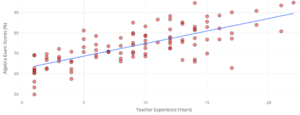
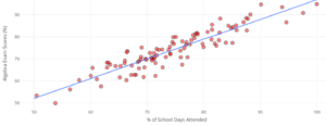
Your department’s head statistician gathers data from a random sample of 100 students in the state. In separate scatterplots, she visualizes the relationship between their algebra state exam scores and three explanatory variables: their math teachers’ experience levels (years teaching), their attendance (percentages of school days attended), and their schools’ math department discretionary budgets per teacher. These plots are visualized below, along with their linear regression models:
Explanatory Variable: Teacher Experience
Explanatory Variable: Attendance
Explanatory Variable: Math Dept. Budget
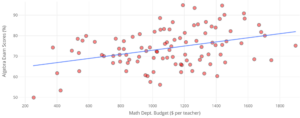
Part A: Rank in order (from highest to lowest) the [latex]R^2[/latex] values you’d expect from each of these linear models.
Part B: If you had to use one of these explanatory variables to predict the exam score of a newly sampled student, which would you use? Explain.
Guidance
[Summary: What did you choose to use as the explanatory variable for your analysis? Did you rely solely on evidence in the data to make your choice or did you permit opinion to bias your decision? In statistics, it is important to understand that we rely on mathematical tools to make decisions in order to minimize the opportunity for opinion to drive our conclusions.]
In Question 3, you are given the precise [latex]R^{2}[/latex] values for each of the scatterplots you examined in Question 2. Use them to make a final determination of which explanatory variable seems most reasonable to use as a predictor of low test scores.
question 3
Here are the [latex]R^2[/latex] values from each of the previous models:
- Teacher experience model: 53.8%
- Attendance model: 84.2%
- Math budget model: 13.5%
Interpret the [latex]R^2[/latex] value from the attendance model. Make sure you interpret in context.
You probably have a fairly good idea of which model would be most appropriate to use to predict low test scores. But there are other aspects of the models to consider. For example, see the Teacher Experience scatterplot again to answer Question 4.
Explanatory Variable: Teacher Experience
question 4
On the Teacher Experience scatterplot, note that there’s one data point representing a student whose teacher has more than 15 years of teaching experience but who scored fairly low on the assessment.
Part A: Locate the data point on the Teacher Experience scatterplot.
Part B: If we removed this data point from the graphic, would the [latex]R^2[/latex] value increase, decrease, or stay the same? Explain.
Now that you have thoroughly examined all three potential explanatory variables, it’s time to propose a policy change based on the data. Answer Question 5 independently before discussing it in your group or with a partner. Be sure to consider both pros and cons as you develop your response.
question 5
Your staff proposes three new education policies: one aims to recruit more experienced teachers, another aims to improve student attendance rates, and the last aims to increase math department budgets. Assume these policies would have the same costs and popularity. Which would you choose to implement? Explain.
No matter which policy you chose to implement, in real school districts in the United States, superintendents have implemented initiatives designed to improve attendance as a measure to support improving test scores. The surprising result of these initiatives is that while attendance increased over time, test scores did not.
Work together in pairs or in groups to consider this result as you answer Question 6. Include specific reasoning in your answer as to why attendance may not be causally related to exam scores. For example, could there be alternative causal mechanisms that result in a correlation between attendance and test scores?
question 6
Let’s move from this hypothetical example to real examples. Seeing similar patterns to what you previously analyzed, superintendents in school districts across the United States have piloted large-scale (and sometimes quite expensive) initiatives to improve student attendance. These included:
- Call programs for chronically-absent students
- Hiring attendance case managers and coordinators
- Using Uber/Lyft for students with transportation issues
The results have often looked like this:
 .
. 
How is it possible that, in school districts with strong correlations between test scores and attendance rates, improving attendance didn’t lead to an overall improvement in student test scores?
Guidance
[Wrap-up: What sort of alternative causes for the correlation between attendance and low test scores did you come up with? It is likely that confounding variables could explain at least some of the apparent causal relationship. Consider this graph:
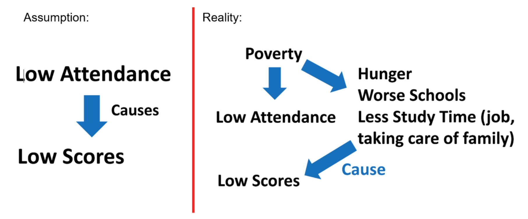 Discuss the difference between the assumption made by the data analysis, that low attendance causes low test scores and the reality that groups of students who tend to experience low attendance also tend to experience several other factors that can also lead to low scores. When performing analysis, it is crucial to keep an open mind for alternative factors that may be driving a response.]
