learning goals
At the end of this page, you should feel comfortable performing these skills:
- Infer the type of dataset used to create the graphical display.
- Identify the scale/color used in the graphical display.
- Identify the data source for the graphical display.
- Recognize an accurate interpretation of the graphical display (such as change in percentage).
- Write a statement about interpreting the graphical display.
During the upcoming activity, you will need to read and interpret the components of a complex graphical display called a heat map. This type of graphical display is commonly seen in the media. You will need to be able to infer the type of dataset used to create the graphical display, identify the scale/color used, identify the data source, recognize an accurate interpretation of the graphical display, and write a statement interpreting the graphical display.
Heat Maps
A heat map is a representation of data in the form of a map or diagram where data values are grouped into different colors. A heat map can be a map of the United States where ranges of a statistic calculated from data values for the statistic are represented by different colors. A heat map can also be of the entire world.
Video Placement
[Perspective/Worked Example Video: a 3-instructor video that uses the image of a heat map to discuss its features — in particular, interpreting the title and key to find the sample and population for the data, locating information about the source (and evaluating the source, as a point of discussion), interpreting the title to find a range for the data, correctly identifying the colors as given in the key, interpreting a particularly colored region on the map, and summarizing the information represented in the heat map.]
Now you try analyzing and interpreting a heat map. Use the graph[1] below to answer the questions on this page.
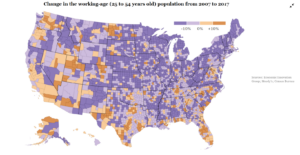
Question 1
What was the sample of people used in creating this heat map?
- a) All ages for anyone working in the United States
- b) People working in the United States, between the ages of 25 and 54 years old
- c) People working in any country, between the ages of 25 and 54 years old
- d) People working in the United States, being less than 25 or greater than 54 years old.
Question 2
What was the source of the data used to create this heat map?
- a) The New York Times
- b) All people in the United States
- c) Economic Innovation Group/Moody’s/U.S. Census Bureau
- d) The U.S. government
question 3
What years of data were collected for this heat map?
- a) All years between 2007 to 2017
- b) Only 2007
- c) Only 2017
- d) Only years 2007 and 2017
question 4
What type of summary statistic is displayed on the heat map?
- a) Change in percent
- b) Average
- c) Standard deviation
- d) Median
question 5
What does the dark purple color represent on the heat map?
- a) A decrease in the percentage of the working age population from 2007 to 2017 between 0% and 10%
- b) An increase in the percentage of the working age population from 2007 to 2017 between 0% and 10%
- c) A decrease in the percentage of the working age population from 2007 to 2017 greater than 10%
- d) An increase in the percentage of the working age population from 2007 to 2017 greater than 10%
question 6
What does the lighter orange color represent on the heat map?
- a) A decrease in the percentage of the working age population from 2007 to 2017 between 0% and 10%
- b) An increase in the percentage of the working age population from 2007 to 2017 between 0% and 10%
- c) A decrease in the percentage of the working age population from 2007 to 2017 greater than 10%
- d) An increase in the percentage of the working age population from 2007 to 2017 greater than 10%
question 7
What is the correct interpretation of a dark purple-colored county on the heat map?
- a) In 2017, there were less working age people (25–54 years old) in that county compared to 2007.
- b) In 2017, there were more working age people (25–54 years old) in that county compared to 2007.
- c) There was not a change in the number of working age people (25–54 years old) in that county between 2007 and 2017.
question 8
Write a sentence about what you see from this heat map. What do you notice?
Summary
In this What to Know page, you learned what heat map is and how to analyze the information represented in this type of graphical display. Let’s summarize these skills and tasks as you saw them in the questions.
- In Questions 1, 3, and 4, you inferred the type of dataset used to create a graphical display.
- In Questions 5 and 6, you identified the scale/color used in a graphical display.
- In Question 2, you identified the data source for a graphical display.
- In Question 7, you recognized an accurate interpretation of a graphical display.
- In Question 8, you wrote a statement about interpreting a graphical display.
Hopefully, you feel comfortable with the heat map as a graphical display of data. In the upcoming Forming Connections activity, you’ll extend the ideas you’ve learned to look at other types of complex graphical displays.
- The Learning Network. (2019, September 26). What’s going on in this graph? | Sept 25, 2019. The New York Times. https://www.nytimes.com/2019/09/19/learning/whats-going-on-in-this-graph-sept-25-2019.html ↵
