Learning Goals
At the end of this page, you should feel comfortable performing these skills:
- Develop intuition about how [latex]R^{2}[/latex] is related to the shape of a scatterplot.
- Use technology to calculate [latex]R^{2}[/latex].
- Interpret the meaning of [latex]R^{2}[/latex] in context.
- Identify possible values of [latex]R^{2}[/latex].
In the next in-class activity, you will need to be able to interpret the meaning of [latex]R^2[/latex] in context, relate [latex]R^2[/latex] to the shape of a scatterplot, and identify variable types (explanatory and response) and plot data in a scatterplot. We’ll prepare for this by developing your understanding of how [latex]R^{2}[/latex] is related to the shape of a scatterplot as your learn to calculate, interpret, and recognize this measure in different scenarios.
The Coefficient of Determination
The coefficient of determination, denoted [latex]R^2[/latex] and pronounced “R squared,” is the proportion of the variation in the response variable that can be explained by its linear relationship with the explanatory variable. The following graphic shows a visualization of what we mean by this.
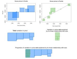
The scatterplots show the prices and sizes of six houses. The first scatterplot includes the data points, as well as a horizontal line whose y-intercept is the mean house price. The second scatterplot includes the data points and the line of best fit. The blue squares in the first scatterplot are a demonstration of the total variation in the price; as you may recall from your discussion of variance, this is related to the sum of the squared distance from the mean. When we find the line of best fit, the distance of each data point to the line is minimized. The green squares in the second scatterplot are a demonstration of the variation in price that is left over after fitting a line to the data; in other words, the green squares show the variation in price that is not explained by its linear relationship with size.
When we compare the unexplained variation with the total variation, we can visually estimate that the unexplained variation comprises about one-fifth of the total variation. As a result, we estimate that about four-fifths (or about 80%) of the variation is explained.
When we use technology to compute [latex]R^2[/latex] for this dataset, we find that [latex]R^2=0.82[/latex]. This is consistent with our visual estimations. In other words, 82% of the variation in house price can be explained by the fact that houses differ in size and there is a linear relationship between price and size.
Video Placement
[Perspective Video: A three-instructor video that gives perspectives for how to see [latex]R^{2}[/latex] as the proportion of the variation in the response variable that can be explained by its linear relationship with the explanatory variable. This video shouldn’t be technical for these introductory stats students. In fact, it should reassure them that the interpretation of [latex]R^{2}[/latex] will be the more important skill to attain, while still developing an intuition of what [latex]R^{2}[/latex] measures in linearly related data. Stress that students don’t need to follow the idea presented in the above images thoroughly, but do refer to them, and make it clear that a key point within the scope of this course is made in the notion that [latex]R^{2}[/latex] close to 1 indicates that a proportion of the variation close to 100% can be explained by the explanatory variable — a strong linear correlation.]
About the Notation
You’ll sometimes see [latex]R^{2}[/latex] written in the lowercase as [latex]r^2[/latex] (like in the DCMP Data Analysis tool), but [latex]R^2[/latex] and [latex]r^2[/latex] mean the same thing. In these activities, we will use the notation [latex]R^2[/latex].
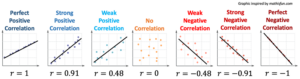
The reason that we use the symbol [latex]R^{2}[/latex] is that the coefficient of determination is equal to the square of the correlation coefficient [latex]r[/latex]. Because of this, [latex]R^2[/latex] is more sensitive to differences in the strength of the linear relationship between the two variables than [latex]r[/latex] is. This increased sensitivity can be seen in the graphic below; the difference between [latex]R^2[/latex] values is greater than the difference between corresponding [latex]r[/latex] values.
[The image below is missing the line that indicates the R^2 values beneath each r value! — Please re-snip and re-insert the full image.]
We will not go into more detail here about how [latex]R^2[/latex] is calculated; instead, you will practice finding and interpreting this value.
If you are curious about how this quantity is computed, see this video https://www.youtube.com/watch?v=lng4ZgConCM.
[latex]R^{2}[/latex] and Scatterplot Shape
You’ve seen that the coefficient of determination [latex]R^2[/latex] is a measure of the proportion of the variation of a response variable in linearly related bivariate data that can be explained by its relationship with the explanatory variable. You should understand that
- [latex]R^2[/latex] is equivalent to the square of the correlation coefficient [latex]r[/latex] and will always be a positive number.
- [latex]R^2[/latex] should be interpreted as a percentage.
- That is, if a data set has [latex]r=0.87[/latex], then [latex]R^2=0.7569[/latex], which would be expressed as [latex]75.69\%[/latex].
- We would say that approximately [latex]75.7 \%[/latex] of the variation in the response variable is due to its linear relationship with the explanatory variable.
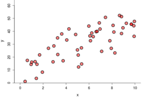
Consider what you already understand about the shape and spread of a scatterplot.
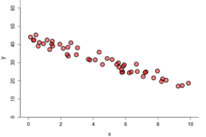
- The strongest linear relationships appear in plots as data that is roughly linear in shape with data points that lie very close to some line.
- Weaker relationships may be very roughly linear in shape and more spread out, with data points that lie further from some line.
- Non-linear relationships have data points that either form other shapes or are randomly scattered across the plot.
Use what you already know together with the idea that [latex]R^2[/latex] is the square of [latex]r[/latex]to answer Question 1.
question 1
For this question, use the following graphs.
Graph A
Graph B
Graph C
Part A: Which of the previous scatterplots demonstrates the strongest linear relationship?
Part B: Which of the previous scatterplots do you expect to have the highest value of [latex]R^2[/latex]? Explain.
Now that you have developed some intuition about [latex]R^2[/latex] and the shape of a plot, let’s explore how the spread of a plot affects the value of [latex]R^2[/latex].
question 2
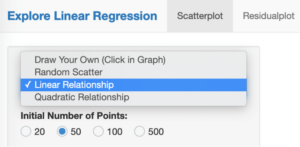
Go to the DCMP Explore Linear Regression tool at https://dcmathpathways.shinyapps.io/ExploreLinReg/. From the drop-down menu, select “Linear Relationship.”
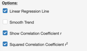
Select the boxes that will display [latex]r[/latex] and [latex]R^2[/latex]:
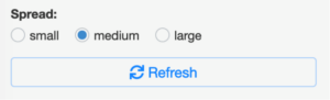
Toggle back and forth between the different options for spread. Make a note for yourself about how [latex]R^2[/latex] changes as you change the spread from large to medium to small. As you do this, note that squaring [latex]r[/latex] does, in fact, yield [latex]R^2[/latex].
Part A: When the data points lie closer to the line of best fit, the linear relationship between the explanatory variable and the response variable ___________.
- a) gets stronger
- b) gets weaker
- c) stays the same
Part B: As the linear relationship between the explanatory variable and the response variable gets stronger, the value of [latex]R^2[/latex] __________.
- a) increases
- b) decreases
- c) stays the same
Hopefully you are feeling more confident in understanding [latex]R^2[/latex] with regard to what you already knew about linear relationships and the shape and spread of the data on a scatterplot.
Interpreting [latex]R^2[/latex] in context
Now it’s time to put together what you’ve learned so far about explanatory and response variables, visual clues in a scatterplot regarding the appropriateness of linear analysis, the correlation coefficient [latex]r[/latex], and the coefficient of determination [latex]R^2[/latex]. See the video below for a summary of these ideas, then use what you’ve learned to answer Questions 3 – 6.
Video Placement
[A 3-instructor worked example that summarizes the ideas appearing in Questions 3 – 6. This can be a place to use an inclusion or social justice example. The example should walk through identifying response and explanatory variables from a scenario description, anticipation of the R^2 value upon visual inspection of the plot, confirmation of R^2 via a data analysis tool, and interpretation of R^2 in the context of the scenario.]
Now you try it. Go to the DCMP Linear Regression tool at https://dcmathpathways.shinyapps.io/LinearRegression/. Select “From Textbook” and then select the “Bad Drivers” dataset to answer Question 3 – 6 below.
question 3
We wish to investigate the relationship between the losses (in dollars) incurred by insurance companies for collisions per insured driver and insurance premiums (in dollars). Insurance companies incur losses when drivers who are insured through them are involved in collisions, and the insurance companies then have to pay for the associated costs. Insurance premiums are the fees that insurance companies charge; drivers pay premiums to the insurance companies in order to buy insurance coverage.
Part A: Which variable is the explanatory variable?
- a) Losses
- b) Insurance premiums
Part B: Which variable is the response variable?
- a) Losses
- b) Insurance premiums
question 4
Visually inspect the scatterplot. Which of the following do you expect of the [latex]R^2[/latex] value?
- a) Very close to 0%
- b) Between 10% and 50%
- c) Between 50% and 90%
- d) Very close to 100%
question 5
Use the tool to find [latex]R^2[/latex]. Note that the coefficient of determination ([latex]R^2[/latex]) is given in a table below the scatterplot. What is the value of [latex]R^2[/latex]?
question 6
Interpret [latex]R^2[/latex] for this scatterplot: _______% of the variation in _______ can be explained by its linear relationship with _______.
Identifying [latex]R^2[/latex] in Context
The final two questions below ask you to think carefully about the characteristics of [latex]R^2[/latex] and the characteristics of data graphed on a scatterplot. Use what you have learned about these to answer the questions below. Don’t forget to use the given hint if necessary.
question 7
Depending on the tools you use, [latex]R^2[/latex] may be expressed as a decimal or as a percentage. Even though the tool expresses [latex]R^2[/latex] using a percentage, it is important to be able to read values of [latex]R^2[/latex] in both decimal and percentage form. Consider an arbitrary [latex]R^2[/latex]. Which of the following are possible values of [latex]R^2[/latex]? There may be more than one correct answer.
- a) 0.1
- b) 30%
- c) 1.5
- d) 1.5%
- e) 100%
- f) -0.1
- g) -44
- h) 1
question 8
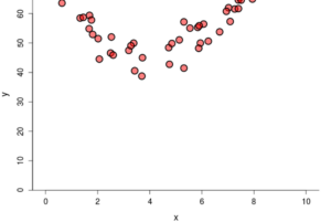
Both of the plots below have an [latex]R^2[/latex] value of 0.9%. This is quite close to zero, which means that very little of the variation in the response variable can be explained by its linear relationship with the explanatory variable.
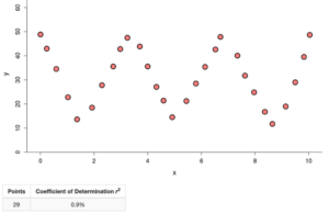 .
. 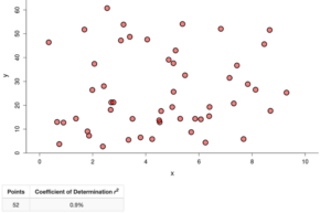
Determine whether this statement is true or false: If [latex]R^2[/latex] is very small, then there is no relationship between the explanatory variable and the response variable.
Summary
In this What to Know page, you learned about the coefficient of determination [latex]R^{2}[/latex]. Here is a summary, per question, of what you saw.
- In Questions 1, 2, 4, and 8, you developed intuition about how [latex]R^{2}[/latex] is related to the shape of a scatterplot.
- In Question 3, you identified variable types (explanatory and response) and plotted data in a scatterplot.
- In Question 5, you used technology to calculate [latex]R^{2}[/latex].
- In Question 6, you interpreted the meaning of [latex]R^{2}[/latex] in context.
- In Question 7, you identified possible values of [latex]R^{2}[/latex].
Hopefully, you are beginning to develop a basic understanding of the coefficient of determination [latex]R^{2}[/latex]. Let’s move to the activity in Forming Connections to continue exploring these ideas.
