Learning Outcomes
- Use a spreadsheet to explore measures of central tendency of a data set
- Use a spreadsheet to explore measures of spread and variation of a data set

A group of 50 students at a hypothetical math camp was given instruction in an algorithm used to teach beginners how to solve a 3×3 speed cube. None had ever learned a method for solving one before. After a week of practice, they were each asked to solve 10 cubes and record their average solving time. Their average 10-cube times in seconds are listed below.
| 129 | 122 | 115 | 100 | 108 | 129 | 131 | 145 | 118 | 96 |
| 149 | 95 | 118 | 158 | 131 | 135 | 145 | 98 | 123 | 161 |
| 166 | 110 | 145 | 96 | 157 | 158 | 117 | 115 | 103 | 145 |
| 143 | 94 | 97 | 154 | 162 | 111 | 110 | 137 | 150 | 145 |
| 119 | 155 | 112 | 129 | 140 | 139 | 164 | 158 | 134 | 98 |
We’d like to explore the shape, center, and variability of the data to gain some understanding. Let’s start by opening a new workbook and saving it somewhere safe. You should save your work frequently or enable an auto-save feature. Rename Sheet1 as Speed Cube Times.
Spreadsheet Hands-On: Use a Spreadsheet to Perform Descriptive Statistics
Step 1: Load the data set
- Type the 50 numbers from the table above into the spreadsheet in column A. You may be able to copy them from the text page and paste them into the worksheet. If so, you’ll need to transpose the the rows into columns. To do so, after pasting the data in the spreadsheet, you’ll have 5 rows of 10 columns. Select the first row, copy it, and paste it elsewhere on the sheet. Click the Ctrl (paste options) box and choose Transpose in the uppermost Paste options box. It’s the one with the perpendicular arrows. Continue until you have all five rows in column A in cells 1 through 50. Then, delete the tabular data.
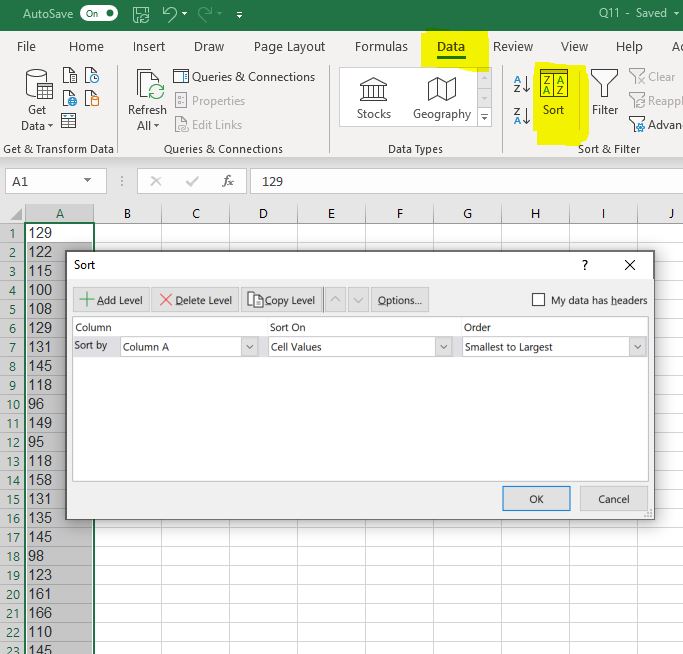
- The numbers don’t need to be in any particular order, but if you’d like to arrange them, you can. Select cells A1 – A50 where the data is. Click on Data in the ribbon above the sheet, then click on Sort. Make sure that “My data has headers” is unchecked. Then sort by Column A on Cell Values, Smallest to Largest, and click OK.
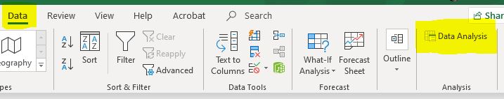
- Check to see if you have the Excel Data Analysis ToolPak loaded into your copy of the program. Click on Data and look for the Data Analysis tab on the ribbon (see the image below). If it is there, you already have the ToolPak. If it is not there, click File, then Options. Choose Add-ins in the menu that opens, then click Go… . Click Analysis ToolPak on the next menu, then click OK. Once you add it, you won’t have to add it again.
The next step is to get a list of descriptive statistics from the Data Analysis ToolPak.
Step 2: Obtain the descriptive statistics from the ToolPak.
- Excel and other spreadsheets have function that will enable you to obtain descriptive statistics one by one. That’s time-consuming, so we’ll use the descriptive statistics feature of the Statistics ToolPak. Click Data, then Data Analysis, and choose Descriptive Statistics.
- Click into the box next to Input Range to give your data to the tool. Then select your data, or just type $A$1:$A$50 (assuming your data is in column A in rows 1 – 50).
- Click in the Output Range box and choose a cell to put your summary in, like $C$1.
- Click to choose Summary statistics, Kth Largest (set to 2), and Kth Smallest (set to 2), and click OK. A column of statistics should have appeared, labeled Column 1. You can click that and rename it if you like.
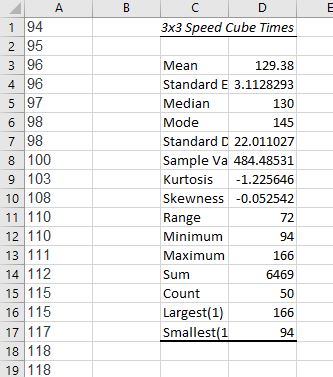
- Note that the Minimum value is 94 and the Maximum is 166. We also checked the boxes to be given the Largest (1) at 166 and the Smallest(1) at 94. You could have chosen any number for largest and smallest, say 2 or 3 away from the ends of the range, just to get a feel for any outliers (unusually large or small values) in the set.
- We can read mean, median, and mode from the data, the standard deviation, and the range. Another statistic of interest will be skewness.
Now that our data is loaded and groomed, we’d like to start looking at it from different angles. Getting practice looking at various representations of data will help you learn what views work best with different types of information. We will create a frequency table and a histogram first.
You learned about creating Frequency Tables and Histograms by hand earlier in the text. Now we’ll let the program do the heavy lifting for us. But there is some preparation we must do first. You may recall that a frequency table has two columns: one for the categories and one for the frequencies. We’ll need to decide on some categories that make sense for our particular quantitative data and the class interval for each.
Step 3: Create a Frequency Table and a Histogram
Recall the details of our data set. The numbers represent the average times of novice cube solvers after a week of instruction. Perhaps we are interested in how our class of 50 students has progressed and how we might like to tweak the subsequent instruction. Different representations of the spread and center of the data may yield some insight. A histogram could help us sense for how long it’s taking the students to solve a cube on average by categorizing them by equal intervals of length in seconds. But what is the best way to divide them up? Examining the range is a good place to start.
The range of the data is 72. That is, there are 73 values to distribute including the fastest time of 94 seconds and the slowest time of 166 seconds. We want to choose class intervals (the width of each bin) that make sense for our data but choosing the intervals is a subjective task. There is a rule of thumb that says that the bins shouldn’t be too narrow or too wide to make it difficult to see the shape of the distribution. Sometimes it’s best to play around with different widths to choose the best representation. There are statistical rules that can help choose the intervals. Two that are commonly used are Sturges’ Rule and Rice’s Rule.
handling roots in the calculator
Recall that [latex]{\sqrt[n]{a}}^{m} = a^{\frac{m}{n}}[/latex]
This allows us to write [latex]\sqrt[3]{a} = {a}^{\frac{1}{3}}[/latex]
That is, to evaluate a cube root such as [latex]\sqrt[3]{8}[/latex] in the calculator, raise 8 to the [latex]\dfrac{1}{3}^{rd}[/latex] power. Try it. [latex]8\wedge(1/3)[/latex]. You should get 2.
- Sturges’ Rule states that the number of bins should be twice the cube root of the sample size, [latex]n[/latex]. That’s [latex]2\ast \sqrt[3]{n}[/latex]. In this case, [latex]2\ast \sqrt[3]{50}\approx7.4[/latex]
- Rice’s Rule states that the number of bins should be equivalent to [latex]1+3.3\log n[/latex]. In this case, [latex]1+3.3\log50 \approx 6.6[/latex]
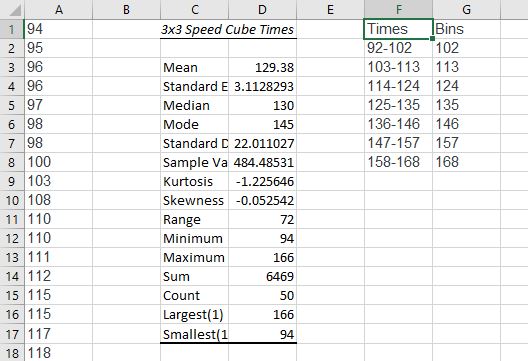
We can compromise on 7, which gives us a class interval of 10.4. So, we’ll set the bins to be 11 seconds wide and run from 92 – 168.
- Excel will only accept the rightmost edge of the bin, so we’ll need two columns. Type out the bins and rightmost bin edges for Excel in columns F and G as shown in the image below.
- Next, click on Data Analysis and choose Histogram. Set the Input Range to $A$1:$A$50 to feed it the data. Set the Bin Range to $G$1:$G$8 and uncheck the Labels box. Set the Output Range to $I$1 and click Chart Output. Click OK.
- Next, create the Frequency Table. Select and copy the Frequency column and paste somewhere in the middle of the sheet. Then copy the Times column from column F and paste it adjacent to the pasted Frequencies. Adjust your formatting for font and style.
- We need to do a little housekeeping to the Histogram to remove the blank spaces. Right click on a data bar in the histogram. Choose “format data series,” and select Series Options (it may already be selected for you). Make the Gap Width 0%. Then choose the paint bucket and add Solid line.
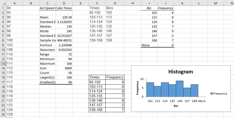
- The frequency table and histogram both indicate that the data are fairly evenly distributed in frequency. The mean and median are in agreement at about 130 which indicates that the data is distributed symmetrically about the center with a standard deviation of 22. The skewness also indicates a symmetric distribution, since the skew value is very close to zero. That means we don’t have any large outliers to pull the mean in one direction or the other. Since about 68% of the data in a normal distribution lie within 1 standard deviation from the center, we can be fairly certain that most of the students are solving the cube in between 108 – 152 seconds. The mode is 145, so there is a peak of students at that mark, on average. That doesn’t mean that most students are solving the cube at 145 seconds. It just means that of all the recorded solving times, 145 came up the most. A dot plot would make the mode easier to see.
Step 4: Create a dot plot.
- The dot plot will have a horizontal axis containing all the integers between 94 and 166. We’ll need to get frequencies for each number appearing in the data set. Essentially, we’ll move through the set, number by number, and place a dot on the chart over each number in data set. Well, we’ll have Excel do it for us. Click into cell B1. We will use an Excel formula called COUNTIF().
- Into cell B1, type COUNTIF($A$1:$A1,A1), then enter. That tells Excel to increment the count in the cell next to each data element by one if it encounters it. Select the cell again and drag that formula down through the column to B50.
- Now highlight both columns, A and B through row 50. Click on Insert in the ribbon and then click Charts, then scatter chart (the one without lines or curves). The mode stands out as the tallest vertical stack of data elements on the chart.
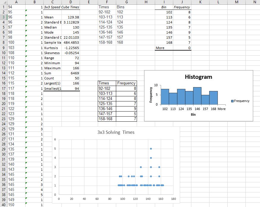
There are more explorations we can make of this data, but they will just uncover what we’ve found so far already. Most of our students have done well and are solving the cube after one week somewhere between 108 and 152 seconds, with a handful of quick learners and a handful of students lagging behind. That’s nearly 3/4 of a minute spread around the center, though. There is no clear pattern showing for the class as a whole. You may wish to revisit this data after practicing some other methods in the next sections to see if you gain more insight.