Learning Outcomes
- Create a histogram that represents a data set
- Analyze a frequency polygon graph that compares two variables
Visualizing Numbers
Quantitative, or numerical, data can also be summarized into frequency tables.
Example
A teacher records scores on a 20-point quiz for the 30 students in his class. The scores are:
19 20 18 18 17 18 19 17 20 18 20 16 20 15 17 12 18 19 18 19 17 20 18 16 15 18 20 5 0 0
These scores could be summarized into a frequency table by grouping like values:
| Score | Frequency |
| 0 | 2 |
| 5 | 1 |
| 12 | 1 |
| 15 | 2 |
| 16 | 2 |
| 17 | 4 |
| 18 | 8 |
| 19 | 4 |
| 20 | 6 |
Using the table from the first example, it would be possible to create a standard bar chart from this summary, like we did for categorical data:
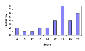
However, since the scores are numerical values, this chart doesn’t really make sense; the first and second bars are five values apart, while the later bars are only one value apart. It would be more correct to treat the horizontal axis as a number line. This type of graph is called a histogram.
Histogram
A histogram is like a bar graph, but where the horizontal axis is a number line.
example
For the values above, a histogram would look like:
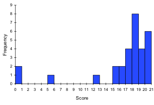
Notice that in the histogram, a bar represents values on the horizontal axis from that on the left hand-side of the bar up to, but not including, the value on the right hand side of the bar. Some people choose to have bars start at ½ values to avoid this ambiguity.
This video demonstrates the creation of the histogram from this data.
Unfortunately, not a lot of common software packages can correctly graph a histogram. About the best you can do in Excel or Word is a bar graph with no gap between the bars and spacing added to simulate a numerical horizontal axis.
If we have a large number of widely varying data values, creating a frequency table that lists every possible value as a category would lead to an exceptionally long frequency table, and probably would not reveal any patterns. For this reason, it is common with quantitative data to group data into class intervals.
Class Intervals
Class intervals are groupings of the data. In general, we define class intervals so that
- each interval is equal in size. For example, if the first class contains values from 120-129, the second class should include values from 130-139.
- we have somewhere between 5 and 20 classes, typically, depending upon the number of data we’re working with.
example
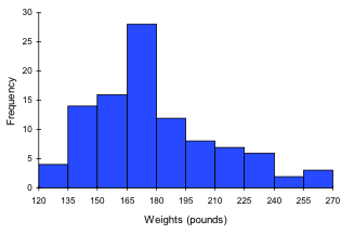
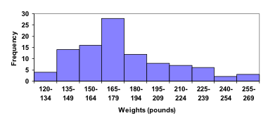
Suppose that we have collected weights from 100 male subjects as part of a nutrition study. For our weight data, we have values ranging from a low of 121 pounds to a high of 263 pounds, giving a total span of 263-121 = 142. We could create 7 intervals with a width of around 20, 14 intervals with a width of around 10, or somewhere in between. Oftentimes we have to experiment with a few possibilities to find something that represents the data well. Let us try using an interval width of 15. We could start at 121, or at 120 since it is a nice round number.
| Interval | Frequency |
| 120 – 134 | 4 |
| 135 – 149 | 14 |
| 150 – 164 | 16 |
| 165 – 179 | 28 |
| 180 – 194 | 12 |
| 195 – 209 | 8 |
| 210 – 224 | 7 |
| 225 – 239 | 6 |
| 240 – 254 | 2 |
| 255 – 269 | 3 |
A histogram of this data would look like:
In many software packages, you can create a graph similar to a histogram by putting the class intervals as the labels on a bar chart.
The following video walks through this example in more detail.
Try It
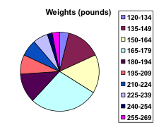
Other graph types such as pie charts are possible for quantitative data. The usefulness of different graph types will vary depending upon the number of intervals and the type of data being represented. For example, a pie chart of our weight data is difficult to read because of the quantity of intervals we used.
To see more about why a pie chart isn’t useful in this case, watch the following.
Try It
On campus, 36 students were surveyed and asked what they had paid for textbooks that term. The given responses are below. Create a histogram for this data.
| $240 | $320 | $160 | $165 | $180 | $315 | $460 | $360 | $260 |
| $360 | $160 | $290 | $380 | $395 | $285 | $300 | $310 | $345 |
| $140 | $310 | $250 | $220 | $285 | $315 | $350 | $235 | $330 |
| $320 | $285 | $355 | $305 | $340 | $280 | $460 | $300 | $420 |


When collecting data to compare two groups, it is desirable to create a graph that compares quantities.
Example
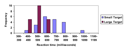
The data below came from a task in which the goal is to move a computer mouse to a target on the screen as fast as possible. On 20 of the trials, the target was a small rectangle; on the other 20, the target was a large rectangle. Time to reach the target was recorded on each trial.
| Interval (milliseconds) | Frequency small target | Frequencylarge target |
| 300-399 | 0 | 0 |
| 400-499 | 1 | 5 |
| 500-599 | 3 | 10 |
| 600-699 | 6 | 5 |
| 700-799 | 5 | 0 |
| 800-899 | 4 | 0 |
| 900-999 | 0 | 0 |
| 1000-1099 | 1 | 0 |
| 1100-1199 | 0 | 0 |
One option to represent this data would be a comparative histogram or bar chart, in which bars for the small target group and large target group are placed next to each other.
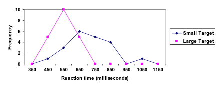
Frequency polygon
An alternative representation is a frequency polygon. A frequency polygon starts out like a histogram, but instead of drawing a bar, a point is placed in the midpoint of each interval at height equal to the frequency. Typically the points are connected with straight lines to emphasize the distribution of the data.
example
This graph makes it easier to see that reaction times were generally shorter for the larger target, and that the reaction times for the smaller target were more spread out.
The following video explains frequency polygon creation for this example.
Candela Citations
- Revision and Adaptation. Provided by: Lumen Learning. License: CC BY: Attribution
- Presenting Quantitative Data Graphically. Authored by: David Lippman. Located at: http://www.opentextbookstore.com/mathinsociety/. Project: Math in Society. License: CC BY-SA: Attribution-ShareAlike
- numbers-education-kindergarten. Authored by: karanja. Located at: https://pixabay.com/en/numbers-education-kindergarten-738068/. License: CC0: No Rights Reserved
- Creating a histogram. Authored by: OCLPhase2's channel. Located at: https://youtu.be/180FgZ_cTrE. License: CC BY: Attribution
- Defining class intervals for a frequency table or histogram. Authored by: OCLPhase2's channel. Located at: https://youtu.be/JhshitTtdP0. License: CC BY: Attribution
- When not use a pie chart. Authored by: OCLPhase2's channel. Located at: https://youtu.be/FQ8zmZ56-XA. License: CC BY: Attribution
- Frequency polygons. Authored by: OCLPhase2's channel. Located at: https://youtu.be/rxByzA9MFFY. License: CC BY: Attribution