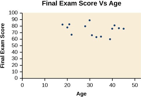
Figure 1. A scatter plot of age and final exam score variables
Notice this scatter plot does not indicate a linear relationship. The points do not appear to follow a trend. In other words, there does not appear to be a relationship between the age of the student and the score on the final exam.
Example 1: Using a Scatter Plot to Investigate Cricket Chirps
The table below shows the number of cricket chirps in 15 seconds, for several different air temperatures, in degrees Fahrenheit.[1] Plot this data, and determine whether the data appears to be linearly related.
| Chirps | 44 | 35 | 20.4 | 33 | 31 | 35 | 18.5 | 37 | 26 |
| Temperature | 80.5 | 70.5 | 57 | 66 | 68 | 72 | 52 | 73.5 | 53 |
Solution
Plotting this data suggests that there may be a trend. We can see from the trend in the data that the number of chirps increases as the temperature increases. The trend appears to be roughly linear, though certainly not perfectly so.
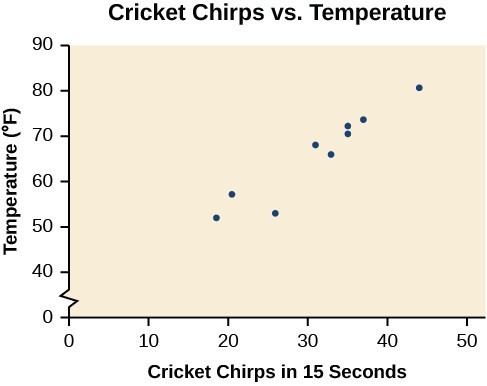
Figure 2
Candela Citations
CC licensed content, Shared previously
- Precalculus. Authored by: Jay Abramson, et al.. Provided by: OpenStax. Located at: http://cnx.org/contents/fd53eae1-fa23-47c7-bb1b-972349835c3c@5.175. License: CC BY: Attribution. License Terms: Download For Free at : http://cnx.org/contents/fd53eae1-fa23-47c7-bb1b-972349835c3c@5.175.
- Selected data from http://classic.globe.gov/fsl/scientistsblog/2007/10/. Retrieved Aug 3, 2010 ↵