Sometimes the patterns that develop during data analysis can be described as correlations: the patterns demonstrate a direct or inverse relationship between the studied variables. A direct relationship is one in which both variables change in the same direction (and by the same factor/at the same rate). For example, car accidents at higher speeds tend to result in more severe injuries. An inverse relationship, in contrast, is one in which the two variables change in opposite directions (but still by the same factor/at the same rate). For example, students who accrue more absences tend to earn lower final grades. Importantly, the most you can usually state is that there is—or seems to be—a correlation of some type between your variables.
Causation, in which there is a cause-and-effect relationship between the variables, is extremely difficult to demonstrate. WRIT 250 projects customarily cannot claim a pattern of causation as the projects do not control for enough variables. As such, you want to analyze your data for correlational relationships, in which there seem to be connections between one variable and another. You want to avoid indicating that one of your variables “causes” another variable to shift.
You also want to be sure that the correlations themselves make sense—that there is, in fact, a relationship that can be logically seen between your variables. For a visual representation of why not all correlations work, here is a “good” example of a problematic correlation:
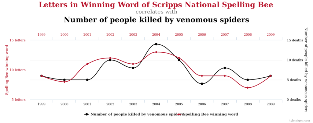
While this chart does indicate that there is a similarity in the shape of the lines representing the number of letters in the winning spelling bee words and the number of people killed by venomous spiders from 1999 to 2009, no logical relationship—either causal or correlative in nature—actually exists between the two. (For more examples of such charts, you can peruse the more than 30,000 examples at Tyler Vigen’s Spurious Correlations.)
Candela Citations
- Incorporating your Data. Authored by: Sarah Wilson & Trey Bagwell . Provided by: University of Mississippi. Project: WRIT 250 Committee OER Project. License: CC BY-SA: Attribution-ShareAlike