Learning Objectives
- Create PowerPoint slide with integrated Excel chart.
Option 1 for Chart Integration
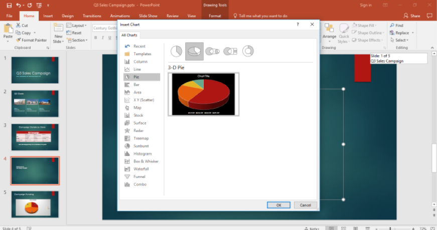
The next slide in the presentation is the budget distribution chart. Cameron will create a chart from scratch in a new slide. He opens the New Slide options and selects Content with Caption, then types in the title in the box. He moves the cursor over the large box and clicks on the Insert Chart icon and decides on the type of chart.
For this slide, he selects a 3-D Pie chart. A small Excel spreadsheet pops up above the pie chart for Cameron to enter the data for the chart.
Cameron begins to type in the data by double-clicking on a cell and replacing the text or numbers in it. He changes the numbers cells to percentages. There is an extra row he doesn’t need, so he selects it, right-clicks, and selects the Delete Row from the menu. Cameron now clicks the X in the small window and closes it.
Cameron decides to show the budget present age on the chart and needs to modify a few other aspects about the chart to make it easier to see.
He takes the following steps:
- Chart Elements Button. This + button allows Cameron to change aspects of the chart.
- Elements List. Cameron clicks the Data Labels box to change the labels.
- Arrow Button. Cameron clicks the small right arrow, and a new menu appears.
- Data Label List. Cameron moves the chart numbers to the center of their respective areas.
Next, Cameron changes the area numbers to percentages and increases the font size of the chart text and the Store label sizes.
The chart is now too close to the store labels. Cameron clicks on the chart and hovers over the border until the four-arrow cursor appears. He drags the chart up, closer to the title. This centers the chart and makes it easier to read the labels.
Option 2 for Chart Integration
What if Cameron had an existing sales budget chart? He could copy and paste the chart into his presentation. First he opens the Excel file with the chart in it. Since he has learned to copy and paste from the previous table, he puts the PowerPoint and Excel windows side by side then takes the following steps:
- Select Excel. Cameron makes sure Excel is the current window and opens the chart file.
- Select Chart. Cameron selects the chart in the Excel file by right-clicking on the chart.
- Select Copy. Cameron sees a menu appear and selects the Copy choice. He can also use Ctrl+C to copy the chart.
Practice Question
- PowerPoint Presentation Paste Chart. With the desired chart copied, Cameron moves over to his PowerPoint presentation and places the curser in the correct spot and right-clicks again to bring up the menu. In the menu he selects the Paste option and the chart is placed in the presentation. He can also use the Ctrl+V keys to paste the chart.
- Resize Chart. Cameron now grabs one of the chart border area spots and moves it to the desired size in the presentation.
- Change Chart. If Cameron needs to change something about the chart, such as the type of chart, the data in the chart, the labels, and so on, he can right-click on the chart itself. A menu will appear that allows him to change aspects of that chart. Any changes made will not affect the original Excel file chart.
Practice Question
Candela Citations
- Excel Chart in PowerPoint. Authored by: Sherri Pendleton. Provided by: Lumen Learning. License: CC BY: Attribution


