Learning Objectives
- For a linear relationship, use the least squares regression line to model the pattern in the data and to make predictions.
So far we have used a scatterplot to describe the relationship between two quantitative variables. We described the pattern in the data by describing the direction, form, and strength of the relationship. We then focused on linear relationships. When the relationship is linear, we used correlation (r) as a measure of the direction and strength of the linear relationship.
Our focus on linear relationships continues here. We will
- use lines to make predictions.
- identify situations in which predictions can be misleading.
- develop a measurement for identifying the best line to summarize the data.
- use technology to find the best line.
- interpret the parts of the equation of a line to make our summary of the data more precise.
Making Predictions
Earlier, we examined the linear relationship between the age of a driver and the maximum distance at which the driver can read a highway sign. Suppose we want to predict the maximum distance that a 60-year-old driver can read a highway sign. In the original data set, we do not have a 60-year-old driver.
How could we make a prediction using the linear pattern in the data?
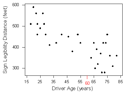
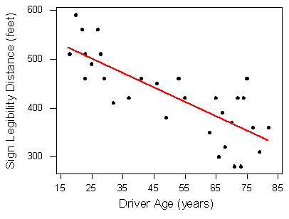
Here again is the scatterplot of driver ages and maximum reading distances . (Note: Sign Legibility Distance = Max distance to read sign.) We marked 60 on the x-axis.
Of course, different 60-year-olds will have different maximum reading distances . We expect variability among individuals. But here our goal is to make a single prediction that follows the general pattern in the data. Our first step is to model the pattern in the data with a line. In the scatterplot, you see a red line that follows the pattern in the data.
To use this line to make a prediction, we find the point on the line with an x-value of 60. Simply trace from 60 directly up to the line. We use the y-value of this point as the predicted maximum reading distance for a 60-year-old. Trace from this point across to the y-axis.
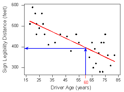
We predict that 60-year-old drivers can see the sign from a maximum distance of just under 400 feet.
We can also use the equation for the line to make a prediction. The equation for the red line is
Predicted distance = 576 − 3 * Age
To predict the maximum distance for a 60-year-old, substitute Age = 60 into the equation.
Predicted distance = 576 − 3 * (60) = 396 feet
Shortly, we develop a measurement for identifying the best line to summarize the data. We then use technology to find the equation of this line. Later, in “Assessing the Fit of a Line,” we develop a method to measure the accuracy of the predictions from this “best” line. For now, just focus on how to use the line to make predictions.
Learn By Doing
Before we leave the idea of prediction, we end with the following cautionary note:
Avoid making predictions outside the range of the data.
Prediction for values of the explanatory variable that fall outside the range of the data is called extrapolation. These predictions are unreliable because we do not know if the pattern observed in the data continues outside the range of the data. Here is an example.
Example
Cricket Thermometers
Crickets chirp at a faster rate when the weather is warm. The scatterplot shows data presented in a 1995 issue of Outside magazine. Chirp rate is the number of chirps in 13 seconds. The temperature is in degrees Fahrenheit.
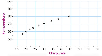
There is a strong relationship between chirp rate and temperature when the chirp rate is between about 18 and 45. What form does the data have? This is harder to determine. A line appears to summarize the data well, but we also see a curvilinear form, particularly when we pay attention to the first and last data points.

Both the curve and line are good summaries of the data. Both give similar predictions for temperature when the chirp rate is within the range of the data (between 18 and 45). But outside this range, the curve and the line give very different predictions. For example, if the crickets are chirping at a rate of 60, the line predicts a temperature just above 95°F. The curve predicts a much lower temperature of about 85°F.
Which is a better prediction? We do not know which is better because we do not know if the form is linear or curvilinear outside the range of the data.
If we use our model (the line or the curve) to make predictions outside the range of the data, this is an example of extrapolation. We see in this example that extrapolation can give unreliable predictions.
Learn By Doing
Learn By Doing
Candela Citations
- Concepts in Statistics. Provided by: Open Learning Initiative. Located at: http://oli.cmu.edu. License: CC BY: Attribution