I’m a Writer, Not a Graphic Designer! (Or, Who Gives a CRAP?)
It’s easy to get by in most college writing without thinking about visual design or graphics. About the most visual design college writing asks for is that you emulate the MLA or APA document format, pretty bare bones visual designs in themselves. Create your text of letters and numbers, and plug it in.
The web, though, is a different place. To be a web writer, you have to expand your definition of “text” beyond merely copy (the alphanumeric symbols on the page you might have previously thought exclusively constituted all writing) to include visual design as well as the use of font, images, layout, video, and other media. Using these new forms of writing also raises new issues about copyright and fair use.
A good starting point is to learn some basic design principles. To think about visual design of your pages, you need a design vocabulary: a set of terms you can use to talk about what you like and don’t like in a web page.
Designer Travis McAshan notes that: “Graphic design contains underlying principles that govern the most important aspects of great design. These principles create the acronym C.R.A.P. which stands for contrast, repetition, alignment, and proximity. The well-balanced combination of these principles tends to create design which most people would consider visually pleasing.”
C.R.A.P: Article
Review this article before reading any more of this page: Is Your Website Design “CRAP”?
White Space Is Your Friend
Now that you understand what CRAP is, a good next principle is that the background on the page, the “white space,” (also known as “negative space”) is your friend. Cluttered websites where everything is smashed together can be difficult to read. Websites that are well designed contain plenty of white space. The text has room to “breathe” and the pages are much more reader friendly for it.
Now suppose your white space is not white, but a background image (this is why we need the term negative space). If the background image is too strong—such as a bright picture or a repeating design behind your text—it will call too much attention to itself. Reading text may be extremely difficult, and you may obscure important information. Consider a solid color background and add pictures to create interest. Or if you want to use an image as a background, you might be able to fade the image so that it is very subtle against a solid background, almost transparent.
Contrast
Still, even solid backgrounds can be a problem if there is not enough contrast between the background and the copy on the page. (See, we just used the C of CRAP, contrast, to talk about a web design issue.) The worst cases are color combinations that will give readers migraines, like red text on a blue background. It might look interesting at first, but it will make your readers’ eyes bleed (or at the very least give them a headache) if they have to look it at for longer than a few seconds. Chances are they won’t stick around that long if they see a page full of jarring colors (anyone tired of MySpace yet?).
Using Color
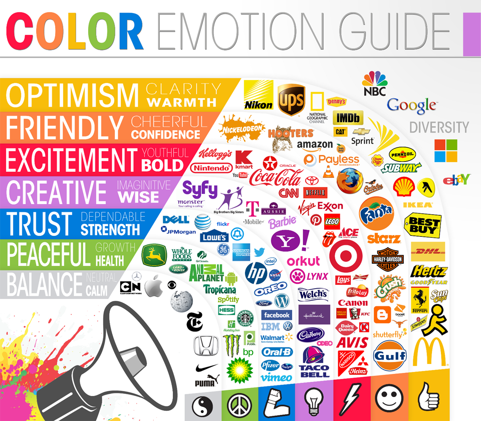
A designer has to choose colors that are the right tone to support the mission or focus of the website. Most people know that blue (because of water) and green (because of plants) can symbolize life. Red can hint at anger or, ironically, love. The chart below, links specific colors to emotions . . . and to products. This chart was created for people creating advertisements.

Color Emotion Guide
It can be hard to come up with a color scheme of multiple colors that work well on a site. If your website has a primary logo or visual, one technique can be to use the color picker in an image editor to choose the colors that match with that logo or visual. Or if you still feel challenged in trying to pick out colors that go together in your design, tools such as Canva’s Color Wheel Tool can help you to come up with complementary/contrasting colors.
The Color Wheel

A Basic Color Wheel
They use color theory. Color theory is a practical combination of art and science that’s used to determine what colors look good together. The color wheel was invented in 1666 by Isaac Newton, who mapped the color spectrum onto a circle. The color wheel is the basis of color theory, because it shows the relationship between colors.
Colors that look good together are called a color harmony. Artists and designers use these to create a particular look or feel. You can use a color wheel to find color harmonies by using the rules of color combinations. Color combinations determine the relative positions of different colors in order to find colors that create a pleasing effect.
There are two types of color wheel. The RYB or red, yellow, blue color wheel is typically used by artists, as it helps with combining paint colors. Then there is the RGB, or red, green and blue color wheel, which is designed for online use, as it refers to mixing light – like on a computer or TV screen.
Complementary Colors
Two colors that are on opposite sides of the color wheel. This combination provides a high contrast and high impact color combination – together, these colors will appear brighter and more prominent.
The article below contains an interesting discussions of the use of color, particularly with commercial websites. Note: This is a commercial website:
WEB WRITING STYLE GUIDE
Version 1.0, June 2011
Edited by Matt Barton, James Kalmbach, and Charles Lowe
