Types of Visual Aids
Visual aids fall into two main categories—images and informational graphics. Images include photographs, illustrations and clip art, and video footage. Informational graphics include tables, charts, bar graphs, and line graphs.
These visual aids serve two purposes: to add emotional impact to your presentation and to organize information more clearly. With that in mind, read to find out how specific types of visual aids achieve those purposes.
Photographs
A striking photograph can capture your audience’s attention far more successfully than words can. Consider including photographs at the beginning or end of your presentation to emphasize your main ideas or to accompany a particularly important point in the body of your presentation. Remember that, as with other types of graphics, less is often more. Two or three well-chosen photographs are more effective than a dozen mediocre ones.
Key Takeaways
When you choose photographs, ask yourself these questions:
- What purpose does this image serve? Will it surprise the audience? Will it provoke a strong emotional response? Does it support an important point?
- Will this photograph be more effective if shown with only a caption, or does it need additional text?
- Will the audience understand what is happening in the photograph? Is the meaning immediately evident, or does the photo need some context?
- Would editing the image make it more effective? Consider using image-editing software to crop the photo, change the brightness, or make other cosmetic changes. (Do not go overboard, though. A slightly imperfect but authentic image is preferable to one that has been obviously altered.)
- Is this image copywrited? May I ethically use this image? How will I cite the photographer? (See the example under the image below.)
Illustrations
Illustrations, such as editorial or political cartoons, serve much the same purpose as photographs. Because an illustration does not capture a moment in time the way a photo does, it may have less impact. However, depending on your topic and the effect you want to achieve, illustrations can still be very useful. Use the same criteria for choosing photographs to help you choose illustrations.
Tip: Style
The style of an illustration or photograph affects viewers just as the content does. Keep this in mind if you are working with the stock images available in office software programs. Many of these images have a comical tone. This may be fine for some topics—for instance, a presentation on television shows for children. However, if you need to project a more serious tone, make sure you choose images to suit that purpose. Many free (or reasonably priced) image banks are available online.
Video Footage
Even more than photographs, video footage can create a sense of immediacy, especially if your video includes sound. Showing a brief video clip can help your audience feel as if they are present at an important event, connect with a person being interviewed, or better understand a process. Again, ask yourself the following questions to ensure you are using the footage well:
- What purpose does this video serve? (Never rely on video clips just to fill time.)
- How much footage should be shown to achieve your purpose?
- What will need to be explained, before or after showing the video, to ensure that your audience understands its significance?
- Will it be necessary to edit the video to stay within time requirements or to focus on the most important parts?
Tables
Informational graphics, such as tables, charts, and graphs, do not provoke the same response that images do. Nevertheless, these graphics can have a powerful impact. Their primary purpose is to organize and simplify information.
Tables are effective when you must classify information and organize it in categories. Tables are an especially good choice when you are presenting qualitative data that are not strictly numerical. Table 14.1 “Example of Qualitative Data Table” was created for a presentation discussing the subprime mortgage crisis. It presents information about people who have held powerful positions both in the government and at one of the investment banking firms involved in the subprime mortgage market.
| Name | Role(s) at Goldman Sachs | Years Active | Government Role(s) | Years Active |
|---|---|---|---|---|
| Henry Paulson | Chief operating officer | 1994–98 | US secretary of the treasury | 2006–9 |
| Chief executive officer | 1998–2006 | |||
| Robert Rubin | Vice chairman and co-chief operating officer | 1987–90 | Assistant to the president for economic policy and director, National Economic Council | 1993–95 |
| Co-chairman and co-senior partner | 1990–92 | US secretary of the treasury | 1995–99 | |
| Stephen Friedman | Co-chief operating officer | 1987–90 | Assistant to the president for economic policy and director, National Economic Council | 2002–5 |
| Co-chairman | 1990–92 | |||
| Chairman | 1992–94 |
Sources: www.rollingstone.com/politics…B3351,11459%5D;
http://www.nytimes.com/2008/10/19/business/19gold.html;
http://topics.nytimes.com/top/reference/timestopics/people/p/henry_m_jr_paulson/index.html?inline=nyt-per;
http://topics.nytimes.com/top/reference/timestopics/people/r/robert_e_rubin/index.html?inline=nyt-per,
http://www.nytimes.com/2002/12/13/us/man-in-the-news-economic-adviser-from-other-side-of-the-deficit-stephen-friedman.html;
http://news.bbc.co.uk/2/hi/business/342086.stm.
Tip
If you are working with numerical information, consider whether a pie chart, bar graph, or line graph might be an effective way to present the content. A table can help you organize numerical information, but it is not the most effective way to emphasize contrasting data or to show changes over time.
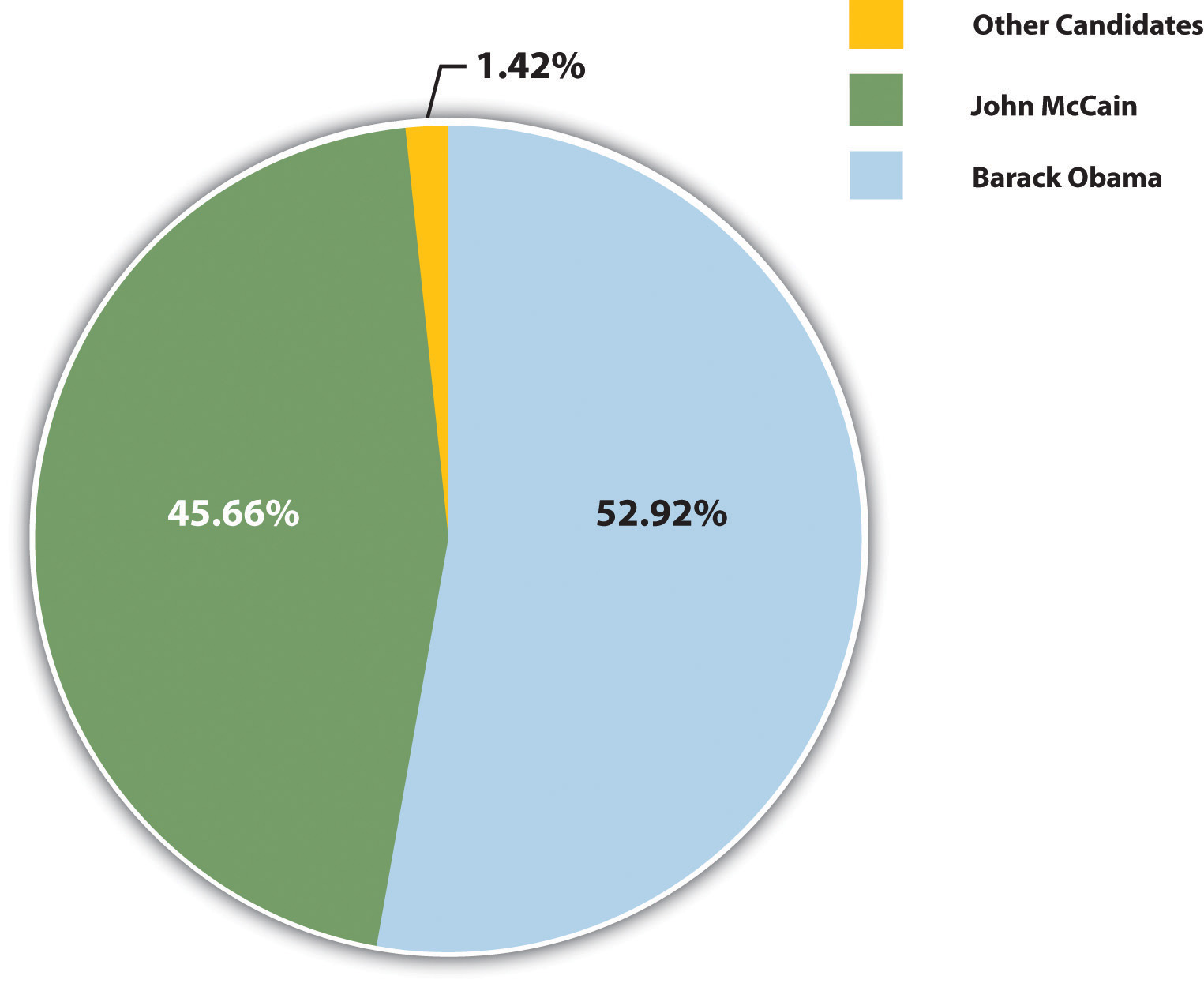
Pie Charts
Pie charts are useful for showing numerical information in percentages. For example, you can use a pie chart to represent presidential election results by showing what percentage of voters voted for the Democratic presidential candidate, the Republican candidate, and candidates from other political parties.
Bar Graphs
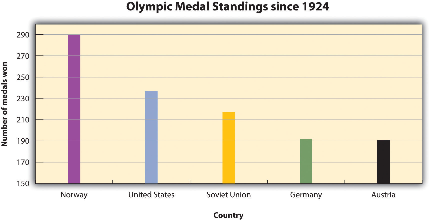
Bar graphs work well when you want to show similarities and differences in numerical data. Horizontal or vertical bars help viewers compare data from different groups, different time periods, and so forth. For instance, the bar graph in Figure 14.2.4 allows the viewer to compare data on the five countries that have won the most Olympic medals since the modern games began in 1924: Norway, the United States, the former Soviet Union, Germany, and Austria. Bar graphs can effectively show trends or patterns in data as well.
Line Graphs
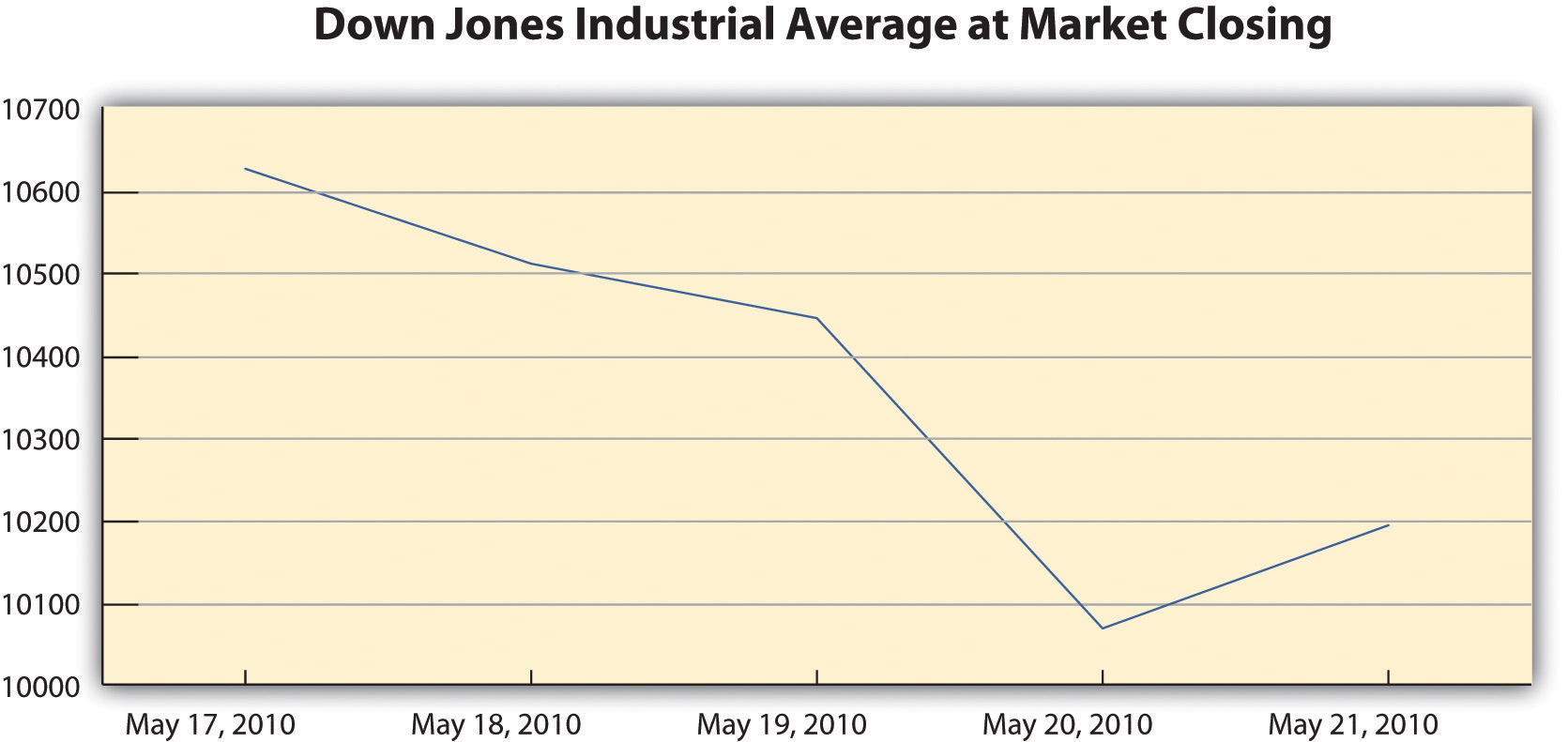
Like bar graphs, line graphs show trends in data. Line graphs are usually used to show trends in data over time. For example, the line graph in Figure 14.2.5 shows changes in the Dow Jones Industrial Average—an economic index based on trading information about thirty large, US-based public companies. This graph shows where the Dow closed at the end of each business day over a period of five days.
Exercise 14.2.114.2.1
In this exercise, you will begin to refine your ideas for incorporating media into your presentation. Complete the following steps on your own sheet of paper.
- Revisit the list you brainstormed for Exercise 3 in Section 14.1 and the annotated outline you developed for Exercise 4.
- Analyze the two different types of visual aids: images and informational graphics. Identify at least two places in your presentation where you might incorporate visual aids.
- Evaluate the purpose of the visual aid. Does it create emotional impact, or does it organize information? Is the visual effective?
- Determine whether you will be able to create the visual aid yourself or will need to find it.
Writing Captions
Any media you incorporate should include a caption or other explanatory text. A caption is a brief, one- to two-sentence description or explanation of a visual image. Make sure your captions are clear, accurate, and to the point. Use full sentences when you write them.
Captions should always be used with photographs, and in some cases, they can be useful for clarifying informational graphics, which represent qualitative data visually. However, informational graphics may not require a caption if the title and labels are sufficiently clear. For other visual media, such as video footage, providing explanatory text before or after the footage will suffice. The important thing is to make sure you always include some explanation of the media.
Copyright and Fair Use
Before you download (or scan) any visual media, make sure you have the right to use it. Most websites state their copyright and terms of use policy on their home page. In general, you may not use other people’s visual media for any commercial purpose without contacting the copyright holder to obtain permission and pay any specified fees.
Copyright restrictions are somewhat more ambiguous when you wish to download visual media for educational uses. Some educational uses of copyrighted materials are generally considered fair use—meaning that it is legally and ethically acceptable to use the material in your work. However, do not assume that because you are using the media for an educational purpose, you are automatically in the clear. Make sure your work meets the guidelines in the following checklist. If it does, you can be reasonably confident that it would be considered fair use in a court of law and always give credit to the source.
Media Fair Use Checklist
- You are using the media for educational purposes only.
- You will make the work available only for a short period and to a limited audience. For instance, showing a copyrighted image in a classroom presentation is acceptable. Posting a presentation with copyrighted images online is problematic. In addition, avoid any uses that would allow other people to easily access and reproduce the work.
- You have used only as much of the work as needed for your purposes. For video and audio footage, limit your use to no more than 10 percent of the media—five minutes of an hour-long television show, for example. Image use is harder to quantify, but you should avoid using many images from the same source.
- You are using the media to support your own ideas, not replace them. Your use should include some commentary or place the media in context. It should be a supporting player in your presentation—not the star of the show.
- You have obtained the material legally. Purchase the media if necessary rather than using illegally pirated material.
- Your use of the media will not affect the copyright holder or benefit you financially.
By following these guidelines, you are respecting the copyright holder’s right to control the distribution of the work and to profit from it.
Key Takeaways
Visual Aid Evaluation Checklist
- Visual aids are clearly integrated with the content of the presentation
- Photographs and illustrations suit the overall tone of the presentation
- Images and text are large and clear enough for the viewer to see or read
- Images are shown with explanatory text or a caption
- Informational graphics include clear, easy-to-read labels and headings
- Text within informational graphics is easy to read (Watch out for wordiness and crowded text or a font that is too small and hard to read.)
- Formatting choices (color, different fonts, etc.) organize information effectively
- Any text within graphics is free of errors
- Hyperlinks within slides function properly
- Display text for hyperlinks is concise and informative (Never paste a link into a slide without modifying the display text.)