Learning Objectives
- Discuss why visuals are used to complement text in documents.
- Examine how visuals are classified according to Tables or Figures.
A table is used to organize data in volumes and rows using numbers and words. Tables present a logical representation of data. Tables are usually used to show comparison data.
Figures, on the other hand, illustrate all other types of data. Figures include such visuals as pie charts, line graphs, bar graphs, layouts, photographs, drawings and photographs:
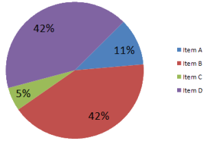
- Pie Charts show segments that compare percentages of a whole.
- Line graphs show the relationship between two or more variables.
- Horizontal Bar Graphs show comparisons of similar units.
- Vertical Bar Graphs illustrate timelines.
- Layouts show detailed space.
- Flow Charts show time sequences or hierarchal structures
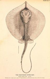
- Drawings eliminate unnecessary details to more effectively show how items relate to other items.
- Photographs are exact representations of items. (Riordan, 2005)
Note that although visuals and text complement each other, either can stand alone. Both include and express the same information in different formats.
References: Riordan, D.G. (2005). Technical report writing today. Boston: Houghton Mifflin Company.
See the following examples of Tables and Figures:
Tables
Figures
Candela Citations
CC licensed content, Shared previously
- Technical Writing. Authored by: Dr. Elizabeth Lohman. Provided by: Tidewater Community College. Located at: http://www.tcc.edu/. Project: Z Degree Program. License: CC BY: Attribution
- Image of Pie Chart. Authored by: Smallman12q. Located at: http://commons.wikimedia.org/wiki/File:Sample_Pie_Chart.png. License: CC0: No Rights Reserved
- Image of Bar Graph of Canadian Population. Authored by: Srm038. Located at: http://commons.wikimedia.org/wiki/File:2011_Canadian_Population_%28bar_chart%29.png. License: CC BY-SA: Attribution-ShareAlike
- Image of Vertical Bar Graph. Authored by: Flo422. Located at: http://commons.wikimedia.org/wiki/File:Number_of_humans_launched_into_space_bar_chart.png. License: CC BY-SA: Attribution-ShareAlike
- Image of Line Graph. Authored by: SBell93. Located at: http://commons.wikimedia.org/wiki/File:A_line_graph_showing_the_of_population_for_Thoralby.jpg. License: CC BY-SA: Attribution-ShareAlike
Public domain content
- ASCII Table. Authored by: ZZT32. Located at: http://commons.wikimedia.org/wiki/File:ASCII-Table.svg. License: Public Domain: No Known Copyright
- Table of Car Prices. Authored by: Lou Sander. Located at: http://commons.wikimedia.org/wiki/File:AHPJonesPurchasePrice02.png. License: Public Domain: No Known Copyright
- Image of Flow Chart. Authored by: Vrmant. Located at: http://commons.wikimedia.org/wiki/File:Update_Flow_Chart.jpg. License: Public Domain: No Known Copyright
- Image of Southern Sting Ray. Authored by: H. L. Todd. Provided by: NOAA. Located at: http://commons.wikimedia.org/wiki/File:Dasyatis_sabina_drawing.jpg. Project: Historic Fisheries Collection. License: Public Domain: No Known Copyright
- Image of Ship Photograph. Authored by: Unknown. Provided by: http://www.washingtonruralheritage.org/cdm/singleitem/collection/skamania/id/937/rec/2. Located at: http://commons.wikimedia.org/wiki/File:SS_Columbia_Undated_Photograph.png. License: Public Domain: No Known Copyright
- Image of Orchestra Layout. Authored by: Darkdoc. Located at: http://commons.wikimedia.org/wiki/File:Orchestra_layout.svg. License: Public Domain: No Known Copyright


