VISUAL RHETORIC
The term rhetoric is often misunderstood. Perhaps as a result of being applied to political speeches and advertising, the word is sometimes associated with dishonesty. That’s not what real rhetoric is about. Rhetoric is the art of persuasion, the science of using specific techniques, such as rhetorical appeals and figurative language, to inform and persuade, and perhaps even to change someone’s mind.
traditional rhetorical appeals
The Greek philosopher Aristotle characterized three main rhetorical tactics:
- Ethos: the reliance on the character or spirit of the speaker or writer to persuade an audience. “I’m ethical, honorable, and trustworthy; therefore, you should believe what I am telling you.”
- Logos: the use of logic or reason in an attempt to persuade an audience. (*Note: this is not the same thing as a company logo.)
- Pathos: the attempt to elicit an emotional response, such as pity, to persuade an audience to believe something or take an action.
Visual rhetoric includes the application of these rhetorical principles to communication in a visual medium. What emotions, desires, or arguments does the image below bring to mind? Of course your personal knowledge, awareness of world events, ethics, and prejudices—the lens through which you view the world—will shape your immediate response, but regardless of this, an image like the one below usually does elicit a response.

“Baby Weddell Seal” © Samuel Blanc [CC BY-SA 3.0]
We can use rhetorical elements—including ethos, logos, and pathos—not only in writing and speaking, but whenever visual communication comes into play, such as in slideshows.
SLIDESHOW BASICS
Even the most dynamic speakers often make use of visual aids to accompany their presentations and help illustrate their ideas. Just as using graphics in documents enhances the documents and engages readers, having well designed visuals as part of an oral presentation makes your presentation more interesting and pulls your audience in. Visual aids also help you organize your presentation and stay on track, and help the audience retain information.
Slideshows such as PowerPoint and Google Slides are the most common form of visual aid used in presentations, so a great deal of discussion has been focused on the pros and cons of this tool. While there are many other presentation tools available, PowerPoint is a workplace standard, so it would be wise to gain proficiency with it. The key concept to remember is that your visual aids should supplement and illustrate what you want to say to your audience rather than being the sole focus of your presentation.
SLIDESHOW TERMINOLOGY
When designing a slideshow for a presentation, it is helpful to be familiar with key terminology.
- Deck: the entire slideshow presentation (all the slides in the presentation).
- Gloss: what the speaker says about each slide. The speaker should not simply read what is on the slide. Slides should have minimal text in the form of key words and short bullet points. A slide might include key quotations. The speaker should elaborate on what is written or shown on the slide.
- Slide: one page of the presentation (Below, Figure 12.1 shows one slide from the deck above) with the various elements identified.
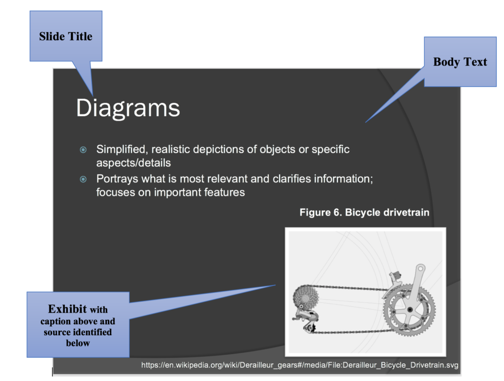
Figure 12.1. PowerPoint slide with annotations. Keithonearth, [Bicycle image embedded in slide]. CC BY-SA 3.0.
- Slide Titles: usually at the top of the slide, the titles acts as “headings” indicating the topic to be discussed in each slide.
- Body Text: written text on the slide, often in the form of bullet points or key terms. This text should be kept to a minimum (key words/phrases; quotations you want to read out loud). Don’t write your “script” in the slide’s body text.
- Exhibits: illustrative graphics on the slides that are glossed in the presentation. You should discuss graphics and explain what is important about them.
- Decorative Graphics: slide motifs, themes, and other non-essential images that add visual appeal to the slides, but do not illustrate substantive ideas.
- Notes: this is the section underneath the slide where you can write notes you want to cover in your gloss. The audience will not see the notes section.
EFFECTIVE USE OF SLIDESHOWS
Microsoft introduced PowerPoint in 1990, and the conference room has never been the same. But a fundamental problem—text-heavy, unfocused, overlong presentations—has dulled the initial enthusiasm for the software. If you are sure that a visual presentation will provide something necessary to your audience, keep the number of slides and the amount of text on each slide to a bare minimum. Think of a slide presentation as a way of supporting or augmenting the content in your talk; don’t let the slides replace your content.
If you plan to read your slides to the audience, abandon that plan. It’s considered one of the single most annoying things a presenter can do. Excessively small text and complex visuals (including distracting animations) are frequently cited as annoyances.
Try to design your slides so that they contain the information that your viewers might want to write down; for example, good presentations often contain data points that speakers can’t just rattle off or quick summaries of key concepts. If you can’t explain how the slides add value to your presentation, don’t use them.
Slides overloaded with text and/or images will strain your audience’s capacity to identify important information. Complex, distracting transitions or confusing (or boring) graphics that aren’t consistent with your content are worse than no graphics at all.
To get a feel for what may annoy your audience, try Googling “annoying PowerPoint presentations.” You’ll get a million hits containing helpful feedback and good examples of what not to do.
slideshow revision checklist
Use these tactics to create useful, effective slideshows.
- Simplicity is best: use a small number of high-quality graphics; limit text to bullet points. Don’t think of a slide as a page that your audience should read.
- Chunking helps: break your information up into small bites for your audience, and make sure your presentation flows well. Think of a slide as a way of reminding you and the audience of the topic at hand.
- Remember Repetition: slides should have a consistent visual theme, including font choice.
- Think big: use a minimum 24-point font. Anything smaller will not be visible from the back of the room.
- Practice: software is only a tool, and the slide projector is not presenting—you are.
In technical communication, slideshows and document graphics are not the only visual media you may use. Pamphlets, posters, billboards, videos, and other kinds of displays can also work to convey your message. Considering how to present ideas visually can be as important as determining what to say.
Below are some resources to help you design visual information in a rhetorically effective way:
Visual Rhetoric page from the Online Writing Lab (OWL) at Purdue University
Rule of Thirds (Wikipedia)
Color theory (Tiger Color)
Psychology of Font Choices (The Daily Egg)
Using design guidelines from the graphics chapter—CRAP in particular—and the visual rhetoric principles discussed above will help you design consistent, helpful, and visually appealing slides. But all the design skill in the world won’t help you if your content is not tightly focused, smoothly delivered, and visible. The same rule that applies to using graphics in documents applies to creating effective slides: keep it simple.
Candela Citations
- This chapter is a derivative of Technical Writing Essentials by Susan Last, licensed under a Creative Commons 4.0 International License. Located at: https://pressbooks.bccampus.ca/technicalwriting/. License: CC BY-NC-SA: Attribution-NonCommercial-ShareAlike. License Terms: Technical Writing Essentials by Kim Wozencraft is licensed under a Creative Commons Attribution-NonCommercial-ShareAlike 4.0 International License, except where otherwise indicated.