Professional technical writing often contains graphics—drawings, diagrams, photographs, illustrations, tables, pie charts, bar charts, line graphs, flow charts, and so on. Technical writers integrate graphics, also referred to as visuals, to complement text in a document. Visuals can take a number of forms, but their purpose rarely varies: graphics should help to clarify the information presented. They also provide an additional benefit: they help to break up a text-heavy document, thereby making it more visually appealing. As you learn how to use graphics in your documents, you will begin to appreciate their effectiveness and functionality as tools for clear communication.
Different types of graphics are effective for presenting various types of information. The table below indicates which kinds of graphics are best-suited for presenting particular types of information.
Tables
Tables permit rapid access to and relatively easy comparison of information, particularly numerical information. If the data is arranged chronologically (for example, sales figures over a ten-year period), the table can show trends—patterns of rising or falling activity. Tables are not necessarily the most vivid or dramatic means of showing such trends or relationships between data—that’s why we have charts and graphs. But tables are very useful for conveying numerical data, especially when dealing with large amounts of data.
| Type of Information | Suitable Graphics |
| Numerical Information | Tables, charts, (bar graphs, line graphs, pie charts), infographics |
| Process descriptions | Flow charts, infographics |
| Logical relationships | Organizational charts. logic trees |
| Spatial relationships | Maps, diagrams |
| Visual characteristics | Photographs, screenshots, line drawings, maps |
However, don’t get locked into the notion that tables are strictly for numerical data. Tables are also useful for comparisons. Whenever you have situations where you offer categories of comparison, you’ve got a possibility for a table. For example, imagine that you are comparing several models of a laser printer: cost, print speed, supply costs, warranty terms, and so on. Though the table cells will be filled with a combination of words and numbers, a table is still the best solution. Many retail websites offer product comparison options, and when you select the items you wish to compare, what opens is a table that displays the comparison categories in the stub column (the left-most column) and the different models across the top row of the table.
Table format. In its simplest form, a table is a grid of rows and columns. At the top of each column is a column heading, which defines or identifies the contents of that column (and may indicate the unit of measurement, if appropriate). On the left edge of the table are row headings, which define or identify the contents of each row. The image below shows a general table layout. (If data in the rows were numerical, column headings would be centered.) Traditionally, the title of a table is placed on top of the table or is the first row of the table. If the contents of the table are obvious and there is no need to cross-reference the table from anywhere else in the report, you can omit the title.
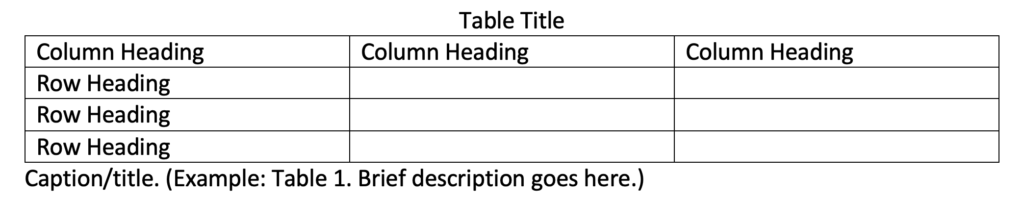
Table layout and terminology. (Image: UbikwitusThey CC BY-NC-SA-4.0)
As for specific style and formatting guidelines for tables, keep these in mind:
- Refer to the table in the text just preceding the table. Explain the general significance of the data in the table; don’t expect readers to figure it out entirely for themselves.
- Don’t overwhelm readers with monster 11-column, 30-row tables. Simplify the table data down to just that amount of data that illustrates your point—without of course distorting that data.
- Don’t put the word or abbreviation for the unit of measurement in every cell of a column. For example, in a column of measurements all in millimeters, don’t put “mm” after every number. Put the abbreviation in parentheses in the column or row heading.
- Right- or decimal-align numbers in the columns.
- Normally, words in columns are left-justified (although you will occasionally see columns of words all centered).
- Column headings are centered over the columns of numerical data (forming a T-shape); left-aligned with columns of text. The alignment of column headings to the actual columnar data is variable. If you have a column of two- or three-letter words, you’d probably want to center the column heading over that data, even though it is words, not numbers. (Doing so avoids an odd-looking L-shaped column.)
- When there is some special point you need to make about one or more of the items in the table, use a footnote instead of clogging up the table with the information.
Producing tables. Most word processing applications have options for drawing tables in documents. Many spreadsheet applications can also be used to create tables.
Charts and Graphs
Charts and graphs are actually just another way of presenting the same types of data that can be presented in tables—although a more dramatic and interesting one. Though charts and graphs offer less detail or precision than tables do, they can be very effective for conveying information visually. A table filled with numbers presents precise information, but doesn’t depict trends or change as strikingly as a line graph does. Imagine the difference between a table with the same numerical information in it as in the line graph below (Fig. 1). A table would offer precise, specific numbers, but the line graph is more effective as far as displaying the temperature change over time.
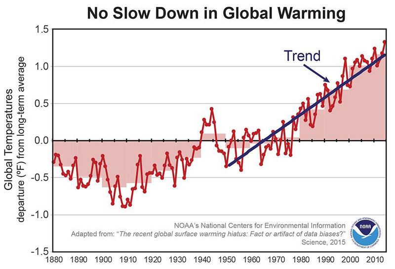
Figure 1. Line graphs are effective for displaying change over time. (“No Slow Down in Global Warming” from the U.S. National Oceanic and Atmospheric Administration is in the Public domain.)
Like tables, bar graphs can be used to show numerical information. Bar graphs are very well suited to showing the relative values of numerical information. Bar graphs can also show change over time. Figure 2, below, created by the U.S. National Park Service, visually depicts not only the difference over time for the numbers of salmon who “escaped” from the fishery at Lake Clark, Alaska to spawn, but shows the variation in numbers from year to year and the extremes in the differences from year to year.
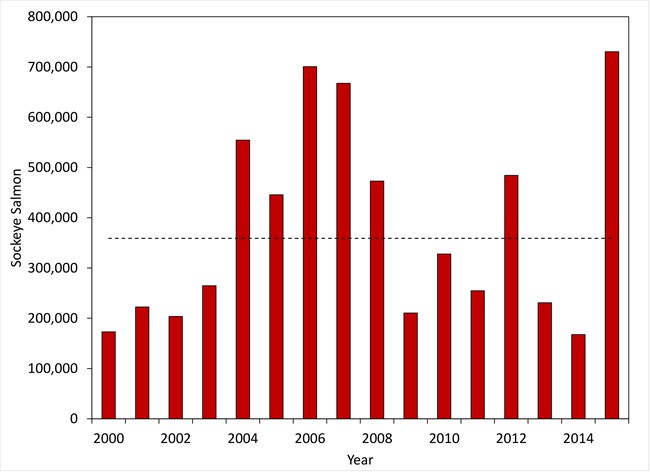
Figure 2. Annual sockeye salmon escapement estimates. The dashed line represents the average escapement of 372,000 for the years 2000 – 2015. (Image from the National Park Service is in the public domain.)
Pie charts offer another way to show numerical information and are best suited to display numerical relationships as parts of a whole. But if you cut the pie into too many slices, the graphic can become cluttered or difficult to read, as in Figure 3, below.
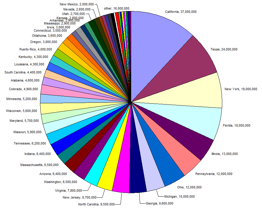
Figure 3. Too many slices spoil the pie. Avoid using more than 8 slices in a pie chart. (Pie Chart of US Population by State is in the public domain.)
In Figure 4, below, from the National Oceanic and Atmospheric Administration, a pie chart is incorporated into a decorative but informative graphic. Including a separate slice for each state affected might have resulted in too many slices. Instead, the creator chose the most important and relevant information to convey an accurate idea of the relative damage suffered by the most severely-impacted states. Analysis of the type of information to be conveyed in a graphic is the first step toward creating effective graphics.
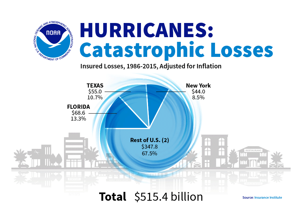
This dressed-up pie chart displays at-a-glance that three states suffered the most catastrophic losses from hurricanes in the U.S. between 1986-2015. (Hurricanes: Catastrophic Losses is in the public domain.)
Many word processing and spreadsheet applications can be used to create charts and graphs, and an ever-expanding number of websites offer increasingly sophisticated tools for creating graphics of all sorts. Remember that it’s important to consider the kind of information you want to present graphically and then choose an appropriate type of graphic to present that particular kind of information most effectively.
Formatting requirements
When you create any type of chart or graph, keep these requirements in mind:
Axis labels—In bar charts and line graphs, don’t forget to indicate what the x and y axes represent. One axis might indicate millions of dollars; the other, five-year segments from 1960 to the present.
Keys (legends)—Bar charts, line graphs, and pie charts often use special color, shading, or line style (solid or dashed). Be sure to indicate what these mean; translate them in a key (a box) in some unused place in the chart or graph.
Figure titles—For most charts and graphs, you’ll want to include a title, in many cases, a numbered title. Readers need some way of knowing what they are looking at. And don’t forget to cite the source of any information you borrowed in order to create the graphic. The standard rule for when to number figures or tables is this: if you cross-reference the figure or table elsewhere in the text, identify it with a number.
Cross-references—When you use a chart or graph, point it out by referring it in the document text (an in-text reference). With that cross-reference, provide some explanation of what is going on in the graphic, how to interpret it, what basic trends it displays, and/or why it’s included in the document. Introduce the information appearing in a graphic in clear sentences in the paragraph preceding the visual. That is also a good place to provide the source material for the information in the graphic, if applicable.
Documentation—When you borrow information to create a graphic, be sure to use the standard format to indicate the source. It does not matter how you import the graphic into your report—it is all borrowed information, which some brave and noble soul worked hard to develop. Give credit where credit is due.
Appearance—Make sure graphics fit within normal margins. You may have to resize a graphic to make sure it does not break the margin lines in your document. If you resize, be sure not to stretch the graphic vertically or horizontally. Maintain the height/width ratio. Leave at least one blank line above and below graphics.
Producing charts and graphs
As with illustrations, you have various options for creating charts and graphs: downloading, screen-capturing, scanning, photocopying, generating your own with software, and drawing your own.
Citing sources of tables, charts and graphs
It’s perfectly legal to borrow tables—to copy, photocopy, download and copy/paste, scan, or to extract subsets of data from them. But you’re obligated to observe copyright laws and also to cite your sources for tables, charts, and graphs just as you are for the words you borrow. Normally, this is done in either the table title, caption (just below the image), or in a footnote.

Graphics help readers understand and retain information, and may also serve decorative purposes, to add visual interest to a document. (Image by Gerd Altmann from Pixabay. Pixabay license: free for commercial use; no attribution required.)
Conclusion
Various graphics options are essential tools in technical writing. Graphics help readers understand and retain information more effectively than text alone does. Graphics are useful for communicating information to non-native speakers and for communicating large amounts of information in a clear, economical way. Images make documents more visually interesting. Add graphics creation to your toolbox to enhance your skillset and your ability to efficiently communicate the information your readers want or need.
Candela Citations
- This chapter is a derivative of Online Technical Writing by Dr. David McMurrey. Located at: https://www.prismnet.com/~hcexres/textbook/. License: CC BY-NC-SA: Attribution-NonCommercial-ShareAlike. License Terms: Technical Writing Essentials by Kim Wozencraft is licensed under a Creative Commons Attribution-NonCommercial-ShareAlike 4.0 International License, except where otherwise indicated.