The basic rule of repetition is that any text, visual, or textual elements that have similar functions should be formatted similarly in order to create continuity and show close relationships between the elements. For example, newspapers, whether online or on paper, have consistent ways of labeling different sections, like Sports, but there is also design consistency throughout the entire publication so you can tell that the section you just picked up belongs to a particular newspaper.
Repetition means that every line classified as a “headline” should look like a headline, and headlines formatted to look alike can be identified as headlines with a similar function in the text. The same principle applies to body text. Fonts should not change without a reason. Lines, logos, and other graphic/visual elements should be formatted consistently. This repetition provides a sense of order and continuity that makes your document more readable and professional looking. Repetition also applies to styles like MLA or APA. All titles are centered. All page numbers are in the upper right-hand corner, after your last name and a single blank character space. The same typeface is used throughout the paper.
On a smaller scale, in a résumé, most applicants use bullet-point sections to list their job duties. In this context, repetition means that the bullet points should be formatted identically: the same font, size, line spacing, and indentation. Each group of bullet-point items should be the same distance from the text above and below. The bullet points themselves should be exactly the same shape and size. The text in the bullet-points should display good parallel structure. Avoid using a single noun for one bullet point and a verb phrase in the next.
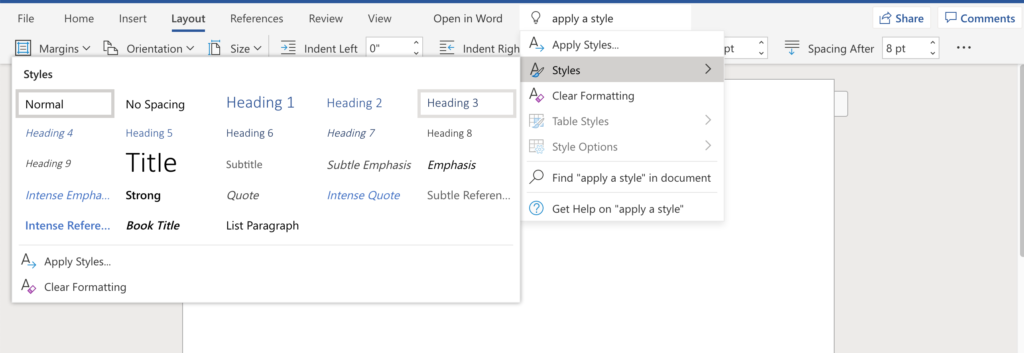
Since managing the formatting of multiple elements by hand can be difficult, many software programs provide templates—ready-made layouts into which you can plug your text and photos and thereby produce documents with a consistent look and feel. Microsoft Word, for example, allows you to set Styles that will keep formatting choices like size, font, and style (bold, italic, etc.) the same for blocks of text with the same functions (body text, headlines, bullet points, subheadings).

Figure 17: The Microsoft Word “Styles” menu (Author screenshot; no attribution needed).
Templates for newsletters, resumes, and PowerPoint presentations ensure that basic design elements like font size and style, colors, image sizes and alignment are consistent from page to page. Templates provide a quick, easy way to solve repetition issues.
Candela Citations
- This chapter is a derivative of Technical Writing by Allison Gross, Annemarie Hamlin, Billie Merck, Chris Rubio, Jodi Naas, Megan Savage, and Michele De Silva, licensed under Creative Commons: NonCommercial-ShareAlike 4.0 International License. Located at: https://openoregon.pressbooks.pub/technicalwriting/. License: CC BY-NC-SA: Attribution-NonCommercial-ShareAlike. License Terms: Technical Writing Essentials by Kim Wozencraft is licensed under a Creative Commons Attribution-NonCommercial-ShareAlike 4.0 International License, except where otherwise indicated.
- This chapter is a derivative of Online Technical Writing by Dr. David McMurrey, licensed under a Creative Commons Attribution-NonCommercial-ShareAlike 4.0 International License. Located at: https://www.prismnet.com/~hcexres/textbook/. License: CC BY-NC-SA: Attribution-NonCommercial-ShareAlike. License Terms: Technical Writing Essentials by Kim Wozencraft is licensed under a Creative Commons Attribution-NonCommercial-ShareAlike 4.0 International License, except where otherwise indicated.
