Learning Outcomes
- Draw and interpret scatter plots
- Find the line of best fit using a calculator
- Distinguish between linear and nonlinear relations
- Use a linear model to make predictions
A professor is attempting to identify trends among final exam scores. His class has a mixture of students, so he wonders if there is any relationship between age and final exam scores. One way for him to analyze the scores is by creating a diagram that relates the age of each student to the exam score received. In this section, we will examine one such diagram known as a scatter plot.
recall ordered pairs as data points
When expressing pairs of inputs and outputs on a graph, they take the form of (input, output). In scatter plots, the two variables relate to create each data point, (variable 1, variable 2), but it is often not necessary to declare that one is dependent on the other. In the example below, each Age coordinate corresponds to a Final Exam Score in the form (age, score). Each corresponding pair is plotted on the graph.
A scatter plot is a graph of plotted points that may show a relationship between two sets of data. If the relationship is from a linear model, or a model that is nearly linear, the professor can draw conclusions using his knowledge of linear functions. Below is a sample scatter plot.
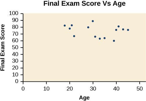
A scatter plot of age and final exam score variables.
Notice this scatter plot does not indicate a linear relationship. The points do not appear to follow a trend. In other words, there does not appear to be a relationship between the age of the student and the score on the final exam.
Example: Using a Scatter Plot to Investigate Cricket Chirps
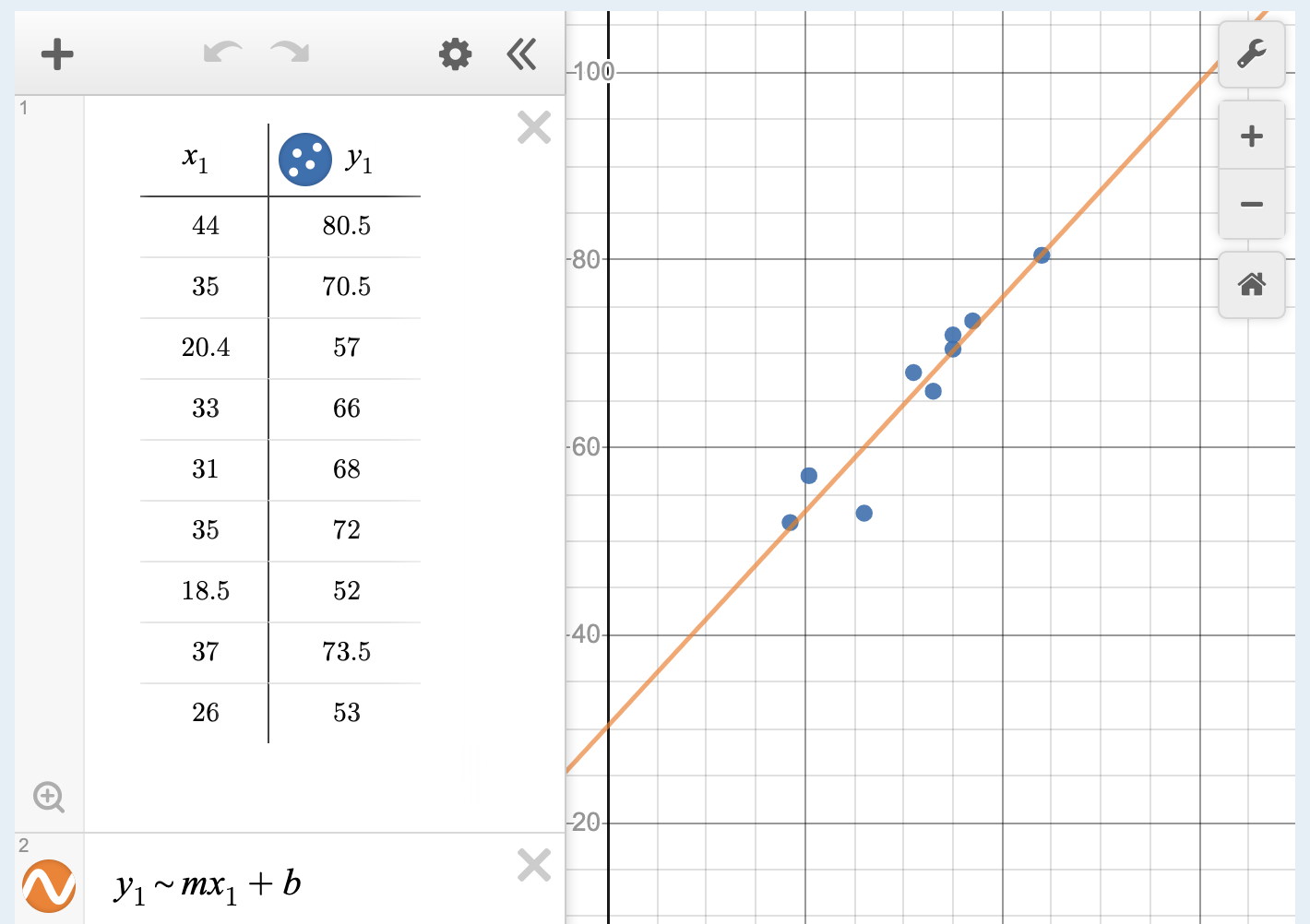
The table below shows the number of cricket chirps in 15 seconds, for several different air temperatures, in degrees Fahrenheit.[1] Plot this data, and determine whether the data appears to be linearly related.
| Chirps | 44 | 35 | 20.4 | 33 | 31 | 35 | 18.5 | 37 | 26 |
| Temperature | 80.5 | 70.5 | 57 | 66 | 68 | 72 | 52 | 73.5 | 53 |

Finding the Line of Best Fit
One way to approximate our linear function is to sketch the line that seems to best fit the data. Then we can extend the line until we can verify the y-intercept. We can approximate the slope of the line by extending it until we can estimate the [latex]\frac{\text{rise}}{\text{run}}[/latex].
Example: Finding a Line of Best Fit
Find a linear function that fits the data in the table below by “eyeballing” a line that seems to fit.
| Chirps | 44 | 35 | 20.4 | 33 | 31 | 35 | 18.5 | 37 | 26 |
| Temperature | 80.5 | 70.5 | 57 | 66 | 68 | 72 | 52 | 73.5 | 53 |

Try It
Recognizing Interpolation or Extrapolation
While the data for most examples does not fall perfectly on the line, the equation is our best guess as to how the relationship will behave outside of the values for which we have data. We use a process known as interpolation when we predict a value inside the domain and range of the data. The process of extrapolation is used when we predict a value outside the domain and range of the data.
The graph below compares the two processes for the cricket-chirp data addressed in the previous example. We can see that interpolation would occur if we used our model to predict temperature when the values for chirps are between 18.5 and 44. Extrapolation would occur if we used our model to predict temperature when the values for chirps are less than 18.5 or greater than 44.
There is a difference between making predictions inside the domain and range of values for which we have data and outside that domain and range. Predicting a value outside of the domain and range has its limitations. When our model no longer applies after a certain point, it is sometimes called model breakdown. For example, predicting a cost function for a period of two years may involve examining the data where the input is the time in years and the output is the cost. But if we try to extrapolate a cost when [latex]x=50[/latex], that is, in 50 years, the model would not apply because we could not account for factors fifty years in the future.
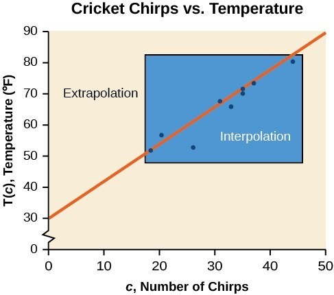
Interpolation occurs within the domain and range of the provided data whereas extrapolation occurs outside.
A General Note: Interpolation and Extrapolation
Different methods of making predictions are used to analyze data.
- The method of interpolation involves predicting a value inside the domain and/or range of the data.
- The method of extrapolation involves predicting a value outside the domain and/or range of the data.
- Model breakdown occurs at the point when the model no longer applies.
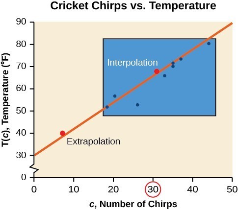
Example: Understanding Interpolation and Extrapolation
| Chirps | 44 | 35 | 20.4 | 33 | 31 | 35 | 18.5 | 37 | 26 |
| Temperature | 80.5 | 70.5 | 57 | 66 | 68 | 72 | 52 | 73.5 | 53 |
Use the cricket data above to answer the following questions:
- Would predicting the temperature when crickets are chirping 30 times in 15 seconds be interpolation or extrapolation? Make the prediction, and discuss whether it is reasonable.
- Would predicting the number of chirps crickets will make at 40 degrees be interpolation or extrapolation? Make the prediction, and discuss whether it is reasonable.
Try It
According to the data from the table in the cricket-chirp example, what temperature can we predict if we counted 20 chirps in 15 seconds?
Finding the Line of Best Fit Using a Graphing Utility
While eyeballing a line works reasonably well, there are statistical techniques for fitting a line to data that minimize the differences between the line and data values.[2] One such technique is called least squares regression and can be computed by many graphing calculators as well as both spreadsheet and statistical software. Least squares regression is also called linear regression, and we can use an online graphing calculator to perform linear regressions.
Example: Finding a Least Squares Regression Line
Find the least squares regression line using the cricket-chirp data in the table below.
Use an online graphing calculator.
| Chirps | 44 | 35 | 20.4 | 33 | 31 | 35 | 18.5 | 37 | 26 |
| Temperature | 80.5 | 70.5 | 57 | 66 | 68 | 72 | 52 | 73.5 | 53 |
Q & A
Will there ever be a case where two different lines will serve as the best fit for the data?
No. There is only one best fit line.
Distinguish Between Linear and Nonlinear Relations
As we saw in the cricket-chirp example, some data exhibit strong linear trends, but other data, like the final exam scores plotted by age, are clearly nonlinear. Most calculators and computer software can also provide us with the correlation coefficient, which is a measure of how closely the line fits the data. Many graphing calculators require the user to turn a “diagnostic on” selection to find the correlation coefficient, which mathematicians label as r. The correlation coefficient provides an easy way to get an idea of how close to a line the data falls.
We should compute the correlation coefficient only for data that follows a linear pattern or to determine the degree to which a data set is linear. If the data exhibits a nonlinear pattern, the correlation coefficient for a linear regression is meaningless. To get a sense of the relationship between the value of r and the graph of the data, the image below shows some large data sets with their correlation coefficients. Remember, for all plots, the horizontal axis shows the input and the vertical axis shows the output.
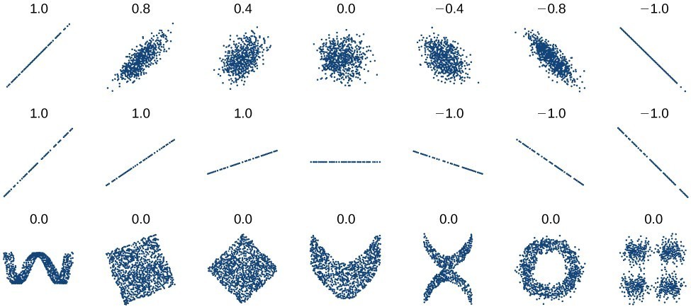
Plotted data and related correlation coefficients. (credit: “DenisBoigelot,” Wikimedia Commons)
A General Note: Correlation Coefficient
The correlation coefficient is a value, r, between –1 and 1.
- r > 0 suggests a positive (increasing) relationship
- r < 0 suggests a negative (decreasing) relationship
- The closer the value is to 0, the more scattered the data.
- The closer the value is to 1 or –1, the less scattered the data is.
Example: Finding a Correlation Coefficient
Calculate the correlation coefficient for cricket-chirp data in the table below.
| Chirps | 44 | 35 | 20.4 | 33 | 31 | 35 | 18.5 | 37 | 26 |
| Temperature | 80.5 | 70.5 | 57 | 66 | 68 | 72 | 52 | 73.5 | 53 |

Use a Linear Model to Make Predictions
Once we determine that a set of data is linear using the correlation coefficient, we can use the regression line to make predictions. As we learned previously, a regression line is a line that is closest to the data in the scatter plot, which means that only one such line is a best fit for the data.
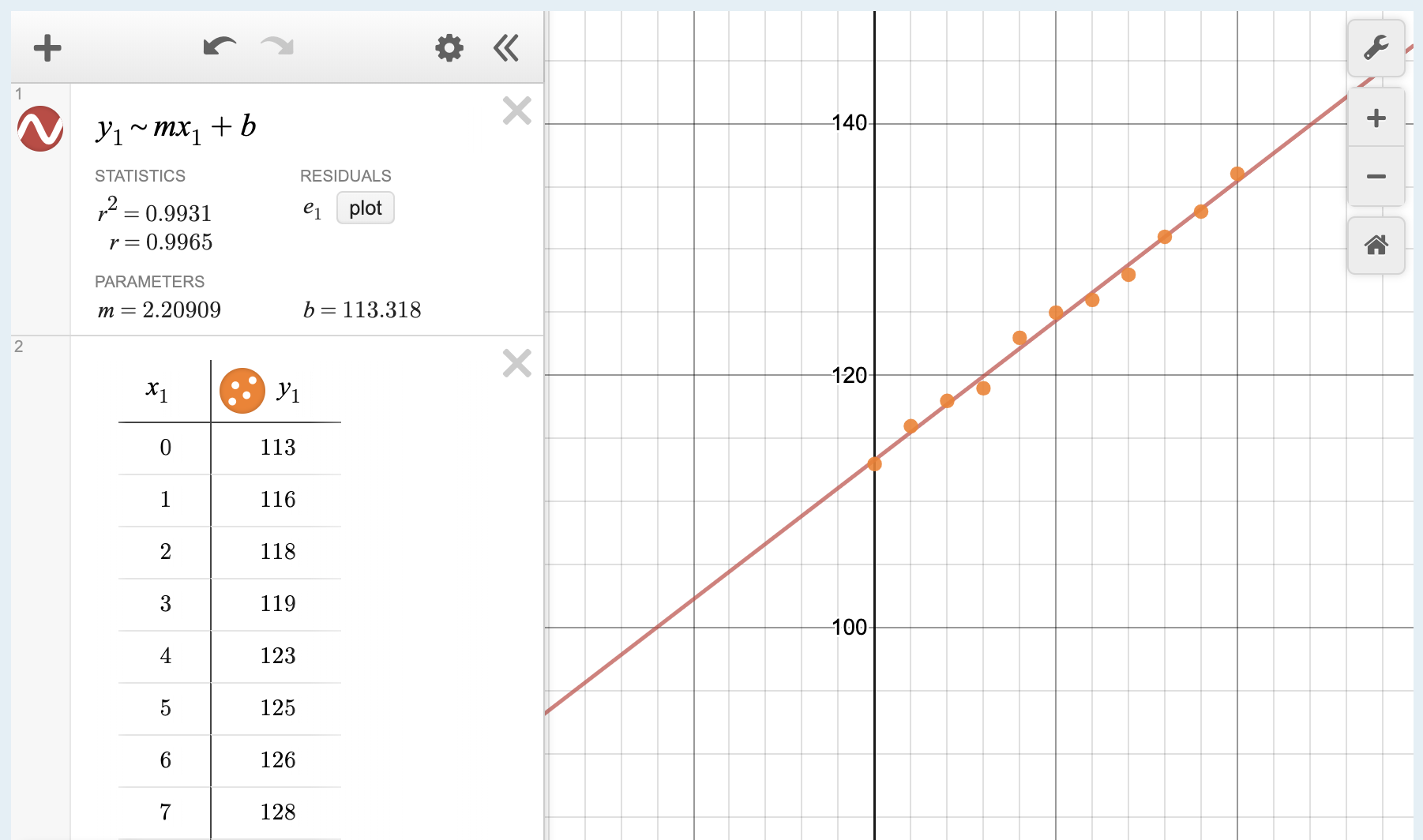
Example: Using a Regression Line to Make Predictions
Gasoline consumption in the United States has been steadily increasing. Consumption data from 1994 to 2004 is shown in the table below.[3] Determine whether the trend is linear, and if so, find a model for the data. Use the model to predict the consumption in 2008.Is this an interpolation or an extrapolation?
| Year | ’94 | ’95 | ’96 | ’97 | ’98 | ’99 | ’00 | ’01 | ’02 | ’03 | ’04 |
| Consumption (billions of gallons) | 113 | 116 | 118 | 119 | 123 | 125 | 126 | 128 | 131 | 133 | 136 |
Try It
Use an online graphing calculator to find a linear regression for the following data, which represents the amount of time a scuba diver can spend underwater as a function of the depth of the water.
| Depth (feet) | Time (minutes) |
| 50 | 80 |
| 60 | 55 |
| 70 | 45 |
| 80 | 35 |
| 90 | 25 |
| 100 | 22 |
1) Write the equation for the least squares regression line.
2) According to the regression line, how long can a diver spend at a depth of 110 feet?
3)How about 120 feet? Why doesn’t this make sense?
4) At what depth would the dive time be zero?

try it
Here are more data sets that you can plot using an online graphing calculator. Try to find a linear regression for them then look at the correlation coefficient to determine whether there is a linear relationship.
| Depth of the Columbia River | Water Velocity |
| 0.66 | 1.55 |
| 1.98 | 1.11 |
| 2.64 | 1.42 |
| 3.3 | 1.39 |
| 4.62 | 1.39 |
| 5.94 | 1.14 |
| 7.26 | 0.91 |
| 8.58 | 0.59 |
| 9.9 | 0.59 |
| 10.56 | 0.41 |
| 11.22 | 0.22 |
| % of Mississippi River in Crops (By Basin) | Nitrate Concentration (mg/ L) |
| 2.4 | 0.647 |
| 1.3 | 1.062 |
| 14.3 | 1.432 |
| 0.5 | 0.579 |
| 45.6 | 3.561 |
| 46.6 | 3.938 |
| 1.5 | 0.927 |
| 53.6 | 2.549 |
| 4.1 | 0.357 |
| 3.1 | 0.245 |
Dimensions of the Lava Dome in Mt. St. Helens, t = 0 on 18 October 1980 (eruption was 18 May 1980).
| Days | Millions of Cubic Meters |
| 0 | 2.9 |
| 70 | 13 |
| 109 | 28 |
| 173 | 40 |
| 242 | 56 |
| 322 | 64 |
| 376 | 75 |
| 547 | 88 |
| 603 | 100 |
| 699 | 115 |
| 872 | 152 |
| 922 | 154 |
| 1087 | 173 |
| 1343 | 178 |
| 1692 | 212 |
| 1858 | 243 |
FYI
Divers who want or need to descend to depths greater than 100 feet employ different techniques and equipment to help them safely navigate the depth. For example, different gas mixtures or rebreather equipment may be used. Gas mixtures such as oxygen, helium, and nitrogen can help to mitigate the narcotic effects of breathing gas at great depths.[4]

A scuba diver using rebreather with open circuit bailout cylinders returning from a 600-foot (180 m) dive.
Candela Citations
- Revision and Adaptation. Provided by: Lumen Learning. License: CC BY: Attribution
- Temperature as a Function of the Number of Cricket Chirps in a 15 Second Period Interactive. Authored by: Lumen Learning. Located at: https://www.desmos.com/calculator/ruvzg6iy3o. License: Public Domain: No Known Copyright
- Consumption of Gas as a Function of Year Interactive. Authored by: Lumen Learning. Located at: https://www.desmos.com/calculator/lv27pmtdbh. License: Public Domain: No Known Copyright
- Dive Time as a Function of Depth Interactive. Authored by: Lumen Learning. Located at: https://www.desmos.com/calculator/zyrpta1uls. License: Public Domain: No Known Copyright
- Precalculus. Authored by: Jay Abramson, et al.. Provided by: OpenStax. Located at: http://cnx.org/contents/fd53eae1-fa23-47c7-bb1b-972349835c3c@5.175. License: CC BY: Attribution. License Terms: Download For Free at : http://cnx.org/contents/fd53eae1-fa23-47c7-bb1b-972349835c3c@5.175.
- Scuba diver using rebreather with open circuit bailout cylinders returning from a 600-foot (180 m) dive. Authored by: Trevor Jackson. Located at: https://commons.wikimedia.org/w/index.php?curid=25988843. License: CC BY-SA: Attribution-ShareAlike
- College Algebra. Authored by: Abramson, Jay et al.. Provided by: OpenStax. Located at: http://cnx.org/contents/9b08c294-057f-4201-9f48-5d6ad992740d@5.2. License: CC BY: Attribution. License Terms: Download for free at http://cnx.org/contents/9b08c294-057f-4201-9f48-5d6ad992740d@5.2
- Selected data from http://classic.globe.gov/fsl/scientistsblog/2007/10/. Retrieved Aug 3, 2010 ↵
- Technically, the method minimizes the sum of the squared differences in the vertical direction between the line and the data values. ↵
- http://www.bts.gov/publications/national_transportation_statistics/2005/html/table_04_10.html ↵
- https://en.wikipedia.org/wiki/Trimix_(breathing_gas) ↵