Preparation
Search the Internet to find a graph or table of values that shows how something is changing over time. The data should be real measured data (not some made-up values for a math problem example or something), and should show something that is changing linear or exponentially.
- The graph or table should show data for at least 4 time periods (years, months, etc.)
- Find data that appears to have a linear or exponential trend.
- Find data that someone hasn’t already used.
What You Will Turn In
- Construct a document that includes a link to the data or graph you used (+2 pt for including, -10 for not including)
- Recreate the table (if it’s huge, just include at least 4 time periods), or create a table from the graph you chose and include it in your document (6 pts.)
- State whether the data appears to be changing linearly or exponentially, and give a reason (4 pts)
- Find an explicit equation to model the data, clearly defining your variables and showing your work (10 pts)
- Use your model to make a prediction about the future (4 pts)
Example
Table 2 on page 2 of this document from Snohomish County, WA shows the incidents of sexual orientation motivated hate crimes in Washington.
1996 1016
1997 1102
1998 1260
1999 1317
2000 1299
2001 1393
While not perfectly linear, the trend appears roughly linear [don’t just assume linearity! – make sure you can give a reason. If I graph your data and it looks exponential, you WILL lose points]. Using the 1996 as n=0, and using data from 1996 and 2001,
(1996) P0 = 1016
(2001) P5 = 1393
[FROM HERE, you would then follow the examples in the book to calculate the equation. IF your data is changing linearly, the procedure will be similar to the “population of elk” example. IF your data is changing exponentially, the procedure will be similar to the “carbon dioxide emissions” example. Suppose I followed the procedure, showing my steps, and came up with this equation:]
Pn = 1016 + 75n where n is years after 1996
Predicting in 2010 (n=14):
P14 = 1016 + 75(14) = 2066
So if this trend were to continue at this rate, this model predicts that in 2010 there would be 2066 incidents of sexual orientation motivated hate crimes in Washington.
Again, this example was specific to linear growth. For an example using exponential growth, see the carbon dioxide emissions example in the book.
——————————————————————-
A note on determining if the trend is linear or exponential
Linear trends increase by approximately the same amount each year (or month or whatever the time unit is), so they have the shape of straight lines. It is important to remember, though, that the world is not perfect, so data is rarely a perfect line. The gas consumption example in the book is an example of data that is not perfectly in a linear, but appears to have an approximately linear trend; in other words, a line fits it pretty well.
Exponential trends are ones that increase by the same percent each year (or whatever the time unit is). If the data is increasing, they have a shape that curves upwards. Sometimes that curve upwards is subtle (like in the first graph of the fish population in the book), and sometimes it’s very pronounced (like in the second graph of the fish population). If the data is a decreasing trend, an exponential trend would look something like this: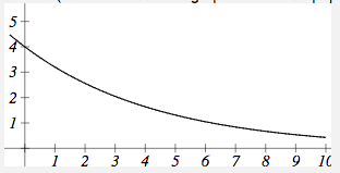
In some cases, it’s hard to tell if the trend is linear or exponential. In that case, think about how the quantity is changing. Is it likely to be increasing by the same number each year? Or is likely to be increasing by the same percent each year?
Keep in mind that there’s always a third possibility: that the data is not changing linearly or exponentially. Here’s a great example: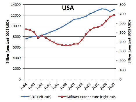
In this graph, the blue graph looks approximately linear, but the red graph is neither linear or exponential (and you shouldn’t use data like that for this assignment!)
Candela Citations
- Growth Models Writing Task. Authored by: Lippman, David. License: CC BY-SA: Attribution-ShareAlike