Learning outcome
- Compare and contrast graphical data to decipher information and make decisions
We looked at graph trends earlier to determine if there was a general statement that could be made about the data presented. But if you are a retail professional and are given accounting information or other data on a graph, you’ll also need to be able to make decisions based on what you can observe and infer.
Let’s take a look at a familiar graph of the Dow Jones Industrial Average.
Example
What can we infer from this graph?
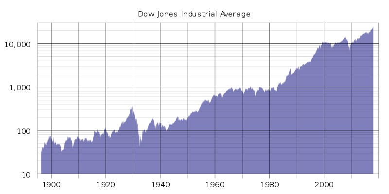
We already determined that the trend was an increase in value over time. We can also say that even after a sharp decrease, the value has risen back to the highest prior point within [latex]25[/latex] years. If you were asked the question, “Should I trust that the Dow Jones will continue to increase over time?”, your reply should be, “Based on historical data, the Dow Jones will continue to increase indefinitely.” There’s nothing on this graph that should lead us to believe otherwise.
TRY IT
The graph below shows the average monthly visitor count at White Sands National Monument sorted by month of the year. Next year, you plan to set up a roadside stand nearby to sell carved wooden souvenirs that you make in your garage. To make a decent profit, you need to dedicate half the year to making the wooden carvings and half the year to selling them. Based on the data below, which half of the year should you set up your roadside stand nearby to the park?

Now let’s take a look again at the graph of the marriage rates in Great Britain.
Example
Let’s first examine the time frame [latex]1930[/latex] to [latex]1975[/latex]. During that time, the data on this graph is all over the place, but there is a slight trend of an increase in marriage rates. However, in the middle of this trend, there is a very sharp incline and then a very sharp decline. Why do you think this is?
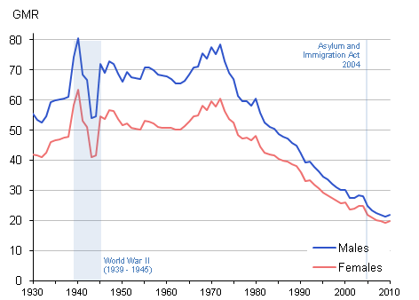
On this graph they have highlighted the [latex]1930[/latex] to [latex]1945[/latex] time period as World War II. Often historical data is indicative of economic and political events. The strong peak at the start of this time period is evidence that prior to young men heading off to war, they were quickly marrying before deployment. The sharp valley indicates that a huge number of men were overseas and marriage was not a top priority as citizens were focused on supporting the military and struggling economy.
Try It
The following bar graph shows the number of customers helped per hour by each of the employees at Sofa Central, a furniture store downtown. Lara, the store manager, is trying to decide who she should promote to floor lead to help mentor the other employees on good sales and service practices. Who should Lara promote?

TRY IT
Kelsey would like to provide a raffle prize that appeals the most people based on their main transportation choice. The pie chart below shows the poll results from the employee newsletter where people were asked how they most commonly get to work. Should the raffle prize be the best parking spot in the lot for a month, a new bike lock and free tune-up at the bicycle shop, a gift card for the local taxi company, a month-long public transit pass, or a new motorcycle helmet?

Graphs allow us to visualize data to quickly see trends or odd outliers to better make decisions. Rather than basing decisions off your gut feeling about something, having data to support that decision is key. Data displayed in graphs gives you the chance to “see” where those values are coming from, use your knowledge to explain variations and results, and anticipate where the data is headed.
Candela Citations
- Bar graph of employees. Authored by: Linux Screenshots. Located at: https://www.flickr.com/photos/xmodulo/26116583444. License: CC BY: Attribution
- Pie chart of transportation. Authored by: Jimmie. Located at: https://www.flickr.com/photos/jimmiehomeschoolmom/3305542857. License: CC BY: Attribution
- Prealgebra. Provided by: OpenStax. License: CC BY: Attribution. License Terms: Download for free at http://cnx.org/contents/caa57dab-41c7-455e-bd6f-f443cda5519c@9.757
- Provided by: National Park Service. Located at: https://www.nps.gov/whsa/learn/news/monumentstatistics.htm. License: Public Domain: No Known Copyright