Learning Outcomes
- Discuss key concepts to keep in mind as you create business presentations
- Discuss available presentation tools to help engage your audience
Key Considerations

Figure 1. There are four commonly accepted modalities for learning, often abbreviated as VARK.
Presentation software allows you to take an oral presentation to the next level—engaging your audience verbally and visually as well as aurally. What’s particularly powerful about using presentation software and other visual aids is the ability to use imagery to bridge cultural and language gaps and arrive at a shared understanding of the issue/opportunity at hand.
A related point to keep in mind is that words have two different meanings—a literal or denotative meaning (think: Merriam-Webster or Wikipedia definition) and a more subjective or connotative meaning. The connotative meaning of a word is based on a person’s cultural background and experiences and has emotional and/or judgement associations. Accomplished presenters are attuned to their audience and avoid words or references that may be misinterpreted by non-native speakers or may be perceived as emotionally “loaded” by audience members from a different subculture. In an increasingly diverse society, cultural awareness is as important for business communicators as it is for international marketers. To ensure that the message you intend to convey is what will be received, ask peers or colleagues—ideally, those with a socio-cultural profile similar to that of your audience—for feedback, with particular attention to the subtext of words and images.
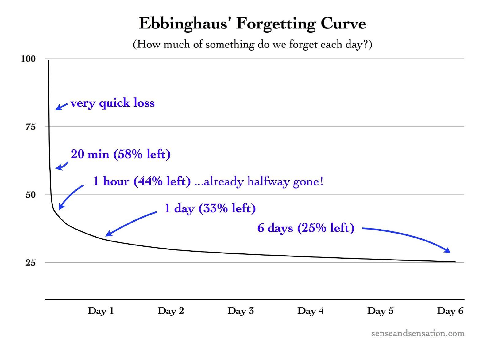
Using multimedia—images, photos and video and animation—that supports your point also provides repetition and can increase retention. A memory research pioneer, German psychologist Hermann Ebbinghaus, found that we forget approximately 50 percent of new information within 18 minutes, with retention falling to 35 percent after a week. However, Ebbinghaus also discovered that repetition of the new information at key intervals can change this trajectory, a discovery known as the spacing effect. Specifically, repeating the information at a 10–20 minute, 24 hours and 7 day intervals countered the initial memory loss and reduced the subsequent rate of memory loss. The lesson for presenters: work repetition into your presentation and your follow-up. Figure 2 shows an illustration of the Forgetting Curve and Spacing Effect.

Figure 2. The Forgetting Curve
Practice Questions
Common Presentation Tools

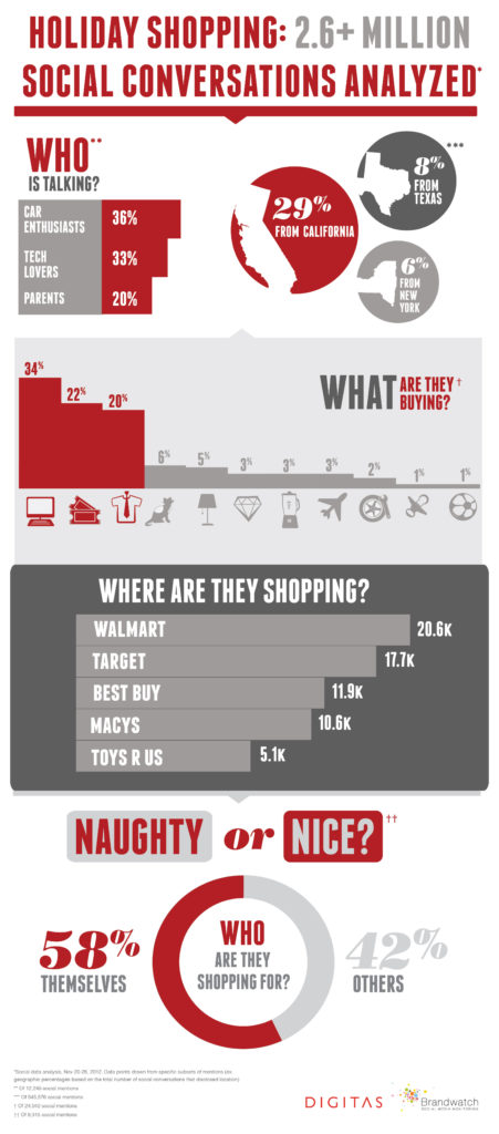
Figure 3. Infographics can be effective visual aids. Click on the image for a larger view.
The right tool for the job depends, of course, on the job. In this case, that means examining your audience and objective. If, for example, your task is simply to present “the facts,” there’s no need to consider interactive tools and techniques. If, however, your objective is to educate and/or inspire, you may want to consider a range of options for involving your audience, engaging them as participants or even co-presenters. For example, some workshops require participants—generally in group—to solve challenges or “stand and deliver.” That is, to review and present a segment of the material to the audience or peers. Or perhaps your goal is to engage a group in a training or strategic planning exercise. In this case, you would want to incorporate tools that support participative learning and collaboration such as Post-It Note Pads, or packages of smaller note pads (don’t forget markers, pens and highlighters) that can be arranged and rearranged as a pattern or plan emerges. Also consider easels, dry erase boards and other surfaces that lend themselves to idea sharing.
Whether you’re presenting to a K-12, higher education, or business audience will also influence your choice of primary and supplemental tools: handouts, product samples, giveaways, worksheets, and snacks (yes, even for the adults). If your assignment is to develop and present a business presentation to be delivered to your Business Communications class peers, the topic, format and any supporting materials may be pre-defined. But don’t stop there. If you’re proposing an edible garden space on campus, you could make or hand out seed packets. Think about how to differentiate yourself and your proposal—whatever you’re proposing—in a way that’s relevant and memorable.
Similarly, if you’re presenting to your management, there may be a company standard template and tools that you’re expected to use. Again, you can distinguish yourself by your knowledge and application of learning and design principles. Even basic facts and figures can be rendered beautifully. Instead of handing out a hard copy of your presentation or supporting charts, graphs or worksheets, consider creating an infographic that distills the insight. For inspiration, visit David McCandless’s Information is Beautiful website. To understand the possibilities for presenting complex data in a compelling manner, explore the resources on Edward Tufte’s website or one of his classic books on data visualization. For perspective, The New York Times described Tufte as the “Leonardo da Vinci of data.” Not to be outdone, Bloomberg labeled Tufte the “Galileo of graphics.”
Practice Question
Tools
A short-list of possible tools that you may need for a presentation includes the following items:
- Presentation software
- Polling software
- Handouts (i.e., infographic, quick reference)—Not your presentation!
- Giveaways
- Pens/pencils/markers
- Flip Charts
- Self-Adhesive Pads
- Dry Erase Boards
- Snacks!
Also consider logistics and technical details including the room layout, lighting, temperature controls, wifi and electrical outlets and bathroom facilities.
Candela Citations
- Presentations and Other Visual Aids. Authored by: Nina Burokas. Provided by: Lumen Learning. License: CC BY: Attribution
- VARK Illustration. Provided by: Lumen Learning. License: CC BY: Attribution
- Ebbinghaus Forgetting Curve. Authored by: Educ320. Located at: https://commons.wikimedia.org/wiki/File:Ebbinghaus%E2%80%99s_Forgetting_Curve_(Figure_1).jpg. License: CC BY-SA: Attribution-ShareAlike
- Naughty or Nice? Holiday Shopping Study. Authored by: Digitas Photos. Located at: https://flic.kr/p/dzvk1A. License: CC BY: Attribution
