Learning Outcomes
- Create a clustered column chart.
Excel is not just used for organizing and processing data and formulas. It also can be used to visually represent data in the form of charts and graphs. In this page, we will work on creating a basic chart, the clustered column chart, and then modifying a chart style.
A clustered column chart is sometimes called a bar graph, because it shows data organized in solid shapes like pillars. A clustered column chart organizes these pillars up and down, so they are “columns.” On the other hand, a clustered bar graph organizes these pillars left to right, so they are “bars.” Bar graphs are useful charts when looking at changes from month to month or across employees.
The first step to creating any chart is to organize your data. It is definitely a good idea to include headers in the first cell of each column. By default, a clustered column chart will cluster the data by the columns in your table, so try to keep that in mind when setting up the worksheet.
- After organizing your data, select the cells you wish to include in the chart. This should be at least two columns.
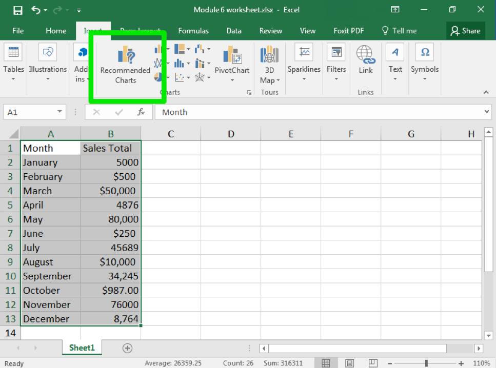
- Click on the Insert tab and find the Charts group of the ribbon.
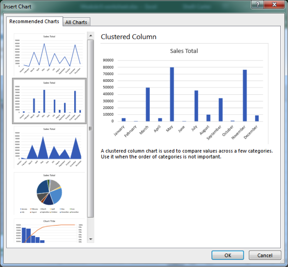
- “Clustered column chart” is actually a recommended chart. Click on that chart.
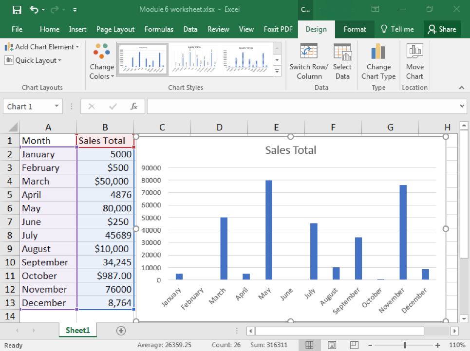
- When you select the chart, you will see colored boxes surrounding the data that connect to the different categories of the chart.
Practice Question
Candela Citations
- Clustered Charts. Authored by: Shelli Carter. Provided by: Lumen Learning. License: CC BY: Attribution
