Learning OUTCOMES
- Describe the distribution of quantitative data using a dot plot.
Introduction
When we work with data, the data is usually in a table. In this form, we can easily see the variable value for each individual. But when we analyze data, we are not focused on information about an individual. We want to describe a group of individuals. In data analysis, our goal is to describe patterns in the data and create a useful summary about a group. A table is not a useful way to view data because patterns are hard to see in a table. For this reason, our first step in data analysis is to create a graph of the distribution of the variable.
In a graph that summarizes the distribution of a variable, we can see
- the possible values of the variable.
- the number of individuals with each variable value or interval of values.
In this module, Summarizing Data Graphically and Numerically, we focus on summarizing the distribution of a quantitative variable. We discuss the distribution of a categorical variable in depth in the module Relationships in Categorical Data with Intro to Probability.
Example
Breakfast Cereals
Here are two graphs of the variable protein for a group of breakfast cereals targeted at children.
In both graphs, the individuals and the variable are the same:
- Individuals: Children’s cereals
- Variable: Grams of protein in a serving of cereal
Let’s compare the graphs to determine which graph is a better summary of the distribution of protein.
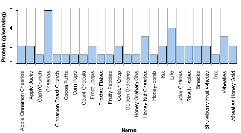
This graph is called a case-value graph. You can see the names of the individual cereals (the cases) and the amount of protein in a serving of each cereal (the variable values). For example, Apple Jacks has 2 grams of protein in a serving. This graph is NOT a good way to summarize the distribution of protein values because we cannot easily determine the number of cereals with each protein amount.
For example, how many cereals have 2 grams of protein in a serving? This graph does not make it easy to answer this question. We have to move across the graph and count the cereals with 2 grams of protein. In this way, a case-value graph is like a table. We cannot easily see patterns in the data or determine the number of individuals with a given variable value.
Here is a second graph of the same data. This graph is called a dotplot. A dotplot gives a better summary of the distribution of protein.
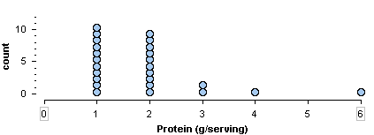
In a dotplot, each dot represents one individual. Here, each dot is a children’s cereal. The numbers on the horizontal axis are the variable values. The vertical axis gives the count of cereals. We can easily see that 10 children’s cereals have 2 grams of protein in a serving.
From the dotplot, we can easily describe the distribution of protein. Here are some observations about this distribution:
- The amount of protein in a serving varies from 1 to 6 grams.
- Most of the cereals have 1 or 2 grams of protein in a serving.
- Larger amounts of protein are less typical.
- One cereal has 6 grams of protein. This much protein is unusual for this group of children’s cereals.
These observations are a good summary of the data.
Try It
Contribute!
Candela Citations
- Concepts in Statistics. Provided by: Open Learning Initiative. Located at: http://oli.cmu.edu. License: CC BY: Attribution