Learning OUTCOMES
- Use a correlation coefficient to describe the direction and strength of a linear relationship. Recognize its limitations as a measure of the relationship between two quantitative variables.
Properties of r
We now discuss and illustrate several important properties of the correlation coefficient as a numeric measure of the strength of a linear relationship.
1. The correlation does not change when the units of measurement of either one of the variables change. In other words, if we change the units of measurement of the explanatory variable and/or the response variable, it has no effect on the correlation (r).
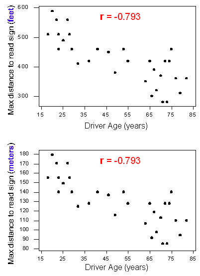
To illustrate, compare the two versions of the scatterplot of the relationship between the age of a driver and the maximum distance for reading a highway sign.

The top scatterplot displays the original data where the maximum distances are measured in feet. The bottom scatterplot displays the same relationship, but with maximum distances changed to meters. Notice that the y-values have changed, but the correlations are the same. This example illustrates that a change in units does not change r. This is true even if we change the units on both variables. It makes sense because a change in units does not change the pattern in the data. The direction, form, and strength of the relationship remain the same. Since r measures direction and strength of a linear relationship, the value of r remains the same.
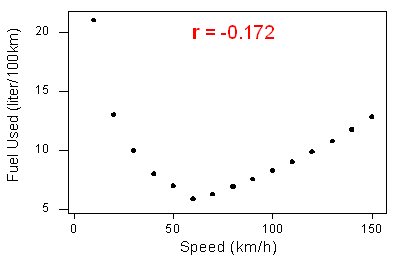
2. The correlation measures only the strength of a linear relationship between two variables. It ignores any other type of relationship, no matter how strong it is. For example, consider the relationship between the average fuel usage of driving a fixed distance in a car and the speed at which the car drives:

The data have a smooth curvilinear form. The relationship is very strong because the data follow the curve perfectly.
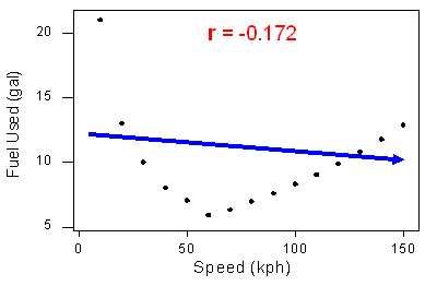
Notice that the correlation r = −0.172 indicates a weak linear relationship. This makes sense because the data does not closely follow a linear form. So the correlation coefficient only gives information about the strength of a linear relationship. It does not give reliable information about the strength of a curvilinear relationship.

This example illustrates that the correlation coefficient is useless as a measure of strength if the relationship is not linear. It also illustrates an important rule: Always make a scatterplot of the data before calculating and interpreting the meaning of r.
Why should we make a scatterplot first? If we did not look at the scatterplot, but looked only at r, what mistake might we make? We might conclude that the relationship between the variables is weak (or that there is no relationship) because r is close to zero. But this conclusion is wrong. We have misinterpreted “r close to 0” as an indicator of a weak relationship or no relationship rather than a weak linear relationship or no linear relationship. We can easily avoid this misinterpretation of r by looking at the scatterplot.
Let’s summarize. If r is close to zero, it means that the data has a very weak linear relationship or no linear relationship. When r is close to zero, it is possible that the data has a strong curvilinear relationship (as we saw in this example). To avoid errors, we must look at the form of the data in the scatterplot before we calculate and interpret r. If the form is not linear, do not use r.
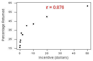
3. The correlation by itself is not enough to determine whether a relationship is linear. To see this, let’s look at a situation with an r-value that is close to 1 but a relationship that is not linear. Recall the study in which participants were paid to complete a survey. The study examined the relationship between the amount of the monetary incentive and the percentage of the sample who returned the survey.

The variables have a strong curvilinear relationship, yet the correlation is r = 0.876, quite close to 1.
Reviewing the last two examples, we see that strong curvilinear relationships can have a correlation close to 0 or close to 1. So the correlation alone does not tell us whether a relationship is linear. We must look at a scatterplot of the data.
Always look at the data!
Try It
Try It
4. The correlation is heavily influenced by outliers. As you will learn in the next two activities, the way the outlier influences the correlation depends on whether or not the outlier is consistent with the pattern of the linear relationship.
Using the simulation below, let’s explore how an outlier affects the correlation.
Click here to open this simulation in its own window.
To see how an outlier affects the correlation, do the following:
- Fill the scatterplot with a hypothetical positive linear relationship between X and Y (by clicking on the graph about a dozen times starting at the lower left and going up diagonally to the top right). Pay attention to the correlation coefficient calculated at the top left of the simulation. (Clicking on the garbage can lets you start over.)
- Once you are satisfied with your hypothetical data, create an outlier by clicking on one of the data points in the upper right of the graph and dragging it down along the right side of the graph. Again, pay attention to what happens to the value of the correlation.
What did this activity illustrate? This activity illustrates that the correlation decreases when the outlier deviates from the pattern of the relationship. By dragging a data point from the upper right to the lower right, you created an outlier that does not fit the positive association in the rest of the data. This decreases the strength of the linear relationship and causes a decrease in [latex]r[/latex] .
In the next activity, you will see how the correlation increases when the outlier is consistent with the direction of the linear relationship.
Let’s Summarize
- A special case of the relationship between two quantitative variables is the linear relationship in which a straight line simply and adequately summarizes the relationship.
- When the scatterplot displays a linear relationship, we supplement it with the correlation coefficient (r), which measures the strength and direction of a linear relationship between two quantitative variables. The correlation ranges between −1 and 1. Values near −1 indicate a strong negative linear relationship, values near 0 indicate a weak linear relationship, and values near 1 indicate a strong positive linear relationship.
- The correlation is an appropriate numerical measure only for linear relationships and is sensitive to outliers. Therefore, the correlation should be used only as a supplement to a scatterplot (after we look at the data).
Contribute!
Candela Citations
- Concepts in Statistics. Provided by: Open Learning Initiative. Located at: http://oli.cmu.edu. License: CC BY: Attribution
