Learning OUTCOMES
- Analyze the distribution of a categorical variable.
- Analyze the relationship between two categorical variables using a two-way table.
We begin our discussion by analyzing the distribution of a single categorical variable. Then we focus on analyzing the association between two categorical variables.
Example
Body Image
What is your perception of your own body? Do you feel that you are overweight, underweight, or about right? A random sample of 1,200 U.S. college students answered this question as part of a larger survey. The following table shows part of the responses:
| Student | Body Image |
| student 25 | overweight |
| student 26 | about right |
| student 27 | underweight |
| student 28 | about right |
| student 29 | about right |
Here are the questions we investigate:
- What percentage of students in the sample fall into each category?
- How are students divided across the three body image categories?
- Is there a pattern in the responses?
- Which response is the most common?
It is difficult to answer these questions by looking at the raw data because the raw data is a long list of 1,200 responses. We cannot see patterns easily by looking at a list, so we summarize the distribution in a table.
Recall from Summarizing Data Graphically and Numerically that in a graph that summarizes the distribution of a quantitative variable, we can see
- the possible values of the variable.
- the number of individuals with each variable value or interval of values.
Here we use a table instead of a graph to summarize the distribution of a categorical variable. We create a table so we can see
- the different values (categories) the variable takes.
- how many times each value occurs (count) and, more important, how often each value occurs (by converting the counts to proportions).
Here is the table for our example:
| Category | Count | Proportion | Percentage |
| underweight | 110 | 110/1,200 = 0.092 | 9.2% |
| overweight | 235 | 235/1,200 = 0.196 | 19.6% |
| about right | 855 | 855/1,200 = 0.713 | 71.3% |
We can use a stacked bar chart to display the distribution of the body image variable. Note that this distribution is completely described by the three percentages 9.2%, 19.6%, and 71.3%, which correspond to the three categories of the body image variable: “underweight,” “overweight,” and “about right.” The percentages add to 100% because all 1,200 individual responses fall into one of these three categories. (Note that the percentages actually add up to 99.9% because we rounded percentages to three decimal places.)

Now that we have summarized the distribution of values in the body image variable, let’s go back and interpret the results in the context of the questions we posed.
Try It
Example
Two-Way Table for Body Image and Gender
Once we’ve interpreted the results, another interesting question arises: If we separate our sample by gender and compare the male and female responses, will we find a similar distribution across body image categories? Or is there a difference based on gender?
Answering these questions requires us to examine the relationship between two categorical variables: gender and body image. We want to determine if gender explains the differences in body image responses. Therefore,
- the explanatory variable is gender, and
- the response variable is body image.
Here is part of the raw data for body image and gender of each student:
| Student | Gender | Body Image |
| student 25 | M | overweight |
| student 26 | M | about right |
| student 27 | F | underweight |
| student 28 | F | about right |
| student 29 | M | about right |
Once again, the raw data is a long list of 1,200 responses. We need to organize the information in a table so we can more easily compare the results for females and males. To summarize the relationship between two categorical variables, we create a display called a two-way table.
Here is the two-way table for our example:
| About Right | Overweight | Underweight | Row Totals | |
| Female | 560 | 163 | 37 | 760 |
| Male | 295 | 72 | 73 | 440 |
| Column Totals | 855 | 235 | 110 | 1,200 |
Let’s take a closer look at this table:
The table helps us to compare females to males because there is a row for each gender. The body image categories are the columns. As we move across a particular row, all of the individuals are of the same gender. And as we move down a particular column, all of the individuals have the same body image.
We also added a row at the bottom and a column at the right, which we call the margins of the table. The numbers in the margins are totals for each row or column.
In the following table, look at the numbers in the Female row and note that their sum, 560 + 163 + 37 = 760, is displayed in the margin at the right labeled Row Totals. There are 760 females in the sample.
| About Right | Overweight | Underweight | Row Totals | |
| Female | 560 | 163 | 37 | 760 |
| Male | 295 | 72 | 73 | 440 |
| Column Totals | 855 | 235 | 110 | 1,200 |
Likewise, in the next table, look at the numbers in the Overweight column and note that their sum, 163 + 72 = 235, is displayed in the margin at the bottom of the table labeled Column Totals. There are 235 students in the sample who answered “overweight” to the body image question.
| About Right | Overweight | Underweight | Row Totals | |
| Female | 560 | 163 | 37 | 760 |
| Male | 295 | 72 | 73 | 440 |
| Column Totals | 855 | 235 | 110 | 1,200 |
Where a row and column cross, we see the number of individuals who fit both descriptions: a particular gender and a particular body image. It may be helpful to think of the six inner cells as six rooms filled with the 1,200 students from the sample. For example, in one room are the 72 males who think of themselves as overweight. In another room, we have 37 females who think of themselves as underweight.
Try It
Try It
So far we have organized the raw data in a much more informative display – the two-way table. But we have not answered our primary question: Is body image related to gender?
Exploring the relationship between two categorical variables (in this case, body image and gender) amounts to comparing the distributions of the response variable (in this case, body image) for different values of the explanatory variable (in this case, male vs. female).
We do this in the next example.
Example
Is Body Image Related to Gender?
Here we have removed the column totals from the table because gender is the explanatory variable. We compare females with particular body image responses to males with the same response, so we need to know the total numbers of females and males. We no longer need to know the total number of students for each body image category.

Note that there are more females than males, so when we compare females to males, it is misleading to compare raw counts in each body image category. For example, it is misleading to say, “Five-hundred sixty females responded ‘about right’ compared to only 295 males,” because the sample includes a lot more females than males. Instead, we compare the percentage of females who responded “about right” to the percentage of males who responded “about right”:
- Of the 760 females, 560 responded “about right”: 560 ÷ 760 = 0.737 = 73.7%
- Of the 440 males, 295 responded “about right”: 295 ÷ 440 = 0.67 = 67%
We can interpret percentages as “a number out of 100,” so by converting to percentages, we are reporting the results as though there are 100 females and 100 males. We can see that a higher percentage of females feel “about right” about their body weight.
In general, we need to supplement our display, the two-way table, with numeric summaries that allow us to compare the distributions. Therefore, we always convert counts to percentages.
Note: It is important to identify the explanatory variable because we always use the totals for the explanatory variable to calculate the percentages.
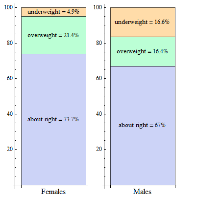
In our example, we look at each gender separately and convert the counts to percentages within each gender. In the Female row, we divide each count by 760, the total number of females. In the Male row, we divide each count by 440, the total number of males. The resulting percentages are shown in the following table: green for females, black for males. We call these conditional percentages. The percentages in green are the distribution of body image based on the condition that students are female. The percentages in black are the distribution of body image based on the condition that students are male. Thus, our two sets of conditional percentages form two conditional distributions for body image.
| About Right | Overweight | Underweight | Row Totals | |
| Female | 560/760 = 73.7% | 163/760 = 21.4% | 37/760 = 4.9% | 760/760 = 100% |
| Male | 295/440 = 67% | 72/440 = 16.4% | 73/440 = 16.6% | 440/440 = 100% |
Here is a side-by-side display comparing the conditional body image distributions for females and males.
Now that we summarized the relationship between the categorical variables gender and body image, we use the next activity to interpret the results in the context of the questions we posed.
Try It
At the start of this example, we asked the following questions:
If we separate our sample by gender and compare the male and female responses, will we find a similar distribution across body image categories? Or is there a difference based on gender?
As a result of our analysis, we know that the conditional distributions for males and females for body image are not the same. And there is enough of a difference to believe that these two categorical variables are in fact related.
In the next activity, we practice investigating the relationship between two different categorical variables.
We investigate this question in the next activity: Is there a relationship between smoking rates and college programs? Researchers sent an online health behavior survey to 25,000 college students in 2009. The following table summarizes results based on 6,055 student responses. (C. J. Berg, C. M. Klatt, J. L. Thomas, J. S. Ahluwalia, and L. C. An, “The Relationship of Field of Study to Current Smoking Status among College Students,” College Student Journal 43(3):744–754, 2009.)
| Smoked in Last 30 Days | Did Not Smoke in Last 30 Days | ||
| Art, design, performing arts | 149 | 336 | 485 |
| Humanities | 197 | 454 | 651 |
| Communication, languages | 233 | 389 | 622 |
| Education | 56 | 170 | 226 |
| Health Sciences | 227 | 717 | 944 |
| Math, engineering, sciences | 245 | 924 | 1,169 |
| Social science, human services | 306 | 593 | 899 |
| Independent study | 134 | 260 | 394 |
| Undeclared | 176 | 489 | 665 |
| 1,723 | 4,332 | 6,055 |
Try It
In the next activity, we investigate whether health insurance coverage differs by geographic region. The U.S. government collects information on Americans who do not have health insurance. Here is the data:
| Region | Uninsured | Insured | Row Totals |
| Northeast | 6,782 | 47,043 | 53,825 |
| Midwest | 7,757 | 57,135 | 64,892 |
| South | 19,090 | 85,800 | 104,890 |
| West | 11,676 | 55,427 | 67,103 |
| Column Totals | 45,305 | 245,405 | 290,710 |
Let’s Summarize
The relationship between two categorical variables is summarized using
- Data display: Two-way table, supplemented by
- Numeric summaries: Conditional percentages.
Conditional percentages are calculated separately for each value of the explanatory variable. When we try to understand the relationship between two categorical variables, we compare the distributions of the response variable for values of the explanatory variable. In particular, we look at how the pattern of conditional percentages differs between the values of the explanatory variable.
Contribute!
Candela Citations
- Concepts in Statistics. Provided by: Open Learning Initiative. Located at: http://oli.cmu.edu. License: CC BY: Attribution