Learning Objectives
Identify ways to communicate effectively in a poster presentation
Especially in the natural and social sciences, research is often presented in the form of a large, printed poster. At a conference poster session, attendees can walk around and take in a large amount of research in a short amount of time. Poster sessions usually offer the opportunity to interact with the researchers and ask questions about the research presented in the poster.

Poster session at the 111th American Society for Microbiology General Meeting, New Orleans, LA.
Tips for Creating a Research Poster
A poster is a visual representation of your research. Your poster should:
- be eye-catching
- tell the story of your research – concisely
- enable the viewer to engage with your research
The viewer should walk away remembering you and your work, not the way the poster looked.
Step 1 – Writing
Before you consider opening PowerPoint, or any other design software, open Microsoft Word. Any word processor will do, but make sure that it has the ability to track your word count and check your spelling.
- Target audience: ask yourself, who is my ideal audience for this poster? Is it other experts in your field, or perhaps the broader public? What is their level of understanding of the subject? This is an important question because if you put a bit of effort into making your poster understandable to the broader public, you automatically increase your potential audience and impact. Also consider that a poster written in plain English works with both experts and non-experts alike, while technical and complicated writing greatly limits your potential audience.
- Bullet points: a poster should not look like a paper, therefore, bullet points are your friend. 200-word paragraphs on a poster would discourage even the most motivated, sober, and caffeinated conference attendant. Bullet points on the other hand are a lot less frightening.
- Use sections with headers: because we are writing with the reader in mind, we want to make the logical flow of the sections as easy as possible for the viewer to follow. My advice is to have large, easy-to-read and numbered sections that cover the main pillars of the story, which typically are:
- Background
- Questions/knowledge gap
- Methods (keep this to the bare minimum or skip it if you can)
- Results
- Conclusions
- References and acknowledgements (smaller at the bottom)
- Fewer words: Depending on the task at hand, the word count of a poster should probably be under 250 in total. Possibly <150 words. Less is definitely more.
- Graphs: One or two graphs is better than three or four, and certainly better than eight or nine! When selecting the graphs to display, also ask yourself who your audience is. This is important because if you are using your poster as an outreach tool for the general public, then there is no point in including complicated graphs that no one is going to understand. However, things are different if you are showing your poster exclusively to an audience of experts. In that case, it’s safe to assume your audience can read your graphs.

A student explains her research, as outlined in the poster behind her.
Step 2 – Concept
Here is where the fun starts. Grab a piece of paper, or open up your design software, and make a first draft.

- Layout and size: vertical or horizontal? Keep in mind that when you design posters, it’s always safer to downsize than to upsize, as upsizing a digital image based on a pixel grid will inevitably cause a loss of resolution.
- Panels: how do we read; left to right or right to left? Top-down or bottom-up? Make sure your poster has a clear directional flow. Start with an enlarged and readable title right at the top, then create a simple layout of panels that make it easy for the viewer to navigate. Remember that we’re committed to keep the reader in mind, so use arrows and numbered headers to help them out.
Step 3 – Design
- Negative space: for some strange reason, many academics feel the need to cover every inch of their poster with text or images. This is the wrong idea! It’s bad because it makes it difficult for the viewer to find the relevant information and to rest their eye. Clear space, also known as negative space, is a super important design concept, one that you should use to your advantage.
- Eye-catching visuals: imagine you’re walking around a poster session, and you’re far enough away from the posters that you can’t read titles or graphs. What will compel you to walk towards a particular poster? It’ll likely be a recognizable image that grabs your attention. Without a big and recognizable image, your poster will look like a fuzzy wall of text and it will likely go unnoticed. Therefore, it’s smart to include one big visual that’s related to your research and has the ability to hook people in from a distance. Be it a rocket, a lion, or an octopus — what matters is that it’s there.
- Color: this should be common sense, yet some scientific posters insist on using unbearable color combinations. Use a limited number of colors, say three to five, and stick with them! Graphs included. It’s often best to have two or three shades of a primary color of your choice, an accent color that stands out, and a couple of text colors.

- You can use the accent color to draw attention to where you want people to look. The important thing is that you use the accent color in moderation.

- See how the 87% and the dot points stand out? This is the effect you want to recreate on your own posters. In case you need some more inspiration, Material Palette is a free tool that creates color palettes for you based on two colours of your choice.
- Background: Maybe you have an awesome photo you really want to include in the poster. Why not blow it up and use it as the background of the whole poster? No! Don’t do it! You’re not doing yourself or the viewer any favors. A photo used as a background is too distracting and makes it impossible to have negative space on your poster. It’s much better to leave the background white, grey, or filled with a light color from your color palette.
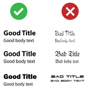
- Fonts: fonts and font sizes work a bit like colors. That is, the fewer you use, the better. My suggestion is to use only one or two different fonts. Boldface should be used on titles and headlines, while all the rest should be normal. When picking the fonts to use, play it safe. Stick with the classic Arial, Myriad Pro, and other familiar fonts and you can’t go wrong. In terms of font size, try 90 for the title, 60 for the headlines, and 36 for the body text. And remember that your poster should not require a magnifying glass to be read, but rather it should be easily readable from three feet away.
- Software: some of you may be thinking that to make great posters you need great (and expensive) software. Wrong! All you really need is Microsoft PowerPoint and the principles contained in this blog post. Feeling like trying something more powerful? Then you could check out Canva, and if you’re really up for a challenge use Affinity Designer, Adobe Illustrator or Indesign. However, be ready for a steep learning curve and a substantial investment on these latter options. On the bright side, Adobe always has significant educational discounts for students and university staff.
Step 4 – Printing
- Get feedback: you’ve designed your masterpiece. Awesome! Congratulations! Now it’s time to get feedback from your classmates and/or colleagues before printing it. Ask them to proofread it too. And remember that people are busy, so do this well in advance, as printing often takes longer than you’d imagine.
- Dummy: before spending money printing your poster, you really want to make a dummy as a final check. Print your poster A4, or even better A3 size if you can, and triple-check that important information isn’t too close to the margins. You’re likely going to put your picture in a corner, so you want to ensure your face isn’t going to get cut in half!
- Color profile: if you designed your poster with professional software, you’ll have the ability to control the color profile. Nothing complicated, there are two options: RGB and CMYK. The first one is for digital use, and the second one is for printing — pick the second one. That’s all you need to know.
- Resolution: if you designed your poster big enough from the start (e.g. A0), you should be alright. As a rule of thumb, your resolution for high-quality printing posters and images should be around 300 dpi (dots per inch).
- Where to print: you have many options, from the big office supplies stores like Office Depot, to the small print shops around campus. Print time varies from place to place, so be sure to plan this ahead of time.
- Paper: shiny things are pretty, but it’s better to avoid shiny and glossy papers when it comes to posters, as they can create annoying reflections. Matte papers are best. But paper isn’t the only option these days, some stores can even print your poster on canvas or cloth.
Try It
Candela Citations
- Poster session. Authored by: Steven Rose. Located at: https://en.wikipedia.org/wiki/File:Printed_poster_session.jpg. License: CC BY-SA: Attribution-ShareAlike
- How to design an award-winning conference poster. Authored by: Tullio Rossi. Located at: https://blogs.lse.ac.uk/impactofsocialsciences/2018/05/11/how-to-design-an-award-winning-conference-poster/. License: CC BY: Attribution
- Science Student Poster Symposium. Authored by: Michael J. Ermarth. Provided by: U.S. FDA. Located at: https://commons.wikimedia.org/wiki/File:Science_Student_Poster_Symposium_(16796190065).jpg. License: Public Domain: No Known Copyright