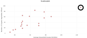
| Store Location | Average Household Income ($1000s) | Number of Organic Vegetables Offered | Store Location | Average Household Income
($1000s) |
Number of Organic Vegetables Offered | |
| S. Flores | 71 | 36 | Marbach Rd. | 49 | 38 | |
| N. Rosillo St. | 34 | 4 | Babcock Rd. | 66 | 84 | |
| Nogalitos St. | 71 | 28 | Wurzbach Rd. | 87 | 61 | |
| Fredericksburg Rd. | 49 | 31 | W. Loop 1604 N. | 78 | 56 | |
| Olmos | 78 | 78 | Bandera Rd. | 59 | 62 | |
| N. New Braunfels Ave. | 41 | 14 | S. New Braunfels | 50 | 44 | |
| Castroville | 38 | 12 | S.W. Military | 48 | 26 | |
| Culebra Rd. | 50 | 18 | S. Zarzamora | 56 | 29 | |
| S.E. Military Dr. | 50 | 65 | E. Basse Rd. | 125 | 95 |
| Skill or Concept: I can . . . | Questions to check your understanding | Rating from 1 to 5 |
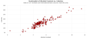
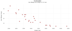
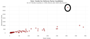
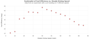
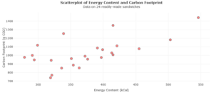
| Read a scatterplot. | 4–6 | |
| Use a scatterplot to determine whether a relationship between two variables has a positive trend, negative trend, or no trend. | 7 | |
| Use a scatterplot to identify linear relationships, non-linear relationships, and outliers. | 8 |
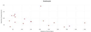
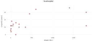
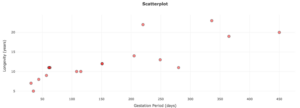
| Animal | Gestation Period | Longevity | Heart Rate (b/m) | Weight (lbs) |
| Bear | 220 | 22 | 80 | 600 |
| Cat | 61 | 11 | 130 | 8 |
| Cow | 280 | 11 | 66 | 1800 |
| Deer | 249 | 13 | 45 | 125 |
| Dog | 63 | 11 | 110 | 50 |
| Donkey | 365 | 19 | 41 | 450 |
| Fox | 57 | 9 | 120 | 7 |
| Giraffe | 450 | 20 | 65 | 1800 |
| Goat | 151 | 12 | 75 | 60 |
| Groundhog | 31 | 7 | 80 | 9 |
| Horse | 336 | 23 | 34 | 1400 |
| Kangaroo | 35 | 5 | 36 | 120 |
| Lion | 108 | 10 | 60 | 350 |
| Monkey | 205 | 14 | 192 | 25 |
| Pig | 115 | 10 | 95 | 200 |
| Sheep | 151 | 12 | 75 | 200 |
| Squirrel | 44 | 8 | 120 | 1 |
| Wolf | 62 | 11 | 70 | 80 |
| Variables | Correlation Coefficient | Description of Strength
|
| Gestation Period, Heart Rate | ||
| Weight, Longevity | ||
| Gestation Period, Longevity |
| Correlation Coefficient, | General Interpretation |
| -1 to -0.7 | Strong negative linear relationship |
| -0.7 to -0.3 | Moderate negative linear relationship |
| -0.3 to -0.1 | Weak negative linear relationship |
| -0.1 to 0.1 | Negligible or no linear relationship |
| 0.1 to 0.3 | Weak positive linear relationship |
| 0.3 to 0.7 | Moderate positive linear relationship |
| 0.7 to 1 | Strong positive linear relationship |
Glossary
- scatterplot
- a graph used to visualize the relationship between bivariate data.
- bivariate data
- two quantitative variables.
- positive trend
- when the response variable tends to increase as the explanatory variable increases
- negative trend
- the response variable tends to decrease as the explanatory variable increases.
- linear
- resembling a straight line.
