All documents have a purpose—to persuade, inform, instruct—but the first and foremost purpose of any document is to be read. The way your document looks on a page or screen determines how fully and carefully your audience reads it. Good design will help your audience get the message you want them to receive and achieve your intended purpose. Remember that people do not read reports or proposals for pleasure; they read them because they have to – it’s part of their job. And since “time is money,” the longer it takes to read the document, the higher the “cost.” When you design a document, your job is to make your audience’s reading process as easy, clear, and efficient as possible by using elements that make your document user friendly.
General design elements to consider include the following:
- White Space & Margins
- Headings
- Lists
- Figures & Tables
- Fonts
- Cover/Title Page
- Table of Contents/List of Figures
White Space & Margins
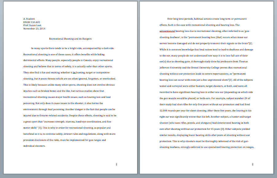
Always make sure that a page has enough white space so that information does not look crammed onto the page. Readers tend not to read when there are large blocks of type. Look at the two figures below – just let your eye scan over the documents (reading the content does not matter). Based solely on the way each document looks, which one would you rather read?
Follow these guidelines to use white space effectively, so that you have a “clean” looking, easy-to-read document:
- Use margins of approximately 1 inch all around. (Note that if you are binding your report, use a 2 inch left margin.)
- Break up lengthy paragraphs into short ones, so that you don’t have large, difficult-to-read blocks of type.
- Use headings to introduce sections of text.
- Start all paragraphs on the left-hand margin; do not indent paragraphs.
- Single-space your text, but leave a double space between paragraphs.
- Align your text to your left-hand margin (called left-justifying), leaving a “ragged” right margin. Never justify both left- and right-hand margins, as this creates strange spacing of words and sentences that makes your text hard to read.
Headings
Headings are standard features of technical documents that serve several important functions:
- Provide organizational overview of the document
- Show logical development of ideas
- Show hierarchical relationship of ideas (headings, sub-headings)
- Allow the reader to scan and read selectively
- Increase readability of the document by providing breaks and white space.
When designing the headings in your document, keep in mind these general principles:
Hierarchical Relationship of Ideas
Use font size, boldness, typography, and color to indicate the relative importance of ideas and how they interconnect. In general, first level headings are larger and bolder than second and subsequent level headings.
Consistency
If you use headings, every section must have a heading. Make sure your headings at each level are consistent in design (font, size, color, etc.) Use consistent, parallel phrasing as well.
Readability
Leave white space above and below headings. There should always be slightly more space above the heading than below it. As a general guideline, use 2-4 headings per page in short reports. Avoid overusing headings. Note that if you use a heading, there should always be some text below it.
Specificity
Use headings that directly and clearly inform the reader of the content of each section. For formal reports, descriptive headings are useful. Descriptive headings succinctly explain the content of each section. For proposals or other documents that have relatively consistent structures, use functional headings to clearly indicate each section. The figure below provides examples of functional and descriptive headings.
Functional Headings – for Proposals Descriptive Headings – for Reports
Placement
Avoid creating “widows and orphans” by leaving a heading at the bottom of the page with no body text below it. Insert a page break before your heading to avoid this.
Lists
Lists, when used correctly, are powerful tools to enhance readability. Lists allow you to emphasize important ideas, simplify long sentences or paragraphs, and help you add white space to make reading more pleasant.
Follow these guidelines when creating lists of any kind:
- Include between 2-8 items in a list. You must have at least two items in a list (or it’s not a list; it’s just an item). Avoid having more than 8 items in a list, as too many items can have the reverse effect. If you emphasize too many ideas, you end up emphasizing nothing. NASA recommends no more than 8 steps in an emergency procedure; more than 8 can be overwhelming in a crisis situation.
- Avoid splitting a list over two pages.
- Set a list in context, with text that explains and/or introduces the nature of the list.
- Use parallel phrasing for each listed item (note that each item in this list starts with a verb).
Common Types of Lists
There are five commonly used types of lists:
- bulleted
- numbered
- in-sentence
- labeled
- nested
Bulleted Lists
Bulleted lists are the most commonly used kind of list. They are effective when:
- You want to emphasize two or more items
- You can place the items in any order (no particular order is required)
- You want to add white space to your document to enhance readability
Bulleted list items should generally be short (a word or a phrase). If you find your bulleted items are longer than this, consider using another kind of list, such as a labeled list or a nested list.
Numbered Lists
Use numbered lists when the order of the listed items is important and ideas must be expressed in chronological order. For example, use a numbered list when you must provide a series of steps in instructions, or when you are introducing ideas that will be discussed in a certain order in the following text. If you have a list of more than approximately 8 items, consider breaking up the list in two or more stages or categories (Steps in Stage 1, Steps in Stage 2, etc.).
In-Sentence Lists
Use in-sentence lists when you want to: a) maintain paragraph style, b) avoid having too many lists on one page, and c) keep the list items relatively short. The previous sentence is an example of an in-sentence list. Note that you can use a lower-case letter with a parenthesis after it to introduce each item. Sometimes in-sentence lists are combined with numbered lists if the list items are short and need to show a chronology.
Labeled Lists
Use a labeled list when you are listing items that need further explanation. Start the list item with the word or term (the “label”), followed by a colon. Provide the brief explanation after the label, as part of the list item. Make sure the label portions (before the colon) are phrased consistently; try to make the explanations that follow roughly equal in length and detail. Labeled lists may also be bulleted or numbered.
sample labeled lists
The project documentation consists of three main reports:
- Report One: an internal, informal proposal
- Report Two: an informative project plan
- Report Three: an final analysis of the project development, enactment, and implementation
The project also includes requires two oral presentations:
- Presentation 1: feasibility of project, presented to top management
- Presentation 2: project kick-off, presented digitally to all employees
Nested Lists
A nested list is a list-within-a-list or a list with sub-listed items. Nested lists can be useful for avoiding overly long bulleted lists by categorizing items into sub-lists. Note the long bullet list on the left does not effectively categorize items, so emphasis is lost. The nested list is more effective.
| Simple Bullet List (too long) | Sample Nested List |
|
Every restaurant should contain the following beverage containers:
(12 items is too many for one list!) |
Every restaurant should contain the following kinds of beverage containers:
|
Figures & Tables
Link to fuller information about creating and using visuals in the Using Visuals section of this text.
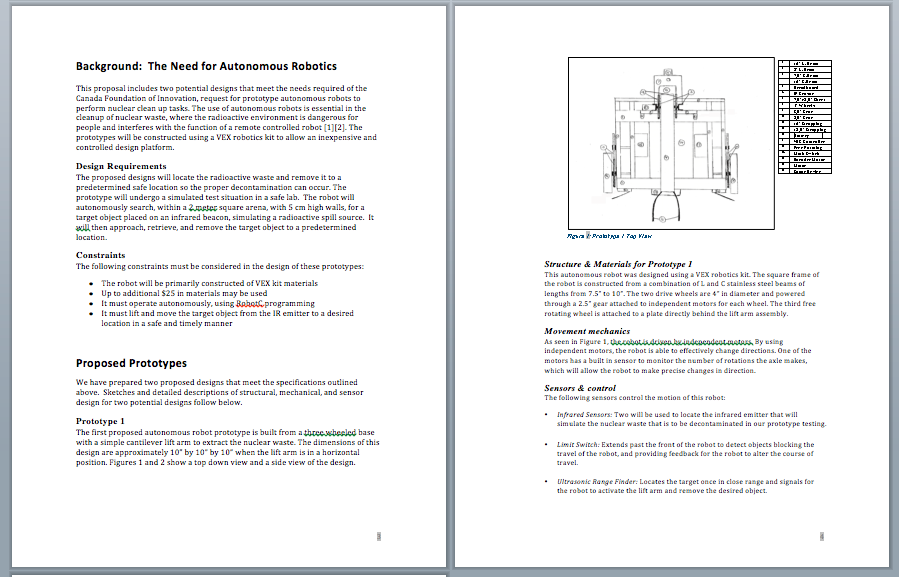
When placing figures and tables within a document, good design requires that you label them with numbered captions that clearly identify and describe them. Figure captions are generally placed below the figures (images, graphs, etc.) while table captions are usually placed above the tables. This is because we generally read tables from the top down, and therefore want to see the caption at the top. On the other hand, figures are not always read top down – usually, when you see a figure, your eye goes to the image first, and then the caption, so it is placed below. If you prefer consistency in captioning, which is an option, then place both figure and table captions at the top consistently throughout your document.

Label each figure or table with the word “Figure” or “Table” and a descriptive caption, and number them sequentially but separately, e.g., Table 1, Table 2, Table 3 and Figure 1, Figure 2, Figure 3.
Finally, if you are using a table or figure from a source (not something that you created yourself), make sure to refer to that source in your caption, and document it, e.g., Figure 1. Network Design [1]. Include the full citation at the bottom of the page or, if there are many figures and tables, in a list at the end of the document.
Emphasis
There are times when you will want to add emphasis to a word, phrase, or statistic so that it stands out from the surrounding text. The use of visual aids in your writing can be an excellent option, and can reinforce the written discussion. For example, if you write that sales are up 4% over this time last year, the number alone may not get the attention it deserves. If, however, near the text section you feature a bar graph showing sales growth, you reinforce the statistic.
You may also want to add emphasis with bold, italics, underlining, highlights, bullets, or other options such as different fonts. However, use these emphasis strategies sparingly, so that you really do make small pieces of information stand out and don’t overwhelm your reader with too many special effects.
Fonts
Using an appropriate type font increases readability. There are two basic types of font, serif and sans serif:

Follow these guidelines for fonts to enhance your document’s readability:
- Always use a standard font, such as Times New Roman or Calibri. Other fonts will be harder for your audience to read.
- In most cases, use one main type of font throughout your document. If you want to mix fonts, then do not use more than two types in one document.
- If you use two font types, the general practice is to use sans serif for headings and serif for the text.
- Apply special effects sparingly, if at all. Confine effects to bold, italics, and underlining, but use these effects only if needed to highlight individual words or very small pieces of text. Overusing special effects will work against your need to highlight particular information.
- Choose an appropriate type size. Most text should be in 12-pt. size, while headings would be larger (perhaps 16- pt. size, depending on the document) and often bold. Subheadings might be 14-pt. size, or they may be 12-pt. bold.
Cover/Title Page
Almost all formal reports have a Cover or Title Page, perhaps both. These two pages are used in nearly identical ways, yet some report types or organizations require both with a slight modification to the page’s purpose.
A cover page is a very simple, precise, brief way to introduce your report to the reader. This should contain:
- A specific title in large font
- Company name
- Name of the author(s)
- Date of the report
Sometimes an image is included on the cover page, and sometimes it is not – it depends on your group or organization’s format expectations as well as your own level of design expertise.
A title page may be used as a cover page; it repeats the information on the cover, but may add more detail. Additional details that may be added on a title page include the following: report number if the report is part of a sequence, additional author information (e.g., titles, contact information), name and address of the supervisor, and the name and address of the organization that supported the report.
Here are examples of cover and title pages; either one is fine for a formal report.

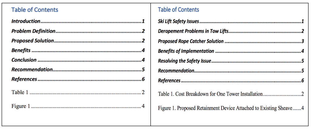
Table of Contents
The table of contents is typically one of the last sections of the document to be created, since it relies on the body of the report. It provides a way of finding information in the report very quickly. In creating a table of contents, you have a number of design decisions:
- Levels of headings to include: In longer reports, consider only including the top two levels of headings. This keeps the table of contents from becoming long and unwieldy.
- Indentation, spacing, and capitalization: Notice in the sample that items in each of the three levels of headings are aligned with each other and page numbers are right-aligned with each other. Notice also the capitalization: Main chapters or sections are all caps; first-level headings use initial caps on each main word; lower-level sections use initial caps on the first word only.
- Vertical spacing: Notice that the first-level sections have extra space above and below, which increases readability.
- Wording: Make sure that the headings are worded exactly the same as they are in the text. As you write and revise, you might change some of the headings—don’t forget to change the table of contents accordingly.
Note that if you have a lot of figures and tables, you should also do a list of Figures & Tables after the table of contents. The same formatting and design characteristics apply.
Document Design Review
View the following video to review major concepts of document design.
Candela Citations
- Written Document Design original content and content adapted from Technical Writing Essentials, Business Communication Skills for Managers, and Business Communication: Written & Verbal Presentation Skills; see attributions below. Authored by: Susan Oaks. Project: Communications for Professionals. License: CC BY-NC: Attribution-NonCommercial
- 3.1 Key Concept: Readability. Authored by: Suzan Last. Provided by: University of Victoria. Located at: https://pressbooks.bccampus.ca/technicalwriting/chapter/3-2-understanding-genres-and-conventions/. Project: Technical Writing Essentials. License: CC BY: Attribution
- 3.2 Headings. Authored by: Suzan Last. Provided by: University of Victoria. Located at: https://pressbooks.bccampus.ca/technicalwriting/chapter/3-5-headings/. Project: Technical Writing Essentials. License: CC BY: Attribution
- 3.3 Lists. Authored by: Suzan Last. Provided by: University of Victoria. Located at: https://pressbooks.bccampus.ca/technicalwriting/chapter/3-6-lists/. Project: Technical Writing Essentials. License: CC BY: Attribution
- 3.4 Figures and Tables. Authored by: Suzan Last. Provided by: University of Victoria. Located at: https://pressbooks.bccampus.ca/technicalwriting/chapter/3-7-figures-and-tables/. Project: Technical Writing Essentials. License: CC BY: Attribution
- Formal Reports. Authored by: Susan Kendall. Provided by: Lumen Learning. Located at: https://courses.lumenlearning.com/wmopen-businesscommunicationmgrs/chapter/formal-reports/. Project: Business Communication Skills for Managers. License: CC BY: Attribution
- image of business people looking at a document design on a laptop. Authored by: rawpixel. Provided by: Pixabay. Located at: https://pixabay.com/photos/business-businessman-businesswomen-3543809/. License: CC0: No Rights Reserved
- image of a laptop with an open document with a graph. Authored by: rawpixel. Provided by: Pixabay. Located at: https://pixabay.com/photos/analysis-brainstorming-business-3783312/. License: CC0: No Rights Reserved
- Tutorial on Organization in Professional Writing: Format. Provided by: ProsWrite. Located at: https://www.youtube.com/watch?v=OKBEx7N0vcg&t=42s. License: Other. License Terms: YouTube video
- Writing Style. Provided by: Lumen Leaning. Located at: https://courses.lumenlearning.com/businesscommunication/chapter/11-2-writing-style/. Project: Business Communication: Written & Verbal Presentation Skills. License: CC BY-NC-SA: Attribution-NonCommercial-ShareAlike