Visual elements such as graphs, charts, tables, photographs, or diagrams capture your readers’ attention and help them understand complicated ideas more fully, such as trends in data and more. Although visuals help you cut down on the amount of explanation in written text, they do not replace written text in the presentation of a concept. Instead, they clarify, illustrate, and augment your written text.
There are two main categories of visuals, Tables and Figures. Tables are used to organize, logically present, and/or compare data in columns and rows, using numbers and words. Figures, on the other hand, illustrate all other types of data. Figures include pie charts, line graphs, bar graphs, layouts, photographs, drawings, and photographs.
Conventions for Integrating Visuals into Your Document
In general, whenever you integrate any kind of visual into a document, webpage, presentation, or any communication, you should adhere to the following practices.
- Place the visual as close as possible to its related text.
- Give each visual a number and a clear descriptive title.
- Refer to the number/title within the body text when discussing the visual’s content.
- Surround the visual with enough white space to emphasize the image and enhance its readability.
- Label all units (x and y axes, column heads, parts of diagrams, etc.)
- Provide the source of the data and/or visual image if you did not create it yourself. Use only those images that you can use ethically (e.g., free images without copyright, creative commons licenses, or used with author’s permission).
- Do not change or distort the data or image.
- If at all possible, try to orient the image in the same direction as the body text (e.g., don’t put the text on the right-hand side of the page and a visual with people facing left on the left-hand side of the page, as the visual and text move your eyes in two different directions).
Look at Figure 1 below. Do you understand the information it conveys? What is missing?
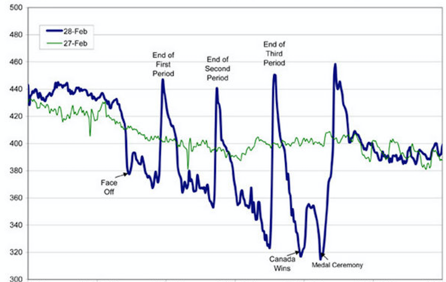
If you look carefully, you might be able to guess the story this graph is telling. However, the lack of a descriptive caption and labeling of axes makes it impossible to know for sure. Compare it to Figure 2 below.
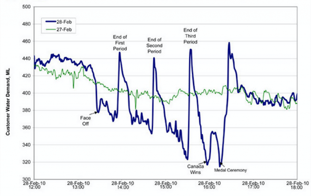
Figure 2 has a number, a descriptive title, and properly labeled x and y axes. It also cites the source the graph was retrieved from with an in-text citation, which is linked to a full reference below.
Selecting the Right Visual
Table 1 below lists common visuals used in professional communication, along with their general purpose.
| TABLE 1 Common types of illustrative graphics |
||
| Type of Visual | Description and Purpose | |
| Tables | Place detailed data/information in categories formatted into rows and columns for comparison; use when exact figures are important. Label column headings and/or rows. | |
| Graphs | Bar Graph | Compare and contrast two or more subjects at the same point in time, or compare change over time. |
| Column Graph | Reveal change in a subject at regular intervals of time. | |
| Line Graph | Show the degree and direction of change relative to two variables; compare items over time, show frequency or distribution, or show correlations. | |
| Charts | Pie Chart | Display the number and relative size of the divisions of a subject; show relation of parts to a whole (parts must equal 100%). |
| Org. Chart | Map the divisions, levels of responsibility, hierarchy, and/or reporting structure within an organization. | |
| Flow Chart | Show the sequence of steps in a process or procedure. | |
| Gantt Chart | Indicates timelines for multi-stepped projects, especially used in proposals and progress reports. | |
| Illustrations | Diagram | Identify the parts of a subject and their spatial or functional relationship; emphasize detail or show dimensions. |
| Photo | Show what a subject looks like in realistic detail or show it being used. | |
| Animation | Simulate a process, operation, or incident. | |
| Film clip | Depict a process, operation, or incident in realistic detail. | |
The video below offers useful information on using graphics in professional communications.
Considering Visuals as Part of the Plan-Create-Revise Process
You might consider visuals – whether to use them and which kinds to use – at any point in the process of planning, creating, and revising a communication. If you know at the start of the process that your audience is unfamiliar with the data you need to present, you might plan on doing a visual presentation via a graphic in addition to explaining the data in words. As you create a draft, you might find that you’re writing multiple paragraphs to explain one concept; it might be useful to consider an appropriate graphic to allow your audience to visualize and to allow you to cut down on your explanation in words. As you revise your communication, you may at that point realize that some information could be emphasized with graphics. Remember that visuals are very useful communication tools; don’t forget to use them if they are appropriate to your purpose, audience, and other aspects of your communication situation.
important note
For fuller information on using visuals, pertinent to both written documents and oral presentations, consult the pages in this text on:
[1] EPCOR, Edmonton’s Water Utility. “Water Consumption in Edmonton during 2010 Gold Medal hockey game,” Cited on Flowing Data[Online] , https://flowingdata.com/2010/03/09/canada-the-country-that-pees-together-stays-together/
Candela Citations
- Using Graphics, edited version of page 3.4 Figures and Tables, Technical Writing Essentials. Authored by: Susan Oaks. Project: Communications for Professionals. License: CC BY-NC: Attribution-NonCommercial
- Page 3.4 Figures and Tables. Authored by: Suzan Last. Provided by: University of Victoria. Located at: https://pressbooks.bccampus.ca/technicalwriting/chapter/3-7-figures-and-tables/. Project: Technical Writing Essentials. License: CC BY: Attribution
- image of professionals at a table, looking at a large page with graphics. Authored by: rawpixel. Provided by: Pixabay. Located at: https://pixabay.com/photos/achievement-analysis-brainstorming-3658092/. License: CC0: No Rights Reserved
- video Tutorial on Development in Professional Writing: Graphics. Authored by: Dr. Kim. Provided by: ProsWrite. Located at: https://www.youtube.com/watch?v=cxc6Z-u_sWY&t=91s. License: Other. License Terms: YouTube video