The Colour Event
The first challenge in dealing with colour in graphic reproduction is to learn to think of colour as an event rather than as an attribute or characteristic of a particular object.
Colour is an event because it requires the participation of three components at a particular point in time to take place. In addition to the object, we require a light source and an observer. Only with the interaction of these three things — object, light, and observer — can we have a colour event or experience.
We need some help from three branches of science, physics, physiology and psychology, to understand how the object, light, and observer contribute to the colour event. If you like memory aids, you can use the acronym POLO to remind you of the three science P’s and the object, light, and observer.
Object
The object and light fall under the domain of physics, while we need both physiology and psychology to describe the observer’s role in the colour event.
The object’s role is to interact with light, and the object can either reflect light back from its surface or transmit light through itself. Reflectance and transmission are the two potential interactions. The majority of objects are opaque, so most of the time we are dealing with the reflection of light. If an object is semi-opaque, and transmits a portion of light, we refer to it as translucent.
Light
Visible light is a tiny sliver of the total electromagnetic spectrum. The electromagnetic spectrum contains all forms of energy, ranging from kilometre-long radio waves at one end and progressing in shortening wavelengths down through microwaves, infrared waves, ultraviolet waves, X-rays, and finally, gamma waves with wavelengths of a subatomic dimension (see Figure 4.1).
Visible light is nestled in-between the infrared and ultraviolet range (see Figure 4.2). The progression from longest to shortest wavelength is from red (following infrared) to violet (preceding ultraviolet) in the 700 to 380 nanometre (millionths of a metre) wavelength distribution.
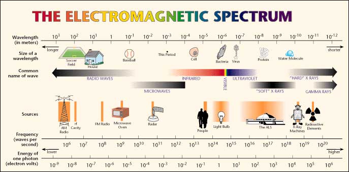
Figure 4.1
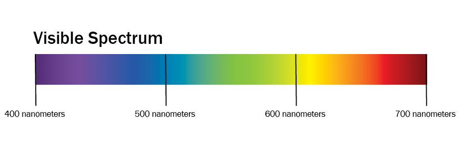
Figure 4.2 (by Ken Jeffery)
We describe the temperature (relative warmness to coolness) of light in degrees Kelvin. Typical daylight ranges from 5000 to 6500 degrees Kelvin. We use the labels D50 and D65 to indicate daylight-viewing conditions at these temperature points.
Observer
The greatest complexity of the colour event occurs in the interaction with the observer. The science of physiology, the study of the human body’s functions, provides half the story. Psychology, which provides insights about the function of the mind, completes the tale.
We begin with how our eyes, our optic systems, respond to light. Trichromacy and opponency are the key concepts.
Trichromacy
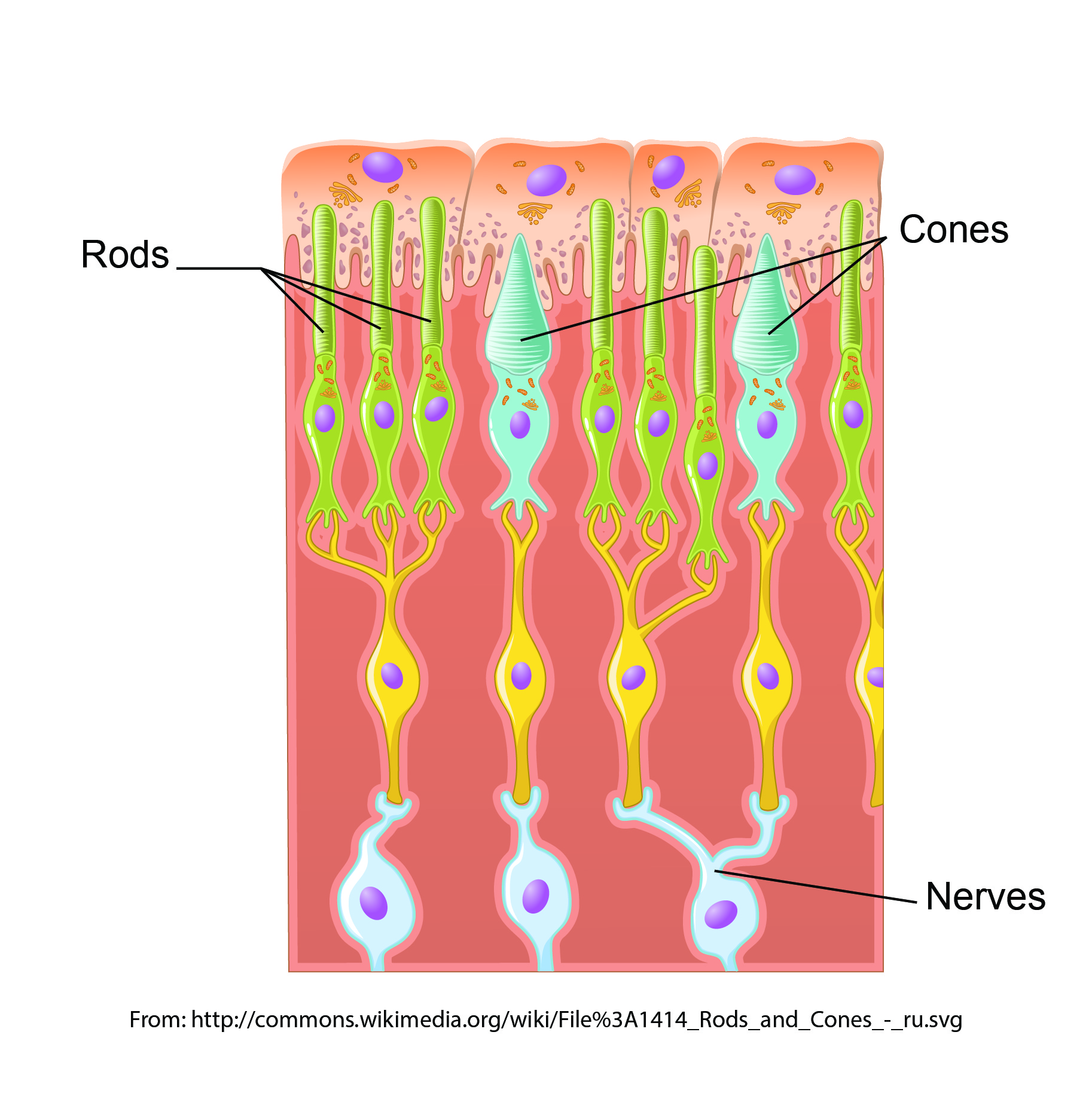
Figure 4.3 Rods and cones (adapted by Ken Jeffery)
We call it ‘visible’ light because it is the portion of the electromagnetic spectrum that our eyes are sensitive to. The two types of receptors in our eyes are cones and rods (see Figure 4.3). The cones respond to colour and the rods come into play in low-light situations when we see only varying shades of grey. There are three types of cones, each sensitive to approximately one-third of the visible spectrum. We characterize those segments of the spectrum as red, green, and blue, and this three-colour or trichromatic response by the cones is where all colour experience begins. Every colour we perceive comes from mixing varying volumes of the red, green, and blue signals from the three types of cones in our eyes.
The Additive Primaries
We refer to the red, green, and blue colour set (RGB) as the additive primaries. When we combine or add all three of these, we get the entire spectrum and, thus, white light. This is the primary colour set involved whenever we talk about the transmission of light, such as the display on a computer monitor, a tablet, or from a projector. For this reason, red, green, and blue are also referred to as the transmissive primaries.
The Subtractive Primaries
What happens when we project two of the three additive primaries on top of each other? This is the same as removing or subtracting one of the additive primaries from white light. Let’s start with red and green. Though not at all intuitive, if you have any experience with mixing paint or inks, the combination of red and green light produces yellow. Remember that we are adding light to light, so the production of a brighter colour is to be expected. Continuing on: combining green and blue gives us a light blue that we call cyan, while the combination of red and blue produces magenta.
Since each of these colours is produced by subtracting one of the additive primaries from the full complement of white light, we refer to this colour set of cyan, magenta, and yellow (CMY) as the subtractive primaries. Each of the subtractive primaries acts as a filter for its complementary colour in the additive primary colour set. Cyan absorbs all red light, reflecting only green and blue. Magenta absorbs all green light, returning only red and blue; while yellow absorbs all blue light and reflects back only red and green. What colour would you see if you shone green light on a magenta patch?
Just as we can produce any colour sensation in the transmission of light by mixing the appropriate quantities of red, green, and blue, we can produce the corresponding colour sensation when we put ink on paper by absorbing the necessary portions of the visible spectrum so that only the required amounts of red, green, and blue are reflected back. This is how cyan, magenta, and yellow work as our primary colours in the printing environment, and why we also call them the reflective primaries.
Opponency
The second half of the role that our human physiology plays in the observer’s part of the colour event is the concept of opponency. Our eyes’ tristimulus response (a response to the red, green, and blue portions of incoming light) is the input, but the interpretation occurs when we map that input to a location in a colour space determined by three axes of opposing sensations. We have a built-in colour map where we define our colour perception by identifying the perceived colour based on its degree of greenness to redness, blueness to yellowness, and darkness to lightness.
These three pairs of opposites — green-red, blue-yellow, dark-light — are the fundamental guide posts we use to position any colour we perceive on our internal colour map. These opponent colour pairs are exclusive colour entities, occupying opposing ends of the range of our interpretation. Unlike a yellowish-orange or a reddish-purple, we cannot imagine a colour having the properties of red and green or blue and yellow at the same time.
Lab Colour Space
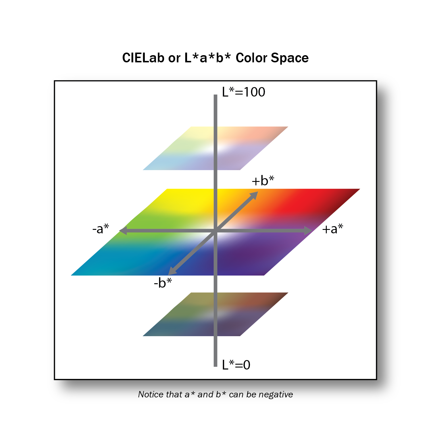
Figure 4.4 (by Ken Jeffery)
Once the opponent nature of colour interpretation was understood, colour scientists were able to create a model colour space based on the opposing pairs. This is the Lab colour space (see Figure 4.4). The Lab variation of interest to us is officially called CIELAB, and all references in this textbook to Lab will mean CIELAB. Additionally, references to L, a, and b in this textbook are equivalent to the L*, a*, and b* units of the CIELAB colour space. Each of the opposing pairs provides one axis of this three-dimensional colour space. L is the axis for darkness to lightness; a is the axis for greenness to redness; and b is the axis for blueness to yellowness. By providing a value for each of the L, a, and b attributes, a colour is accurately and uniquely located in the colour space. The tremendous utility of the Lab colour space is that it allows for the mathematical description of a colour in a non-ambiguous and meaningful way.
Psychology of Colour Perception
We come to the last of our three science P’s: psychology. After the trichromatic response is passed to opponent interpretation in the physiology of our optic systems, the final engagement of colour perception occurs in our minds. This interaction complicates and potentially confounds our objective measurements, so it is critical to be aware of the typical issues that the filter of our mind brings to the arena of colour perception.
Colour Constancy
Colour constancy is how our mind adjusts our colour perception to discount or remove the effects of an overall colour cast due to a coloured illuminant. If we see someone wearing a yellow sweater illuminated by a bluish cast of light, we still ‘see’ a yellow sweater, even though we have no trouble identifying the colour in the sweater as green if it is isolated from the scene. In our mind, we remove the blue constituents of all colours in the scene that we assume are coming from the tint in the light source. This behaviour is also known as chromatic adaptation.
The effect of adjacency is very similar to colour constancy. A colour placed next to a light colour appears darker than when that same colour is placed next to a dark colour (see examples in Figures 4.5 and 4.6). We make adjustments to our interpretation based on our assessment of the environment.
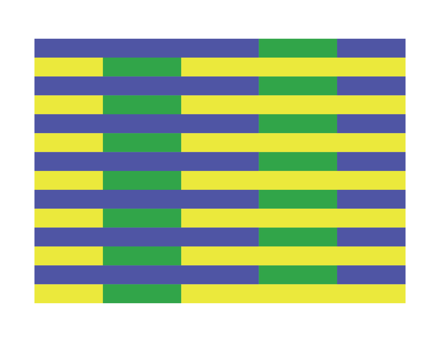
Figure 4.5 Both greens are the same colour (by Ken Jeffery)

Figure 4.6 Both reds are the same colour (by Ken Jeffery)
The effect of colour constancy provides a very important lesson in judging our success in colour matching: it is more important to preserve the overall colour relationships in our image than to focus on individual colour accuracy.
Memory Colours
In our mind’s eye, not all colours are created equal. Due to their historical importance to our survival, we pay special attention to certain colours. Flesh tones, the blue of the sky, and the greens of grass are known as memory colours due to the additional weight they have in our hierarchy of colour.
We need to give these memory colours a priority when we evaluate our colour management efforts. If these key colours aren’t right, then everything will look wrong.
The significant impact of our mind’s contribution to colour perception enforces the requirement to take colour matching beyond the raw numbers we can extract from the physics and physiology of light’s interaction with an object and our optic systems. The psychological components such as colour constancy and memory colours can only be accommodated by human intervention in a colour management system.
Attributions
Figure 4.1
Electromagnetic Spectrum Chart is in the public domain.
Figure 4.3
Image modified from Illustration from Anatomy & Physiology by Kaidor is used under a CC BY SA 4.0 license.
Candela Citations
- Graphic Design and Print Production Fundamentals. Authored by: Graphic Communications Open Textbook Collective. Provided by: BC Campus. Located at: https://opentextbc.ca/graphicdesign/. License: CC BY: Attribution
