Statistics has become the universal language of the sciences, and data analysis can lead to powerful results. As scientists, researchers, and managers working in the natural resources sector, we all rely on statistical analysis to help us answer the questions that arise in the populations we manage. For example:
- Has there been a significant change in the mean sawtimber volume in the red pine stands?
- Has there been an increase in the number of invasive species found in the Great Lakes?
- What proportion of white tail deer in New Hampshire have weights below the limit considered healthy?
- Did fertilizer A, B, or C have an effect on the corn yield?
These are typical questions that require statistical analysis for the answers. In order to answer these questions, a good random sample must be collected from the population of interests. We then use descriptive statistics to organize and summarize our sample data. The next step is inferential statistics, which allows us to use our sample statistics and extend the results to the population, while measuring the reliability of the result. But before we begin exploring different types of statistical methods, a brief review of descriptive statistics is needed.
Statistics is the science of collecting, organizing, summarizing, analyzing, and interpreting information.
Good statistics come from good samples, and are used to draw conclusions or answer questions about a population. We use sample statistics to estimate population parameters (the truth). So let’s begin there…
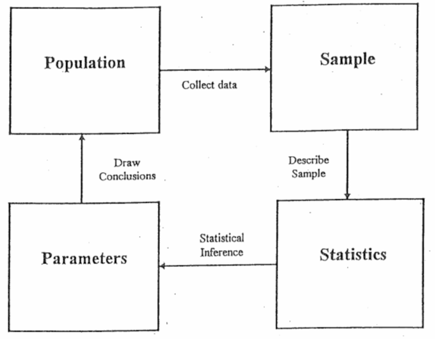
Figure 1. Using sample statistics to estimate population parameters.
Section 1
Descriptive Statistics
A population is the group to be studied, and population data is a collection of all elements in the population. For example:
- All the fish in Long Lake.
- All the lakes in the Adirondack Park.
- All the grizzly bears in Yellowstone National Park.
A sample is a subset of data drawn from the population of interest. For example:
- 100 fish randomly sampled from Long Lake.
- 25 lakes randomly selected from the Adirondack Park.
- 60 grizzly bears with a home range in Yellowstone National Park.
Populations are characterized by descriptive measures called parameters. Inferences about parameters are based on sample statistics. For example, the population mean (µ) is estimated by the sample mean (x̄). The population variance (σ2) is estimated by the sample variance (s2).
Variables are the characteristics we are interested in. For example:
- The length of fish in Long Lake.
- The pH of lakes in the Adirondack Park.
- The weight of grizzly bears in Yellowstone National Park.
Variables are divided into two major groups: qualitative and quantitative. Qualitative variables have values that are attributes or categories. Mathematical operations cannot be applied to qualitative variables. Examples of qualitative variables are gender, race, and petal color. Quantitative variables have values that are typically numeric, such as measurements. Mathematical operations can be applied to these data. Examples of quantitative variables are age, height, and length.
Quantitative variables can be broken down further into two more categories: discrete and continuous variables. Discrete variables have a finite or countable number of possible values. Think of discrete variables as “hens.” Hens can lay 1 egg, or 2 eggs, or 13 eggs… There are a limited, definable number of values that the variable could take on.

Continuous variables have an infinite number of possible values. Think of continuous variables as “cows.” Cows can give 4.6713245 gallons of milk, or 7.0918754 gallons of milk, or 13.272698 gallons of milk … There are an almost infinite number of values that a continuous variable could take on.

Examples
Is the variable qualitative or quantitative?
|
Species |
Weight |
Diameter |
Zip Code |
|
(qualitative |
quantitative, |
quantitative, |
qualitative) |
Descriptive Measures
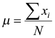
Descriptive measures of populations are called parameters and are typically written using Greek letters. The population mean is μ (mu). The population variance is σ2 (sigma squared) and population standard deviation is σ (sigma).
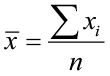
Descriptive measures of samples are called statistics and are typically written using Roman letters. The sample mean is  (x-bar). The sample variance is s2 and the sample standard deviation is s. Sample statistics are used to estimate unknown population parameters.
In this section, we will examine descriptive statistics in terms of measures of center and measures of dispersion. These descriptive statistics help us to identify the center and spread of the data.
Measures of Center
Mean
The arithmetic mean of a variable, often called the average, is computed by adding up all the values and dividing by the total number of values.
The population mean is represented by the Greek letter μ (mu). The sample mean is represented by x̄(x-bar). The sample mean is usually the best, unbiased estimate of the population mean. However, the mean is influenced by extreme values (outliers) and may not be the best measure of center with strongly skewed data. The following equations compute the population mean and sample mean.
where xi is an element in the data set, N is the number of elements in the population, and n is the number of elements in the sample data set.
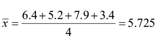
Example 2
Find the mean for the following sample data set: 6.4, 5.2, 7.9, 3.4
Median
The median of a variable is the middle value of the data set when the data are sorted in order from least to greatest. It splits the data into two equal halves with 50% of the data below the median and 50% above the median. The median is resistant to the influence of outliers, and may be a better measure of center with strongly skewed data.
The calculation of the median depends on the number of observations in the data set.
To calculate the median with an odd number of values (n is odd), first sort the data from smallest to largest.
Example 3
23, 27, 29, 31, 35, 39, 40, 42, 44, 47, 51
The median is 39. It is the middle value that separates the lower 50% of the data from the upper 50% of the data.
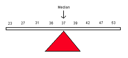
To calculate the median with an even number of values (n is even), first sort the data from smallest to largest and take the average of the two middle values.
Example 4
23, 27, 29, 31, 35, 39, 40, 42, 44, 47
Mode
The mode is the most frequently occurring value and is commonly used with qualitative data as the values are categorical. Categorical data cannot be added, subtracted, multiplied or divided, so the mean and median cannot be computed. The mode is less commonly used with quantitative data as a measure of center. Sometimes each value occurs only once and the mode will not be meaningful.
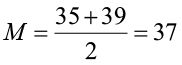
Understanding the relationship between the mean and median is important. It gives us insight into the distribution of the variable. For example, if the distribution is skewed right (positively skewed), the mean will increase to account for the few larger observations that pull the distribution to the right. The median will be less affected by these extreme large values, so in this situation, the mean will be larger than the median. In a symmetric distribution, the mean, median, and mode will all be similar in value. If the distribution is skewed left (negatively skewed), the mean will decrease to account for the few smaller observations that pull the distribution to the left. Again, the median will be less affected by these extreme small observations, and in this situation, the mean will be less than the median.
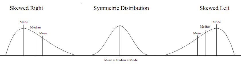
Figure 2. Illustration of skewed and symmetric distributions.
Measures of Dispersion
Measures of center look at the average or middle values of a data set. Measures of dispersion look at the spread or variation of the data. Variation refers to the amount that the values vary among themselves. Values in a data set that are relatively close to each other have lower measures of variation. Values that are spread farther apart have higher measures of variation.
Examine the two histograms below. Both groups have the same mean weight, but the values of Group A are more spread out compared to the values in Group B. Both groups have an average weight of 267 lb. but the weights of Group A are more variable.
Figure 3. Histograms of Group A and Group B.
This section will examine five measures of dispersion: range, variance, standard deviation, standard error, and coefficient of variation.
Range
The range of a variable is the largest value minus the smallest value. It is the simplest measure and uses only these two values in a quantitative data set.
Example 5
Find the range for the given data set.
12, 29, 32, 34, 38, 49, 57
Range = 57 – 12 = 45
Variance
The variance uses the difference between each value and its arithmetic mean. The differences are squared to deal with positive and negative differences. The sample variance (s2) is an unbiased estimator of the population variance (σ2), with n-1 degrees of freedom.
Degrees of freedom: In general, the degrees of freedom for an estimate is equal to the number of values minus the number of parameters estimated en route to the estimate in question.
The sample variance is unbiased due to the difference in the denominator. If we used “n” in the denominator instead of “n – 1”, we would consistently underestimate the true population variance. To correct this bias, the denominator is modified to “n – 1”.
Population variance Sample variance
σ2 = 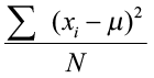 s2 =
s2 = 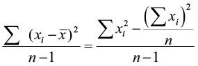
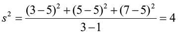
Example 6
Compute the variance of the sample data: 3, 5, 7. The sample mean is 5.
Standard Deviation
The standard deviation is the square root of the variance (both population and sample). While the sample variance is the positive, unbiased estimator for the population variance, the units for the variance are squared. The standard deviation is a common method for numerically describing the distribution of a variable. The population standard deviation is σ (sigma) and sample standard deviation is s.
Population standard deviation Sample standard deviation


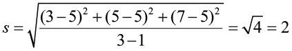
Example 7
Compute the standard deviation of the sample data: 3, 5, 7 with a sample mean of 5.
Standard Error of the Means
Commonly, we use the sample mean x̄ to estimate the population mean μ. For example, if we want to estimate the heights of eighty-year-old cherry trees, we can proceed as follows:
- Randomly select 100 trees
- Compute the sample mean of the 100 heights
- Use that as our estimate
We want to use this sample mean to estimate the true but unknown population mean. But our sample of 100 trees is just one of many possible samples (of the same size) that could have been randomly selected. Imagine if we take a series of different random samples from the same population and all the same size:
- Sample 1—we compute sample mean x̄
- Sample 2—we compute sample mean x̄
- Sample 3—we compute sample mean x̄
- Etc.
Each time we sample, we may get a different result as we are using a different subset of data to compute the sample mean. This shows us that the sample mean is a random variable!
The sample mean (x̄) is a random variable with its own probability distribution called the sampling distribution of the sample mean. The distribution of the sample mean will have a mean equal to µ and a standard deviation equal to ![]() .
.
The standard error ![]() is the standard deviation of all possible sample means.
is the standard deviation of all possible sample means.
In reality, we would only take one sample, but we need to understand and quantify the sample to sample variability that occurs in the sampling process.
The standard error is the standard deviation of the sample means and can be expressed in different ways.
Note: s2 is the sample variance and s is the sample standard deviation
Example 8
Describe the distribution of the sample mean.
A population of fish has weights that are normally distributed with µ = 8 lb. and s = 2.6 lb. If you take a sample of size n=6, the sample mean will have a normal distribution with a mean of 8 and a standard deviation (standard error) of  = 1.061 lb.
If you increase the sample size to 10, the sample mean will be normally distributed with a mean of 8 lb. and a standard deviation (standard error) of  = 0.822 lb.
Notice how the standard error decreases as the sample size increases.
The Central Limit Theorem (CLT) states that the sampling distribution of the sample means will approach a normal distribution as the sample size increases. If we do not have a normal distribution, or know nothing about our distribution of our random variable, the CLT tells us that the distribution of the x̄’s will become normal as n increases. How large does n have to be? A general rule of thumb tells us that n ≥ 30.
The Central Limit Theorem tells us that regardless of the shape of our population, the sampling distribution of the sample mean will be normal as the sample size increases.
Coefficient of Variation
To compare standard deviations between different populations or samples is difficult because the standard deviation depends on units of measure. The coefficient of variation expresses the standard deviation as a percentage of the sample or population mean. It is a unitless measure.
Population data Sample data
CV =  CV =
CV = 
Example 9
Fisheries biologists were studying the length and weight of Pacific salmon. They took a random sample and computed the mean and standard deviation for length and weight (given below). While the standard deviations are similar, the differences in units between lengths and weights make it difficult to compare the variability. Computing the coefficient of variation for each variable allows the biologists to determine which variable has the greater standard deviation.
| Sample mean | Sample standard deviation | |
| Length | 63 cm | 19.97 cm |
| Weight | 37.6 kg | 19.39 kg |
There is greater variability in Pacific salmon weight compared to length.
Variability
Variability is described in many different ways. Standard deviation measures point to point variability within a sample, i.e., variation among individual sampling units. Coefficient of variation also measures point to point variability but on a relative basis (relative to the mean), and is not influenced by measurement units. Standard error measures the sample to sample variability, i.e. variation among repeated samples in the sampling process. Typically, we only have one sample and standard error allows us to quantify the uncertainty in our sampling process.
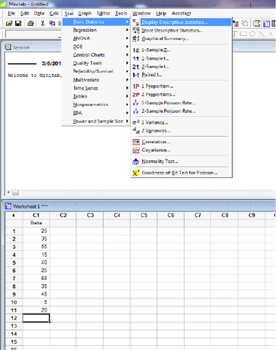
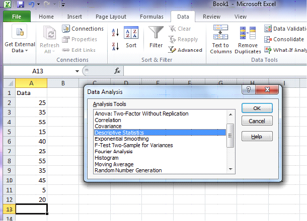
Basic Statistics Example using Excel and Minitab Software
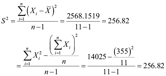
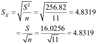
Consider the following tally from 11 sample plots on Heiburg Forest, where Xi is the number of downed logs per acre. Compute basic statistics for the sample plots.
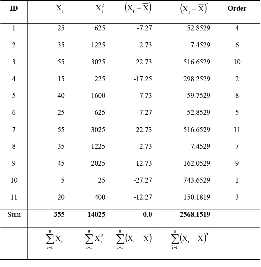
Table 1. Sample data on number of downed logs per acre from Heiburg Forest.
(1) Sample mean: 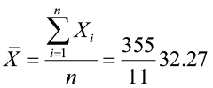
(2) Median = 35
(3) Variance:
(4) Standard deviation: ![]()
(5) Range: 55 – 5 = 50
(6) Coefficient of variation:
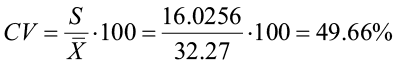
(7) Standard error of the mean:
Software Solutions
Minitab
Open Minitab and enter data in the spreadsheet. Select STAT>Descriptive stats and check all statistics required.
Descriptive Statistics: Data
|
Variable |
N |
N* |
Mean |
SE Mean |
StDev |
Variance |
CoefVar |
Minimum |
Q1 |
|
Data |
11 |
0 |
32.27 |
4.83 |
16.03 |
256.82 |
49.66 |
5.00 |
20.00 |
|
Variable |
Median |
Q3 |
Maximum |
IQR |
|
Data |
35.00 |
45.00 |
55.00 |
25.00 |
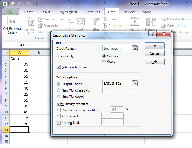
Excel
Open up Excel and enter the data in the first column of the spreadsheet. Select DATA>Data Analysis>Descriptive Statistics. For the Input Range, select data in column A. Check “Labels in First Row” and “Summary Statistics”. Also check “Output Range” and select location for output.
|
Data |
|
|
Mean |
32.27273 |
|
Standard Error |
4.831884 |
|
Median |
35 |
|
Mode |
25 |
|
Standard Deviation |
16.02555 |
|
Sample Variance |
256.8182 |
|
Kurtosis |
-0.73643 |
|
Skewness |
-0.05982 |
|
Range |
50 |
|
Minimum |
5 |
|
Maximum |
55 |
|
Sum |
355 |
|
Count |
11 |
Graphical Representation
Data organization and summarization can be done graphically, as well as numerically. Tables and graphs allow for a quick overview of the information collected and support the presentation of the data used in the project. While there are a multitude of available graphics, this chapter will focus on a specific few commonly used tools.
Pie Charts
Pie charts are a good visual tool allowing the reader to quickly see the relationship between categories. It is important to clearly label each category, and adding the frequency or relative frequency is often helpful. However, too many categories can be confusing. Be careful of putting too much information in a pie chart. The first pie chart gives a clear idea of the representation of fish types relative to the whole sample. The second pie chart is more difficult to interpret, with too many categories. It is important to select the best graphic when presenting the information to the reader.
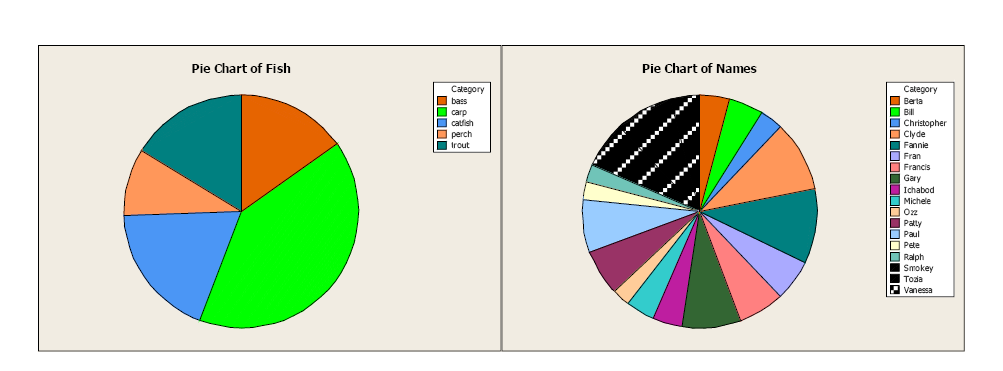
Figure 4. Comparison of pie charts.
Bar Charts and Histograms
Bar charts graphically describe the distribution of a qualitative variable (fish type) while histograms describe the distribution of a quantitative variable discrete or continuous variables (bear weight).
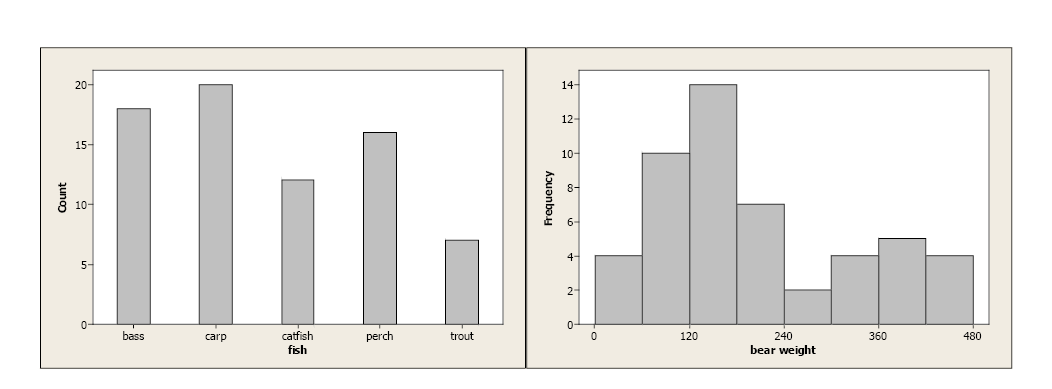
Figure 5. Comparison of a bar chart for qualitative data and a histogram for quantitative data.
In both cases, the bars’ equal width and the y-axis are clearly defined. With qualitative data, each category is represented by a specific bar. With continuous data, lower and upper class limits must be defined with equal class widths. There should be no gaps between classes and each observation should fall into one, and only one, class.
Boxplots
Boxplots use the 5-number summary (minimum and maximum values with the three quartiles) to illustrate the center, spread, and distribution of your data. When paired with histograms, they give an excellent description, both numerically and graphically, of the data.
With symmetric data, the distribution is bell-shaped and somewhat symmetric. In the boxplot, we see that Q1 and Q3 are approximately equidistant from the median, as are the minimum and maximum values. Also, both whiskers (lines extending from the boxes) are approximately equal in length.
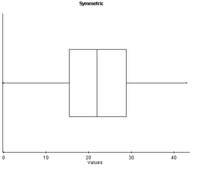
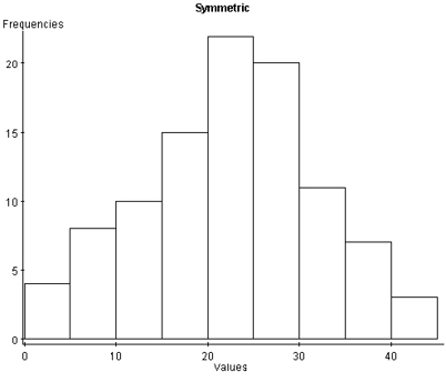
Figure 6. A histogram and boxplot of a normal distribution.
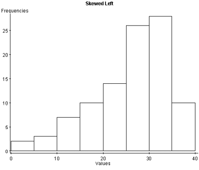
With skewed left distributions, we see that the histogram looks “pulled” to the left. In the boxplot, Q1 is farther away from the median as are the minimum values, and the left whisker is longer than the right whisker.
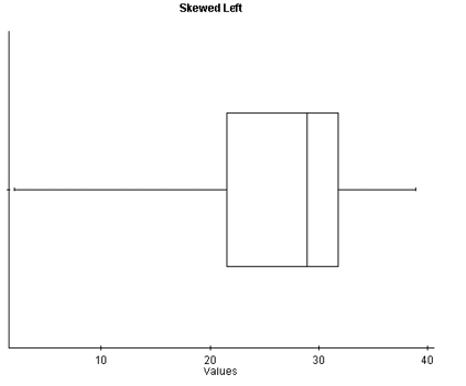
Figure 7. A histogram and boxplot of a skewed left distribution.
With skewed right distributions, we see that the histogram looks “pulled” to the right. In the boxplot, Q3 is farther away from the median, as is the maximum value, and the right whisker is longer than the left whisker.
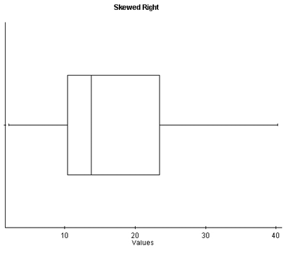
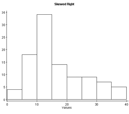
Figure 8. A histogram and boxplot of a skewed right distribution.
Section 2
Probability Distribution
Once we have organized and summarized your sample data, the next step is to identify the underlying distribution of our random variable. Computing probabilities for continuous random variables are complicated by the fact that there are an infinite number of possible values that our random variable can take on, so the probability of observing a particular value for a random variable is zero. Therefore, to find the probabilities associated with a continuous random variable, we use a probability density function (PDF).
A PDF is an equation used to find probabilities for continuous random variables. The PDF must satisfy the following two rules:
- The area under the curve must equal one (over all possible values of the random variable).
- The probabilities must be equal to or greater than zero for all possible values of the random variable.
The area under the curve of the probability density function over some interval represents the probability of observing those values of the random variable in that interval.
The Normal Distribution
Many continuous random variables have a bell-shaped or somewhat symmetric distribution. This is a normal distribution. In other words, the probability distribution of its relative frequency histogram follows a normal curve. The curve is bell-shaped, symmetric about the mean, and defined by µ and σ (the mean and standard deviation).
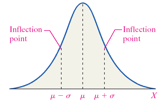
Figure 9. A normal distribution.
There are normal curves for every combination of µ and σ. The mean (µ) shifts the curve to the left or right. The standard deviation (σ) alters the spread of the curve. The first pair of curves have different means but the same standard deviation. The second pair of curves share the same mean (µ) but have different standard deviations. The pink curve has a smaller standard deviation. It is narrower and taller, and the probability is spread over a smaller range of values. The blue curve has a larger standard deviation. The curve is flatter and the tails are thicker. The probability is spread over a larger range of values.
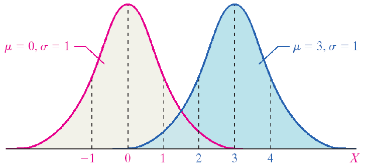
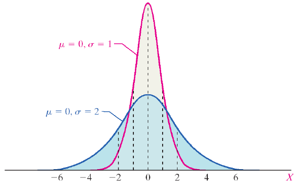
Figure 10. A comparison of normal curves.
Properties of the normal curve:
- The mean is the center of this distribution and the highest point.
- The curve is symmetric about the mean. (The area to the left of the mean equals the area to the right of the mean.)
- The total area under the curve is equal to one.
- As x increases and decreases, the curve goes to zero but never touches.
- The PDF of a normal curve is
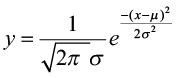 .
. - A normal curve can be used to estimate probabilities.
- A normal curve can be used to estimate proportions of a population that have certain x-values.
The Standard Normal Distribution
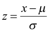
There are millions of possible combinations of means and standard deviations for continuous random variables. Finding probabilities associated with these variables would require us to integrate the PDF over the range of values we are interested in. To avoid this, we can rely on the standard normal distribution. The standard normal distribution is a special normal distribution with a µ = 0 and σ = 1. We can use the Z-score to standardize any normal random variable, converting the x-values to Z-scores, thus allowing us to use probabilities from the standard normal table. So how do we find area under the curve associated with a Z-score?
Standard Normal Table
- The standard normal table gives probabilities associated with specific Z-scores.
- The table we use is cumulative from the left.
- The negative side is for all Z-scores less than zero (all values less than the mean).
- The positive side is for all Z-scores greater than zero (all values greater than the mean).
- Not all standard normal tables work the same way.
Example 10
What is the area associated with the Z-score 1.62?
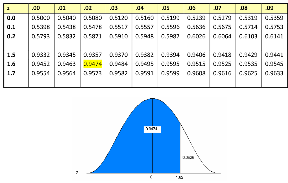
Figure 11. The standard normal table and associated area for z = 1.62.
Reading the Standard Normal Table
- Read down the Z-column to get the first part of the Z-score (1.6).
- Read across the top row to get the second decimal place in the Z-score (0.02).
- The intersection of this row and column gives the area under the curve to the left of the Z-score.
Finding Z-scores for a Given Area
- What if we have an area and we want to find the Z-score associated with that area?
- Instead of Z-score → area, we want area → Z-score.
- We can use the standard normal table to find the area in the body of values and read backwards to find the associated Z-score.
- Using the table, search the probabilities to find an area that is closest to the probability you are interested in.
Example 11
To find a Z-score for which the area to the right is 5%:
Since the table is cumulative from the left, you must use the complement of 5%.
1.000 – 0.05 = 0.9500
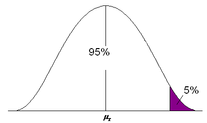
Figure 12. The upper 5% of the area under a normal curve.
- Find the Z-score for the area of 0.9500.
- Look at the probabilities and find a value as close to 0.9500 as possible.
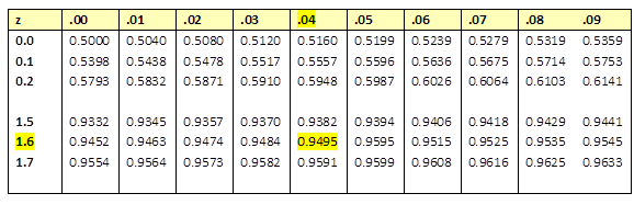
Figure 13. The standard normal table.
The Z-score for the 95th percentile is 1.64.
Area in between Two Z-scores
Example 12
To find Z-scores that limit the middle 95%:
- The middle 95% has 2.5% on the right and 2.5% on the left.
- Use the symmetry of the curve.
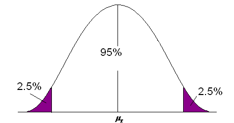
Figure 14. The middle 95% of the area under a normal curve.
- Look at your standard normal table. Since the table is cumulative from the left, it is easier to find the area to the left first.
- Find the area of 0.025 on the negative side of the table.
- The Z-score for the area to the left is -1.96.
- Since the curve is symmetric, the Z-score for the area to the right is 1.96.
Common Z-scores
There are many commonly used Z-scores:
- Z.05 = 1.645 and the area between -1.645 and 1.645 is 90%
- Z.025 = 1.96 and the area between -1.96 and 1.96 is 95%
- Z.005 = 2.575 and the area between -2.575 and 2.575 is 99%
Applications of the Normal Distribution
Typically, our normally distributed data do not have μ = 0 and σ = 1, but we can relate any normal distribution to the standard normal distributions using the Z-score. We can transform values of x to values of z.
For example, if a normally distributed random variable has a μ = 6 and σ = 2, then a value of x = 7 corresponds to a Z-score of 0.5.
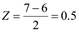
This tells you that 7 is one-half a standard deviation above its mean. We can use this relationship to find probabilities for any normal random variable.
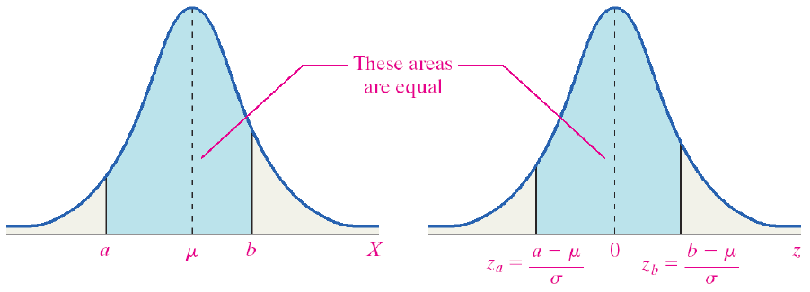
Figure 15. A normal and standard normal curve.
To find the area for values of X, a normal random variable, draw a picture of the area of interest, convert the x-values to Z-scores using the Z-score and then use the standard normal table to find areas to the left, to the right, or in between.

Example 13
Adult deer population weights are normally distributed with µ = 110 lb. and σ = 29.7 lb. As a biologist you determine that a weight less than 82 lb. is unhealthy and you want to know what proportion of your population is unhealthy.
P(x<82)
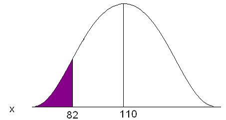
Figure 16. The area under a normal curve for P(x<82).
Convert 82 to a Z-score 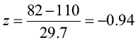
The x value of 82 is 0.94 standard deviations below the mean.
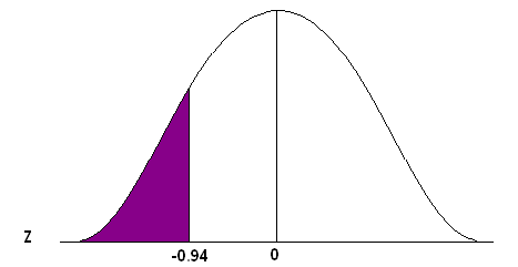
Figure 17. Area under a standard normal curve for P(z<-0.94).
Go to the standard normal table (negative side) and find the area associated with a Z-score of -0.94.
This is an “area to the left” problem so you can read directly from the table to get the probability.
P(x<82) = 0.1736
Approximately 17.36% of the population of adult deer is underweight, OR one deer chosen at random will have a 17.36% chance of weighing less than 82 lb.
Example 14
Statistics from the Midwest Regional Climate Center indicate that Jones City, which has a large wildlife refuge, gets an average of 36.7 in. of rain each year with a standard deviation of 5.1 in. The amount of rain is normally distributed. During what percent of the years does Jones City get more than 40 in. of rain?
P(x > 40)
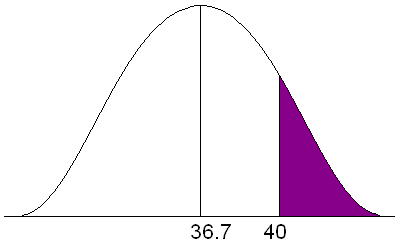
Figure 18. Area under a normal curve for P(x>40).
![]() P(x>40) = (1-0.7422) = 0.2578
P(x>40) = (1-0.7422) = 0.2578
For approximately 25.78% of the years, Jones City will get more than 40 in. of rain.
Assessing Normality
If the distribution is unknown and the sample size is not greater than 30 (Central Limit Theorem), we have to assess the assumption of normality. Our primary method is the normal probability plot. This plot graphs the observed data, ranked in ascending order, against the “expected” Z-score of that rank. If the sample data were taken from a normally distributed random variable, then the plot would be approximately linear.
Examine the following probability plot. The center line is the relationship we would expect to see if the data were drawn from a perfectly normal distribution. Notice how the observed data (red dots) loosely follow this linear relationship. Minitab also computes an Anderson-Darling test to assess normality. The null hypothesis for this test is that the sample data have been drawn from a normally distributed population. A p-value greater than 0.05 supports the assumption of normality.
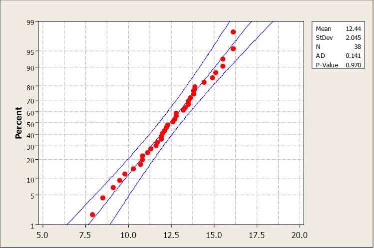
Figure 19. A normal probability plot generated using Minitab 16.
Compare the histogram and the normal probability plot in this next example. The histogram indicates a skewed right distribution.
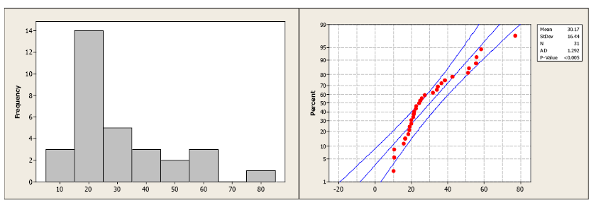
Figure 20. Histogram and normal probability plot for skewed right data.
The observed data do not follow a linear pattern and the p-value for the A-D test is less than 0.005 indicating a non-normal population distribution.
Normality cannot be assumed. You must always verify this assumption. Remember, the probabilities we are finding come from the standard NORMAL table. If our data are NOT normally distributed, then these probabilities DO NOT APPLY.
- Do you know if the population is normally distributed?
- Do you have a large enough sample size (n≥30)? Remember the Central Limit Theorem?
- Did you construct a normal probability plot?
Candela Citations
- Natural Resources Biometrics. Authored by: Diane Kiernan. Located at: https://textbooks.opensuny.org/natural-resources-biometrics/. Project: Open SUNY Textbooks. License: CC BY-NC-SA: Attribution-NonCommercial-ShareAlike