In this section, we provide guidelines and recommendations about color contrast in your textbook materials.
What Is Color Contrast?
Color contrast includes: hue, lightness and saturation of text, images, and background
File types: .doc, .html, .pdf, .jpg, .gif
Before You Begin
What Role Does Color Play in the Delivery of Your Content?
When documents or web pages do not provide enough contrast between foreground elements (e.g., text, images) and background elements (e.g., color, watermark images), some students will have difficulty reading the content. Consider the following questions:
1. Have you presented text- or image-based content on a colored or textured background? If so, you should:
- Confirm that there is sufficient contrast between your foreground content and the chosen background colour or texture.
2. Have you included links in your content? If so, you should:
- Confirm that the color of your web links is distinct from both your background color and the color of the surrounding text.
3. Have you used colour to convey concepts or information? If so, you should:
- Confirm that you are not using color alone to convey this information.
Learning Objectives
Who Are You Doing This For?
This work supports students who:
- Have low vision, like Diana
- Have poor contrast vision
- Are colour blind and cannot differentiate between certain colours
- Are using a device with monochrome display

Profile of Diana, original artwork by BCcampus
What Do You Need To Do?
Contrast
Students with low vision and/or a form of colour blindness may have difficulty reading text that does not contrast enough with the background colour you have selected. If the colour palette you have adopted is too subtle (e.g., white text on a pastel background; medium-grey text on a light-grey background), the contrast between your foreground and background is probably insufficient for some students.
Web Content Accessibility Guidelines (WCAG 2.0) require that “the visual presentation of text and images of text has a contrast ratio of at least 7:1.”[1] The image below presents four different foreground/background colour-contrast examples to illustrate insufficient and sufficient colour contrast ratios.
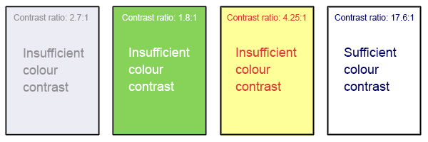
Image displays four examples of foreground (text) colour against background colours; only the example on the far right presents combinations with sufficient colour contrast.
Weblink Colours
Weblinks must be visually distinct from both the surrounding, non-linked text and background colour. If you do not underline your links (or provide some other non-colour cue), you must ensure that you provide both sufficient contrast between the link and background colours and between the link colour and that of the surrounding text.
Web Content Accessibility Guidelines (WCAG 2.0) require a:
- 4.5:1 contrast between the link text color and the background
- 3:1 contrast between the link text color and the surrounding non-link text color[2]
High-Contrast Mode
Some students need to see light text on a dark background for it to be readable, while others require dark text on a light background. Students with low vision (like Diana) must be able to see content when it is displayed in high-contrast mode. This can be a subjective experience, based on individual student needs. We recommend that you try testing your text and image-based content as you go by using high-contrast mode on your own computer and making adjustments as needed.
All content items such as text, images, bullets, and table borders must be visible in both regular and high-contrast modes.
Not sure how to test your content in high-contrast mode?
To test the visibility of your content in this mode, turn on high contrast by simultaneously pressing the following keys on your (PC) keyboard:
Left ALT + Left SHIFT + Print Screen.
To turn off high contrast mode, repeat this step.
Use of Color*
You should not rely on color as the sole means of conveying information and instruction. If the point you are making depends on color to be understood, you will need to edit your materials so that concepts presented in the visuals are not lost to those who are color blind or who require high contrast between colors.[3]
*This topic is also addressed in the Images section of the Toolkit.
Candela Citations
- BC Open Textbook Accessibility Toolkit. Authored by: Amanda Coolidge, Sue Doner, and Tara Robertson. Provided by: BCCampus. Located at: https://opentextbc.ca/accessibilitytoolkit/. License: CC BY: Attribution
- Web Content Accessibility Guidelines (WCAG) 2.0, Guideline 1.4.6 Contrast (Enhanced). Accessed from: http://www.w3.org/TR/UNDERSTANDING-WCAG20/visual-audio-contrast7.html ↵
- WebAIM (2015), WCAG 2.0 and Link Colors. Accessed from: http://webaim.org/blog/wcag-2-0-and-link-colors/ ↵
- Web Content Accessibility Guidelines (WCAG) 2.0, Guideline 1.4.1 Use of Color. Accessed from: http://www.w3.org/TR/WCAG20/#visual-audio-contrast ↵