Learning Objectives
- Determine whether a variable is independent or dependent
- Read a histogram
- Determine the spread, shape, center, and outliers in a histogram
- Use relative frequency to calculate the frequency of an interval
- Read a line graph
- Determine the basic shape of a trend from a line graph
KEY words
- Outliers: data points that fall outside the overall pattern of the distribution.
- Histogram: Most often used with grouped continuous data
- Line Graph: Most often used to show trends
Continuous Data Charts
Histograms
One advantage of a histogram is that it can readily display large data sets when the independent variable is discrete or grouped continuous. When the data is continuous the histogram divides the variable values into equal-sized intervals. The height of the bars shows the frequency (the number of individuals in each interval) or the relative frequency (percent of the total number of individuals).
Example
A Histogram of Hip Measurements
Here we have a histogram that shows hip girth measurements for 507 adults who exercise regularly. (Hip girth is the measurement around the hips.)
Each interval is 5 cm wide and includes the lower measurement but not the higher measurement. The higher measurement belongs to the next interval on the right. For example, the interval 90-95 includes measurements of 90 cm but not 95 cm. The height of each bar indicates the number of individuals with hip measurements in an interval. We can see that 48 adults have hip measurements between 85 and 90 cm, and 97 adults have hip measurements between 100 and 105 cm.

In the histogram, the count is the number of individuals in each interval. The count is also called the frequency. From these counts, we can determine a percentage of individuals within a given interval of variable values. This percentage of the frequency compared to the total of all frequencies is called a relative frequency.
The following questions require us to calculate relative frequencies:
1. Approximately what percentage of the sample has hip measurements between 85 and 90 cm?
Answer: Of the 507 adults in the data set, 48 have hip measurements between 85 and 90 cm.
48 out of 507 is 48 ÷ 507 ≈ 0.095 = 9.5%
So approximately 9.5% of the adults in this sample have hip girths between 85 and 90 cm.
2. A pants manufacturer plans to produce three sizes of sweatpants. Size Large will fit hip girths of 100 cm to 130 cm. What percentage of the sample will wear size Large sweatpants?
Answer: Of the 507 adults in the data set, 158 adults (97 + 42 + 15 + 3 + 1) = 158 have hip measurements of 100 cm or more.
158 out of 507 is 158 ÷ 507 ≈ 0.312 = 31.2%
So 31.2% of the adults in this sample will wear size Large sweatpants.
The histogram in figure 5 illustrates the heights (which were rounded to the nearest half-inch) of [latex]100[/latex] male, semiprofessional soccer players. The heights are continuous data, since height is measured. Height is displayed on the horizontal axis and relative frequency (%) on the vertical axis.

Figure 1. An example of a histogram
Each bar represents the percent of players whose height falls in an interval of width [latex]2"[/latex]. For example, [latex]0.05(=5\text{%})[/latex] of the players are between [latex]59.95"[/latex] and [latex]61.95"[/latex] tall. Since there are 100 players represented, that means that [latex]5[/latex] players ([latex]5\text{% of }100[/latex]) are between [latex]59.95"[/latex] and [latex]61.95"[/latex]. Since the heights were rounded to the nearest half-inch, this means that there were [latex]5[/latex] players whose heights rounded to [latex]60"[/latex], [latex]60.5"[/latex], [latex]61"[/latex] or [latex]61.5"[/latex].
It is easy to identify the mode as it is found at the tallest bar. Most of the players are between [latex]65.95"[/latex] and [latex]67.95"[/latex] tall. Indeed [latex]40\text{%}[/latex] of the players fall in that height interval, so, since there are [latex]100[/latex] players, [latex]40[/latex] of the players are between [latex]65.95"[/latex] and [latex]67.95"[/latex] tall.
Try It
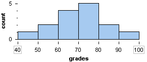
Here is a histogram of the distribution of grades on a quiz.
In the next example, we use a histogram to describe the shape, center, and spread of the distribution of a quantitative variable.
EXAMPLE
Oscar for Best Actress
The histogram shows the ages of the actresses who won an Oscar for Best Actress from 1970 to 2001.

Total Count: There are a total of 32 years from 1970 to 2001, so there are a total of 32 Oscars that were awarded.
Shape: Most of the data lives towards the left of the graph. This means that most of the Oscar winners for Best Actress are young. More precisely, we see that 91% (29 of 32) of the winners were under 50 years of age, and 56% (18 of 32) of the winners are under the age of 35.
Center: The distribution of ages appears to be centered between 30 and 35 years; 28% (9 of 32) of the winners are in this age range.
Spread: The data ranges from about 20 to about 80, so the overall range is approximately 60. There is a lot of variability in the ages of actresses who have won the Oscar for Best Actress.
Outliers: Winners older than 60 are unusual. There are three outliers: one in each of the following intervals: 60–65, 70–75, 75–80.
Now we summarize all of these observations in a paragraph:
Between the years of 1970 and 2001, the Oscar for Best Actress was awarded most often to young actresses: 56% (18 of 32) of the winners were under the age of 35, with 28% (9 of 32) of the winners between 30 and 35 years of age. Winners ranged in age from about 20 to about 80, but only 3 of the 32 were over 60.
Here is a paragraph that uses more formal vocabulary to summarize the distribution of ages:
Between the years of 1970 and 2001, the Oscar for Best Actress was awarded most often to young actresses. The distribution of ages is skewed to the right: 56% (18 of 32) of the winners were under the age of 35, with the center of the distribution between 30 and 35 years of age. With winners ranging in age from about 20 to about 80, the overall range of the distribution is about 60. But much of this variability is due to three outliers who were older than 60 when they won the award.
Example
While most people have an average body temperature of 98.6°F, there is actually a distribution of normal body temperature across people. A study of healthy adults revealed the following:

The numbers along the horizontal temperature axis indicate the middle of each interval.
1. What are the lower and upper temperature limits of the interval with a middle temperature of [latex]90.0[/latex]°F?
The distance between middle values is [latex]0.2[/latex], so [latex]0.1[/latex] less than the middle value will give the lower limit and [latex]0.1[/latex] greater than the middle value will give the upper limit. Consequently, the lower limit is [latex]89.9[/latex]°F and the upper limit is [latex]90.1[/latex]°F.
2. How many people had a temperature between [latex]97.9[/latex]°F and [latex]98.5[/latex]°F?
[latex]97.9[/latex] is the lower limit for the interval marked [latex]98.0[/latex], and [latex]98.5[/latex] is the upper limit for the interval labelled [latex]98.4[/latex]. The number of people between [latex]97.9[/latex]°F and [latex]98.5[/latex]°F is [latex]20+34+56=110[/latex].
3. How many people had a temperature between [latex]99.3[/latex]°F and [latex]99.9[/latex]°F?
[latex]90.3[/latex] is the lower limit for the interval marked [latex]99.4[/latex], and [latex]99.9[/latex] is the upper limit for the interval labelled [latex]90.8[/latex]. The number of people between [latex]99.3[/latex]°F and [latex]99.9[/latex]°F is [latex]12+0+2=14[/latex].
4. How many people were surveyed?
Number surveyed = [latex]2+5+20+34+56+81+72+38+18+12+2=338[/latex].
5. What is the mode of the data, and what does it represent?
The mode is the temperature with the highest frequency. The interval with a midpoint of [latex]98.6[/latex]°F is the mode.
6. What percent (rounded to the nearest tenth of a percent) of those surveyed had a temperature in the modal interval?
[latex]81\text{ out of }338=0.2396...= 24.0\text{%}[/latex]
TRY IT!

1. What was the lowest accumulated snowfall and in which decade did it occur?
2. What was the highest accumulated snowfall and in which decade did it occur?
3. What is the difference between the highest and lowest accumulated snowfall?
4. How many decades had an accumulated snowfall greater than 600 inches?
5. What percent of decades shown on the graph had a snowfall under 500 inches?
The three histograms in figure 2 were constructed using the same set of data. Are you surprised by how different the distribution looks in each histogram? When we change the intervals, the data gets grouped differently. The different grouping affects the appearance of the histogram.

Figure 2
The histogram on the left has an interval width of 20. The first interval starts at 40. In the middle histogram, the bin width was changed to 10 with the first interval still starting at 40. The last histogram, still has an interval width of 10 but the first bin is now at 45.
These changes affect our description of the shape, center, and spread of this set of data. For example, in the histogram on the left, the distribution looks symmetric with a central mode. The data in the histogram on the right appear to live mostly in the lower grades. The histogram on the left shows a mode between 60 and 80, while the middle histogram shows a mode between 70 and 80 and the one on the right shows a mode between 65 and 75.
Changing the size of the interval and the starting point of the first interval will change the look of the histogram even though the data set is the same.
Use the simulation below to investigate what happens to the histogram as the size of the interval and the starting point are changed using the same data set.
Line Graphs
Line graphs are used when the independent variable is continuous and most often used to show trends. A line graph is created by plotting data pairs, then using lines to join the dots. If the independent data is grouped continuous data, the data point is placed at the center of the interval along the horizontal axis. With the horizontal axis frequently showing the passage of time, the graphed data points will show an upward or downward trend of the categories in question.
The line graph in figure 3 illustrates social media traffic trends. Each social media organization is represented by a different colored line. The horizontal axis shows the passage of time, and the vertical axis shows the percentage of media traffic each organization is capturing. The graph shows that Facebook traffic is trending up, while Pinterest has experienced some ups and downs. Third-place Twitter and fourth-place YouTube traffic is relatively flat.
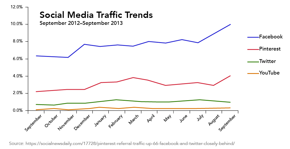
Figure 3. An example of a line graph
Notice that the line graph has a title explaining the data in the graph. The horizontal axis should be labeled “month” and the vertical axis should be labeled “Percent”. Although these labels may seem obvious, and are too often missing from graphs in the media, it is important to be accurate with labels and titles.
The initial value of a line graph is its starting point. For example, in September 2012, figure 3 shows that Pinterest starts off with just over 2% of market share. It then goes on to have a small peak of close to 4% in March before a decline through March. Pinterest reaches its highest value of just under 4% in September 2013. Of course, there may be more data available prior to September 2013 that is not shown on this graph, so the initial value depends on the data being used.
All of the data in Figure 3 is historical; it has already happened. We don’t know from the graph what happened before September 2012 nor what will happen after September 2013. Making an educated guess of what happens beyond the scope of the graphed data is called extrapolation. Examples of extrapolating data are attempting to forecast the weather for the next 10 days; trying to determine if a stock will rise in price or decline over the next few days; or trying to decide if the housing market soar is reaching a bubble. The extrapolation of data does not guarantee accurate results.
TRY IT!
Use the graph to answer the questions.

1. What title would you give this graph?
2. During which year was inflation at its highest? What was that highest value?
3. During which year was inflation at its lowest? What was the lowest value?
4. During which year did inflation increase the most? What was the percent increase?
5. During which year did the inflation rate decrease the fastest? What was the percent decrease?
6. What do you predict the inflation rate to do after 2020?
Example
Gold prices go back to 1915 when gold was valued at $19.25 per ounce. Adjusted for inflation, that is $528.05 in 2021. Gold prices fluctuate daily. The graph shows the monthly average gold prices per ounce adjusted for inflation from October 2011 to October 2021.

First notice that the vertical axis does not start at $0. Why do you think that is? In this case, this graph is only part of a much larger graph where gold prices started at $19.25 per ounce in February 1915. On the original graph the scale did start at zero. However, starting the scale at $1200 allows for better clarity between prices than a graph with a scale starting at $0. Having said that, scales are often manipulated to highlight what the author wants you to see. The complete graph can be found by clicking on this link: Gold Prices – 100 Year Historical Chart
1. What is the initial value for this data?
The initial value of historical record is $528.05 (adjusted for inflation) in 1915.
2. What happened to gold prices in 2013?
Gold prices fell precipitately in 2013 from around $2000 per ounce to about $1400 per ounce.
3. When would have been the best time to buy gold since 2012?
At the end of 2015 as that is when gold prices were at a low of just over $1200 per ounce and that was a turning point for gold prices as they started to gradually increase then take off in 2019.
4. What does it look like will happen to gold prices during 2021?
Gold prices have been showing a general decreasing trend since the high in 2020, and it looks like they will continue to do so. But that could change at any time.
Try It
Use the graph to answer the questions.

1. What does this graph show?
2. What does the ordered pair (1950, 2.6) represent?
3. What was the population of the world in 1975?
4. Describe the trend shown on the graph.
5. What is the population of the world in 2021?
6. What is the population of the world predicted to be in 2100?
7. How many more people are predicted to live in the world in 2100 than did in 2021?
Candela Citations
- Continuous Data Charts. Authored by: Hazel McKenna. Provided by: Utah Valley University. License: CC BY: Attribution
- Inflation graph. Provided by: Macrotrends. Located at: https://www.macrotrends.net/countries/USA/united-states/inflation-rate-cpi. License: All Rights Reserved
- Snow fall accumulation graph. Authored by: Hazel McKenna. Provided by: Utah Valley University. Located at: https://www.weather.gov/media/slc/ClimateBook/Seasonal%20Snowfall%20by%20Year.pdf. License: CC BY: Attribution
- Concepts in Statistics. Provided by: Open Learning Initiative. Located at: http://oli.cmu.edu. License: CC BY: Attribution
- World population graph. Provided by: United Nations. Located at: https://population.un.org/wpp/Graphs/DemographicProfiles/Line/900. Project: World Population Prospects 2019. License: CC BY: Attribution
- Gold prices graph. Provided by: Macrotrends. Located at: https://www.macrotrends.net/1333/historical-gold-prices-100-year-chart. License: All Rights Reserved