Learning Outcome
- Discuss the appropriate use of bar graphs, pie charts, and histograms.
- Read data from bar graphs, pie charts, and histograms.
KEY words
- Bar Graph: used to compare categories. Show frequency in each category. Can be vertical or horizontal.
- Horizontal axis: the line of figures or categories that are arranged from left to right along the bottom of a graph
- Vertical axis: the line of figures or categories that are arranged from bottom to top along the left side of a graph
- Scale: the units into which the axis is divided
- Pie Chart: Pie charts show the composition of data, or the pieces of a whole, as segments that make up a whole circle.
- Histogram: Histograms are similar to bar graphs, but are used for discrete data. The boxes must be ordered numerically along a continuously scaled axis.
- Title: a concise phrase explaining what the graph is showing
Categorical Data Charts
Bar Graphs
Bar graphs are used to compare categories. The horizontal axis is usually used to show the categories while the vertical axis usually shows the frequency of each category. However, the axes can be reversed if a horizontal rather than a vertical bar graph is desired. The bars on a bar graph do not touch because the categories are completely separate from each other, and since the categories have no order, they can be arranged at will.
Figure 1, illustrates an example of a horizontal bar graph. The title tells us that the graph is showing the water required to produce certain foods and consumer goods. The vertical axis shows the independent variable of foods and consumer goods (the categories), while the horizontal axis shows the water needed in liters. The water needed is the dependent variable (it depends on which product is selected) and is a continuous measure. Consequently, the horizontal axis has marks at equal intervals that represent 2500 liters. The length of each bar next to a category illustrates the water needed to produce that product. For example, 1 computer takes 20,000 liters of water to produce it, while 1 slice of wheat bread needs 40 liters. The order of the categories are listed top to bottom from the highest to lowest water needs. This makes the graph look organized, but the categories could be reorganized in any order.

Figure 1.
A bar chart is made up of paired data. In figure 1, the independent variable is product, while the dependent variable is water footprint. Consequently, the ordered pairs are of the form (product, water footprint). For example, the ordered pair (apple, 70) tells us that an apple has a water footprint of 70 liters. Notice the scale on the horizontal axis. By scale we mean the units into which the axis is divided. Numbers should always start at zero and go up in a linear fashion: the distance between two numbers on the axis should be constant.
Example
Use the horizontal bar graph to answer the questions.
- What data is shown in the bar graph?
- What is the independent variable?
- What do the numbers to the right of the bars represent? What unit are they measured in?
- Which country spends the most on military spending?
- How much more does the US spend on military spending than China?
- What is the total amount spent on military spending by the European countries? (United Kingdom, Germany, France, and Italy)?

- The bar graph shows countries with the highest military spending worldwide in 2020
- The independent variable is country.
- These are the amounts spent on military spending in any given country measured in billions of US dollars.
- The US spends the most as it has the longest bar.
- The US spends[latex]$778[/latex] billion and China spends [latex]$252[/latex] billion. So the US spend [latex]$778-$252[/latex] billion = [latex]$526[/latex] billion more.
- The UK spends [latex]$59.2[/latex] billion, Germany spends [latex]$52.8[/latex] billion, France spends [latex]$52.7[/latex] billion, and Italy spends [latex]$28.9[/latex] billion. These amounts add to [latex]$193.6[/latex] billion.
Try It
This histogram has been simplified to make the image look cleaner:

- What is missing from this histogram?
- What does the bar graph show?
- What is the independent variable and where is it found on the graph?
- What does the vertical axis show?
- About how many total Ford vehicles were taken out of production?
- About how many more Jeep Cherokees were taken out of production than Ford Explorers?
Pie Charts (Circle Graphs)
Pie charts show the composition of data, or the parts of a whole. Each piece of the pie represents a category, and each category is represented by an appropriately sized segment. None of the segments overlap as they represent different categories, and the sum of the percents in each category must add to 100%. A pie chart must also include the total number, [latex]n[/latex], of the frequencies, and it must have a title explaining the contents of the chart. In addition, each segment is labeled with the category and the percent of the whole it represents.
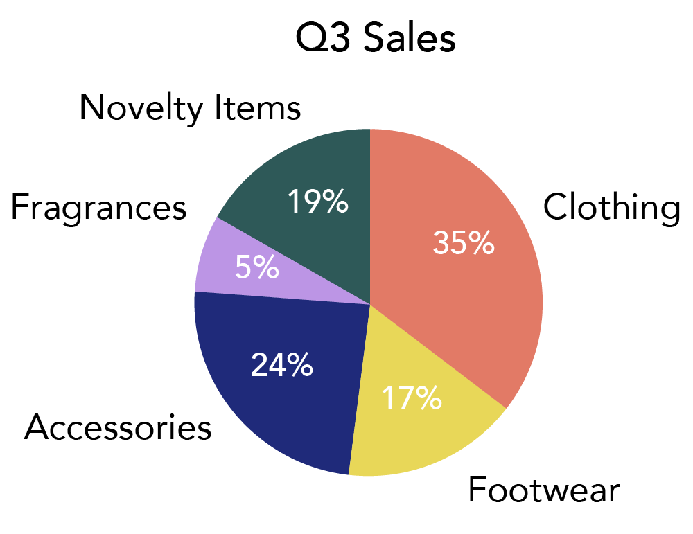
Figure 2. An example of a pie chart
In Figure 2, the whole pie (the whole circle) represents the total products sold at a store in the 3rd quarter (Q3); the pieces of that pie show us the percentage of sales each department made. A pie chart like this makes it very easy to see that the clothing department makes up the largest section of sales, and fragrances the smallest as they have the largest and smallest segments of the whole. Consequently, a pie chart is appropriate to use if comparing different categories. The one thing that is missing from figure 2, is the total number of products sold, [latex]n[/latex]. Without this it is impossible to determine the number of products sold in any given category. For example, if we knew that there were 3,457,940 total items sold, then we could calculate the number of items sold in “Accessories” by multiplying the percent by the total items sold. i.e. [latex]\text{number of items sold in Accessories}=24\text{% of }3,457,940=829,905.6[/latex]. Of course, this answer would be rounded to the nearest item, [latex]829,906[/latex], as accessories are counted in whole numbers.
ASIDE: A pie chart uses a complete circle to represent 100% of the data (1 whole), then appropriately sized segments are drawn to represent the percent of the whole represented by each category. The angle of the segment at the center of the circle can be found by multiplying [latex]360°[/latex] (the total number of degrees at the center of any circle) by the percentage of the whole being represented. For example, in figure 2, the angle for the “Clothing” segment is [latex]35\text{% of }360°=126°[/latex].
Example
The pie chart shows the distribution by party of the 100 members of the senate in the 117th congress (2021-2023):

The Democrats hold 48% of the 100 seats (48 seats)
The Republicans hold 50% of the 100 seats (50 seats)
The Independent Parties hold 2% of the 100 seats (2 seats)
Try It
There are approximately 290 million smartphones in use in the US market.

Use the pie chart to answer the questions:
- Which company has the largest share of the US market? What is that share?
- How many smartphones made by Samsung are in the US market?
- How many more smartphones in the US market are made by Apple than all other brands?
Pie charts are not always good for illustrating categorical data. If there are too many categories, it becomes impossible to tell them apart or assess their relative size. Pie charts should only be used when there is a small number (≤ 6) of categories.

Figure 3. An obviously problematic pie chart with too many categories.
Discrete Data Charts
Histogram
Histograms are particularly useful for large data sets. Histograms are similar to bar graphs, but are used for discrete (or grouped continuous) data. A histogram consists of contiguous (adjoining) bars. The horizontal axis is labeled with what the data represents, and the vertical axis is labeled frequency (or percent frequency). The graph will have the same shape with either label. The difference between a histogram and a bar graph lies in the way the bars are constructed. In a bar graph, the bars do not touch and the categories can be arranged in any order. In a histogram, the independent variable is discrete so has a defined order to it. Consequently, the bars must be ordered numerically along a continuously scaled axis.
Suppose that in a quick campus study, college students were asked how many books they had purchased for the semester. The number of books is discrete data, since books are counted and the number of books purchased has an obvious order.
The frequency table summarizes the data collected:
| Number of books purchased | Number of students |
|---|---|
| 1 | 11 |
| 2 | 10 |
| 3 | 16 |
| 4 | 6 |
| 5 | 5 |
| 6 | 2 |
The histogram in figure 4 displays the number of books on the [latex]x[/latex]-axis and the frequency of purchase on the [latex]y[/latex]-axis.

Figure 4. An example of a histogram
Notice the values along the horizontal axis. The whole numbers for the number of books purchased lie in the center of each bar. This causes the bars, which must touch due to the continuous scale on the horizontal axis, to be half-way between the integer values.
Although the table is easy to read, the graph effectively illustrates the shape, the center, and the spread of the data. The minimum, maximum, and mode are easy to pick out. The minimum is [latex]1[/latex] (the middle value of the box to the far left), the maximum is [latex]6[/latex] (the middle value of the box to the far right), which means the range is [latex]6-1=5[/latex]. The mode, which is the most frequent value is found by identifying the category with the tallest bar, so the mode is [latex]3[/latex]. This tells us that most of the students sampled bought three books that semester.
Example
Consider the histogram:

The histogram shows the quarterly profit or loss of a small company. Notice that negative values indicate a loss while positive values indicate a profit.
- When did the company have the greatest loss and highest profit?
The greatest loss occurred in the 2nd quarter of 2000, while the highest profit was in the 4th quarter of 2000.
- Did the company make an overall profit or loss in 2000?
In 2000, the overall profit was $[latex]24-10+50+65[/latex] thousand = $[latex]129[/latex] thousand or $[latex]129,000[/latex].
- How much money will the company have to make in the 4th quarter of 2021 to make the same profit as 2000?
During the first three quarters of 2021, the company has made $[latex]35-5+45[/latex] thousand = $[latex]95[/latex] thousand or $[latex]95,000[/latex]. They will have to make $[latex](129,000-95,000)[/latex] = $[latex]34,000[/latex].
Try It
Consider the histogram, which is the result of a survey of 400 women. Each interval includes the half-size associated with the corresponding full size. e.g. category 9 represents shoe sizes 9 and 9.5.

- What does the histogram show?
- What is the mode of the data set?
- What percent of women wear the modal shoe size?
- How many women wear the modal shoe size?
- What percent of women wear a size smaller than 8?
- How many women wear size 10 or higher?
- Is a histogram appropriate for showing this data? Explain your reasoning.
Candela Citations
- Reading Graphs and Charts. Authored by: Hazel McKenna. Provided by: Utah Valley University. License: CC BY: Attribution
- Try It: Microchip shortage effect on US vehicles. Authored by: Statista. Provided by: Car and Driver. Located at: https://www.statista.com/chart/24969/vehicles-taken-out-of-production-due-to-microchip-shortages/. License: All Rights Reserved
- Try It: Pie chart--US Smartphone market share. Authored by: Hazel McKenna. Located at: http://counterpointresearch.com/us-market-smartphone-share/. License: Public Domain: No Known Copyright
- Figures 2, 4. Provided by: Lumen Learning. License: CC BY: Attribution
- Concepts in Statistics. Provided by: Open Learning Initiative. Located at: http://oli.cmu.edu. License: CC BY: Attribution
- Figure 1 Bar Graph. Authored by: Statista. Provided by: Water Footprint Network. Located at: https://www.statista.com/statistics/264516/water-footprint-of-food-and-consumer-goods/. License: All Rights Reserved
- Example bar graph: highest military spending. Authored by: Statista. Provided by: SIPRI. Located at: https://www.statista.com/statistics/262742/countries-with-the-highest-military-spending/. License: All Rights Reserved
- Example: 117th congress pie chart. Authored by: Hazel McKenna. Located at: http://senate.gov. License: Public Domain: No Known Copyright
- Figure 3. Located at: https://briancort.com/in-defence-of-the-humble-pie-chart/. License: Public Domain: No Known Copyright