Learning Outcomes
- Read and interpret data from pie charts as percents
Pie Charts
Circle graphs, or pie charts, represent data as sections of the circle (or “pieces of the pie”), corresponding to their percentage of the whole. Circle graphs are often used to show how a whole set of data is broken down into individual components.
Here’s an example. At the beginning of a semester, a teacher talks about how she will determine student grades. She says, “Half your grade will be based on the final exam and [latex]20\%[/latex] will be determined by quizzes. A class project will also be worth [latex]20\%[/latex] and class participation will count for [latex]10\%[/latex].” In addition to telling the class this information, she could also create a circle graph.
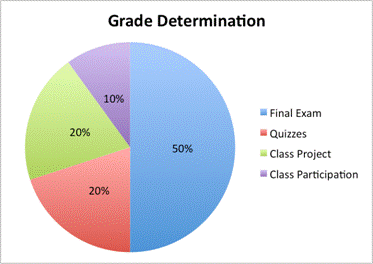
This graph is useful because it relates each part—the final exam, the quizzes, the class project, and the class participation—to the whole.
Example
If the total number of points possible in the class is [latex]500[/latex], how many points is the final exam worth?
Try It
In the following video, an example of using a pie chart to determine a percent of a whole is shown.