Why Study Rational Expressions and Equations?
If you were around in [latex]2011[/latex], you probably heard about Occupy Wall Street (OWS), the protest against social and economic inequality in the US. According to Wikipedia, the main issues raised by OWS were social and economic inequality, greed, corruption, and the perceived undue influence of corporations on government—particularly from the financial services sector. The OWS slogan, “We are the [latex]99\%[/latex]“, refers to income inequality and wealth distribution in the U.S. between the wealthiest [latex]1\%[/latex] and the rest of the population. To achieve their goals, protesters acted on consensus-based decisions made in general assemblies which emphasized direct action over petitioning authorities for redress.

An Occupy Wall Street Ad.
Economists are also interested in how wealth is distributed in economies. The Lorenz curve is a mathematical representation of the distribution of income or of wealth. Max O. Lorenz developed it in [latex]1905[/latex] to represent inequality of the wealth distribution.
The curve is a graph showing the proportion of overall income or wealth assumed by the bottom [latex]x\%[/latex] of the people. It is often used to represent income distribution, where it shows for the bottom [latex]x\%[/latex] of households, what percentage (y%) of the total income they have. The percentage of households is plotted on the [latex]x[/latex]-axis, the percentage of income is on the [latex]y[/latex]-axis. It can also be used to show distribution of assets. In such use, many economists consider it to be a measure of social inequality.
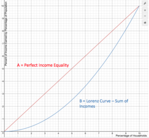
The Lorenz Curve.
Points on the Lorenz curve represent statements like “the bottom [latex]20\%[/latex] of all households have [latex]10\%[/latex] of the total income.” A perfectly equal income distribution would be one in which every person has the same income. In this case, the bottom [latex]N\%[/latex] of society would always have [latex]N\%[/latex] of the income. This can be depicted by the straight line [latex]y = x[/latex], called the “line of perfect equality.”
By contrast, a perfectly unequal distribution would be one in which one person has all the income and everyone else has none. In that case, the curve would be at [latex]y = 0\%[/latex] for all [latex]x < 100\%[/latex], and [latex]y = 100\%[/latex] when [latex]x = 100\%[/latex]. This curve is called the “line of perfect inequality.” The Gini coefficient is the ratio of the area between the line of perfect equality and the observed Lorenz curve to the area between the line of perfect equality and the line of perfect inequality. The higher the coefficient, the more unequal the distribution is. This is given by the ratio [latex]G=\frac{A}{A+B}[/latex], where A and B are the areas of regions as marked in the graph below.
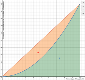
A graph showing the regions which make up the Gini coefficient.
The closer the Gini coefficient is to [latex]1[/latex], the less equally wealth is distributed among an economy. The closer it is to [latex]0[/latex], the more equally wealth is distributed. Below is a map of the world with Gini coefficient color coded.
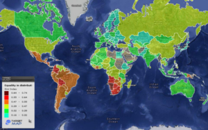
A world map color coded by Gini coefficient.
The Gini Index is a rational expression, or ratio. In this module, we will define and apply mathematical operations to rational expressions. We will also solve rational equations.
Candela Citations
- The Gini Index Description and Graphs. Provided by: Lumen Learning. License: CC BY: Attribution
- Adbuster's image which incorporates the 3 dimensional work of Arturo Di Modica titled Charging Bull. Authored by: By Source. Located at: https://en.wikipedia.org/w/index.php?curid=33128550. License: All Rights Reserved. License Terms: Used under fair use permissions