Today’s lab exercises are designed to help you learn to collect and graph biological data in a scientific manner. The techniques you will practice today can be applied to many different types of data sets (e.g., wildlife populations or vegetation sampling). For convenience, we will use measurements that can be made in the classroom.
Part 1: Normal Distribution
Many characteristics, such as height or weight, are normally distributed in populations. In other words, there is an average for the population and roughly equal variance on both sides in the following pattern:
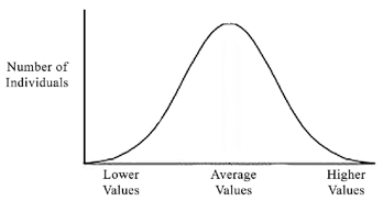
This is a classic “bell shaped” curve representative of a normal distribution. Note that it is symmetrical around an average value, and that most individuals are at or near the average. As the value gets more extreme (for example, taller or shorter height), there are fewer individuals represented.
Procedure
- Each student will collect the following information about him or herself:
- Height (in inches) without shoes—round to the nearest inch
- Weight (in pounds)—round to the nearest pound
- Hair length (in centimeters) from the scalp to the end of the longest hair
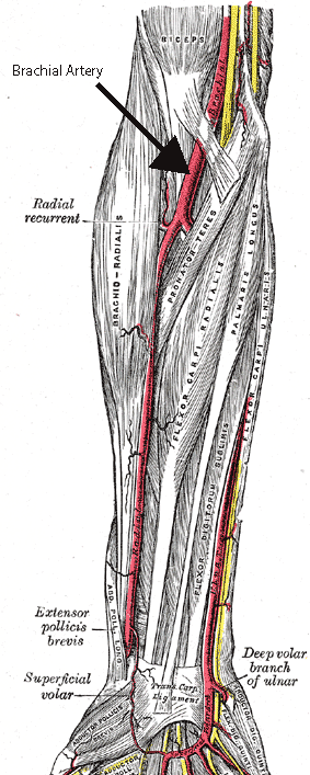
- Blood pressure (in mmHg) taken using a sphygmomanometer
- Palpate the brachial artery
- Position cuff above the brachial artery and locate the pulse in the brachial artery using the stethoscope.
- Pump up cuff (increasing pressure on the brachial artery) while listening to brachial artery. When the pulse disappears, the cuff’s pressure is GREATER than the pressure of the blood pushing out! Continue pumping for about 20 mmHg beyond this point.
- Slowly release pressure to allow blood back through the vessel.
- Karotkoff (kŏ-rot′kof) sounds begin, marking systolic pressure.
- Turbulent blood pushes through the brachial artery.
- Eventually as the pressure releases, the turbulence ceases.
- When the turbulence is gone, record diastolic pressure.
- Mean Arteral Pressure (MAP) = Diastolic Pressure + 1/3 Pulse Pressure
Pulse Pressure = Systolic Pressure – Diastolic Pressure
- Remember to record your own data!
Example MAP
Let’s use the example blood pressure of 120/80 (systolic/diastolic):
120 – 80 = 40 Pulse Pressure
MAP = 80 + (40/3) = 93.3 MAP
= 93 MAP
Remember, you round to the nearest whole number!
Raw Data
Place your data in a table similar to the one below (be sure to add as many rows as there are students).
| Student # | Male/Female | Height (cm) | Weight (lbs) | Hair Length | Mean Arterial Pressure (MAP) |
|---|---|---|---|---|---|
| 1 | |||||
| 2 | |||||
| 3 | |||||
| 4 |
Data Analysis
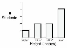
- Construct a bar graph that depicts the distribution of height among class members:
- Divide the range of heights into 3-inch increments; label the x-axis of the graph with these increments, increasing from left to right. There should be no overlap or gaps between increments
- The y-axis should represent the number of students that fall into each height increment. The range should be 0 at the bottom to 10 at top.
- Create a table of data showing how many students fall into each increment, and transfer this informationto your bar graph as follows
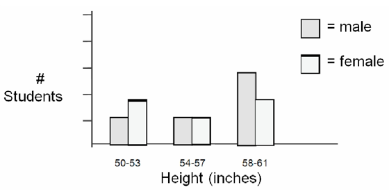
- Next create separate tables of data for male and female heights. Use these data to create a double-bar graph, with a male and female bar for each increment:
Part 2: Correlations
Sometimes two or more characteristics in a population may be correlated (or co-related). This means that they change together in a predictable way. For example, shoe size and height are likely to be correlated since the taller a person is the larger his/her feet are likely to be.
In biological data, as well as data from other fields such as sociology, correlation is often mistakenly taken to mean that there is a causal relationship. A causal relationship implies that one factor causes the other. For example, big feet and tallness are correlated, but big feet do not cause tallness or vice versa. Many correlative relationships reflect an underlying factor that affects both relationships. Another example would be the correlation between lung cancer incidence and lower income level workers.
Think about It
Does low income cause cancer? What might the underlying cause be?
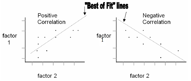
A correlation may be positive or negative. In a positive correlation, an increase in one value is followed by an increase in another value. In a negative correlation, an increase in one value is followed by a decrease in another value. To determine if there is a correlation between two sets of data it is common to graph the two factors against each other, with both values increasing from the point of origin. All data points are plotted and a “best of fit” line is drawn. Check out these two examples:
Data Analysis
Download this graph paper template to complete this section.
- Construct a Height-Weight Correlation Graph
- Using the class data collected, construct a graph of height (x-axis) vs. weight (y-axis). Be sure to use a scale that will give you a reasonably large graph; don’t end up with all your data points crowded in one place!
- Each student in the class will be represented by a single dot. Once all the dots are drawn, draw a straight or curved “best of fit” line through the dots.
- Construct a Height-Hair Length Correlation Graph
- Using the class data, construct a graph of height (x-axis) vs. hair length (y-axis).
- After all the points are plotted, draw a “best of fit” line or curve.
- Construct a Height-Blood Pressure Correlation Graph
- Using the class data, construct a graph of height (x-axis) vs. MAP (y-axis).
- After all the points are plotted draw a “best of fit” line.
Lab Questions
- Did you see any resemblance to a “bell-shaped” curve in your height distribution graphs? Why or why not?
- Were the height distributions of males and females in your class different? Explain your answer.
- Was there a correlation between height and weight? Was it positive or negative?
- Was there a correlation between height and hair length?
- Was there a correlation between height and MAP? What might be a better factor(s) that would correlate with blood pressure?
- A wildlife biologist finds that there is a positive correlation between the number of deer and the number of rabbits in 20 different study areas. This biologist concludes that the deer and the rabbits are somehow helping each other survive. Do you see any problems with this logic? What possible explanations would you offer for this phenomenon?
Candela Citations
- Biology Labs. Authored by: Wendy Riggs. Provided by: College of the Redwoods. Located at: http://www.redwoods.edu. License: CC BY: Attribution
- Modification of Gray 527. Authored by: Henry Gray. Located at: https://commons.wikimedia.org/wiki/File:Gray527.png. Project: Anatomy of the Human Body. License: Public Domain: No Known Copyright