Learning Outcomes
Create workbooks and format data in Microsoft Excel
Imagine that you have a lot of business data. Perhaps you have names and addresses for a mailing list. Maybe you have inventory data or quarterly sales values. All this information could be kept in a Word document, but Microsoft Office actually has an extremely useful program for organizing, storing, and even manipulating data: Microsoft Excel.

Learning to use Microsoft Excel is one of the most helpful and versatile workplace skills you can acquire, and creating a worksheet in a workbook is the first step. Many of the skills you learned for Microsoft Word can also be applied to Microsoft Excel, such as basic text formatting and file extensions. The file extension for a Microsoft Excel workbook is .xlsx, although pre-2003 versions of Excel might use .xls.
In this page, we’ll focus on the manipulation of data, rather than the appearance of the worksheet. Additionally, while this page only provides one method of completing each task, there can be multiple ways to accomplish a single goal. For more in-depth instruction, check out this online course covering the basics of Microsoft Excel.
Using Excel
Before using a workbook, it is helpful to know a few key terms.
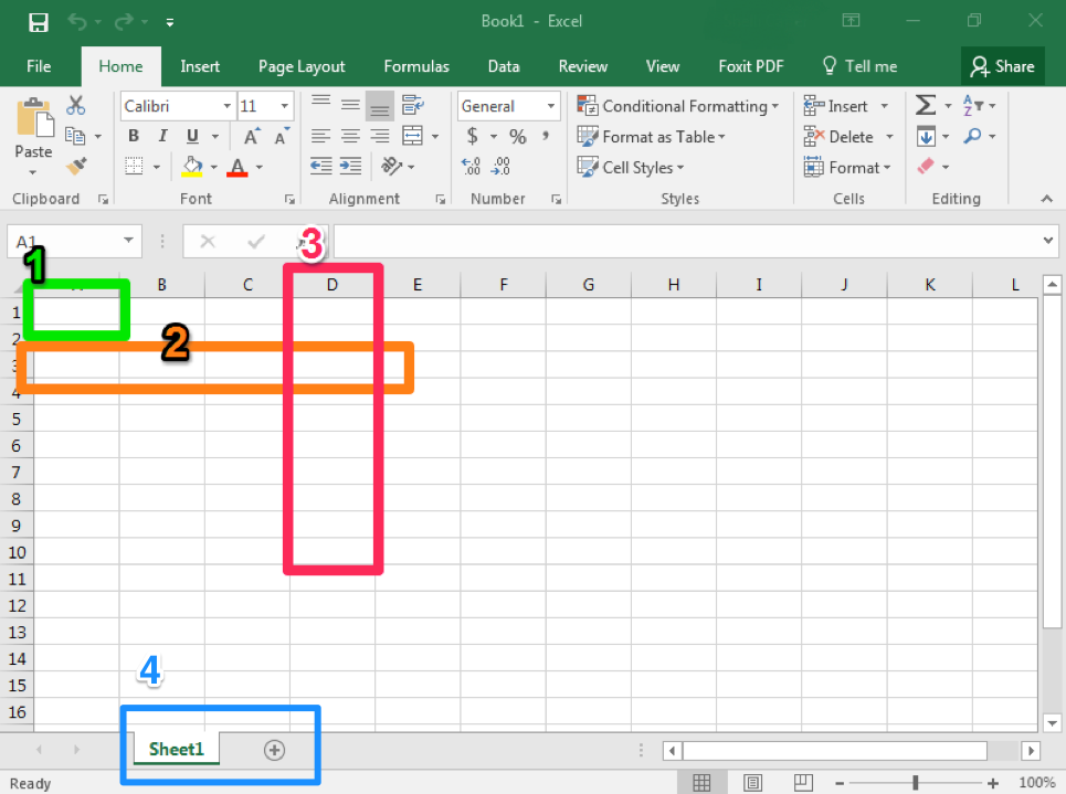
- Cell. This is the area where you will enter data.
- Row. Rows are cells aligned horizontally.
- Column. Columns are cells aligned vertically.
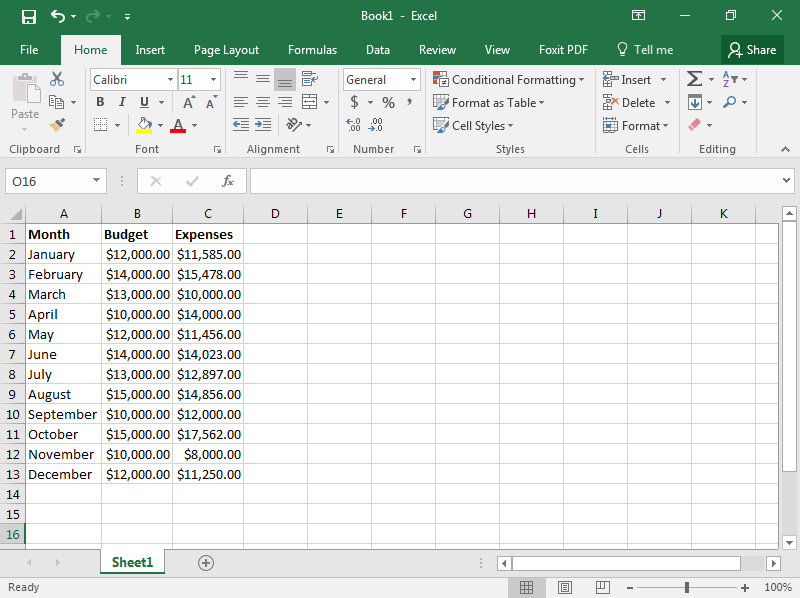
- Worksheet. A worksheet is a single page within a workbook. Like the tabs in an internet browser, the tabs in an Excel workbook show different pages, or worksheets. A workbook may have many worksheets included in it. In this screenshot, the workbook only has one worksheet and one tab, which is labeled Sheet1. The selected tab shows the selected worksheet. Clicking the + button will add another worksheet. When you save a workbook in Excel, all of the worksheets in that workbook are saved.
Comma Styles
At times, you may also wish to use a specific comma style with numbers entered into an Excel worksheet. For example, you may wish “1234” to display as typed or with a comma like “1,234.”
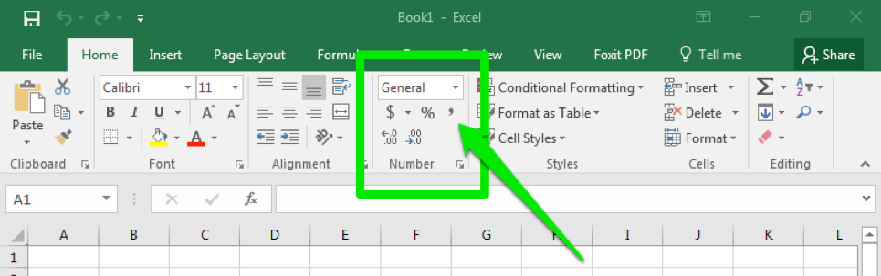
Comma styles are easy to change in Excel using a quick select option in the Number group in the ribbon. Simply to click on the Comma Style button in the Number group.
When clicking the comma style button, the comma style default is to display numbers with a comma in the thousands place and include two decimal places (Ex: “1200” becomes “1,200.00). This will also change the visible cell styles in the Style” area of the ribbon so you can easily select different options for comma and display format.
Listed below are the three most common options for comma and display format.
- Comma: Comma with two decimal points (e.g., 1,234.00)
- Comma [0]: Comma with no decimal points (e.g., 1,234)
- Currency: Comma with two decimal points and a dollar sign (e.g., $1,234.00)
Cell Format
As mentioned previously, Excel will default to certain styles when you create a new worksheet. In particular, this includes the way that numbers are displayed and whether or not commas are automatically included. In this section, we will take a look at changing these defaults.
When you type numbers into an Excel workbook, it will often default to a specific format. For example, if you type “12/15/17,” Excel will convert this to read “12/15/2017,” assuming you were entering month, day, and abbreviated year. Similarly, “3/4” will display at “4-Mar,” the fourth day of March. However, it is possible that you may have been entering fractions, so “3/4” was meant to indicate three-quarters instead.
If this is the case, you will need to format your cells to properly display the information you are entering. When possible, consider formatting your cells before you enter the data. Otherwise, Excel may convert some of the entries and you will need to re-enter that information.
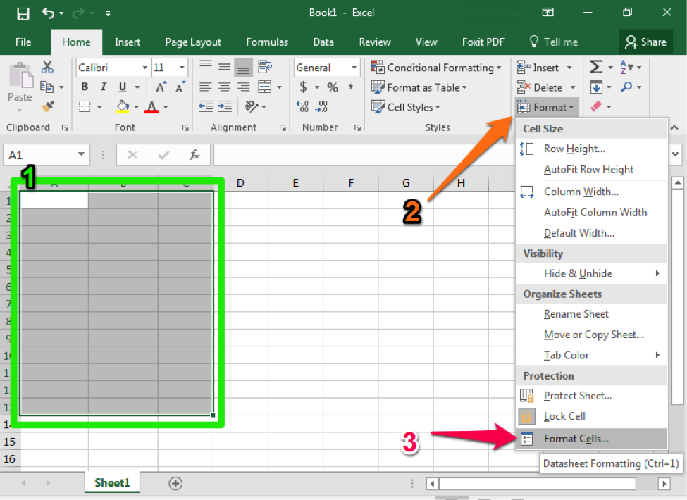
- Begin by highlighting the cells you plan to use.
- Select the Format dropdown from the Cells group of the ribbon.
- Select the Format cells option at the bottom of the dropdown menu.
Flash Fill
Like many modern software programs, Excel is designed to recognize certain patterns. For example, perhaps you are creating a table that lists the last and first names of attendees at a company training session. After all the names have been entered into two separate columns, you realize you would like a single column to correctly display the full name. An easy way to achieve this without having to manually retype the entire list is to use Flash Fill.
- Create a new column for the combined information you wish to display.
- In the first cell, type the name as you wish it to display. In our screenshots, this would be “John Smith.”
- Begin typing the next piece of data in the next cell. Excel should automatically suggest a Flash Fill option.
- If the Flash Fill suggestion matches how you would like the information displayed, simply hit the Enter key and the rest of your column should fill in automatically.
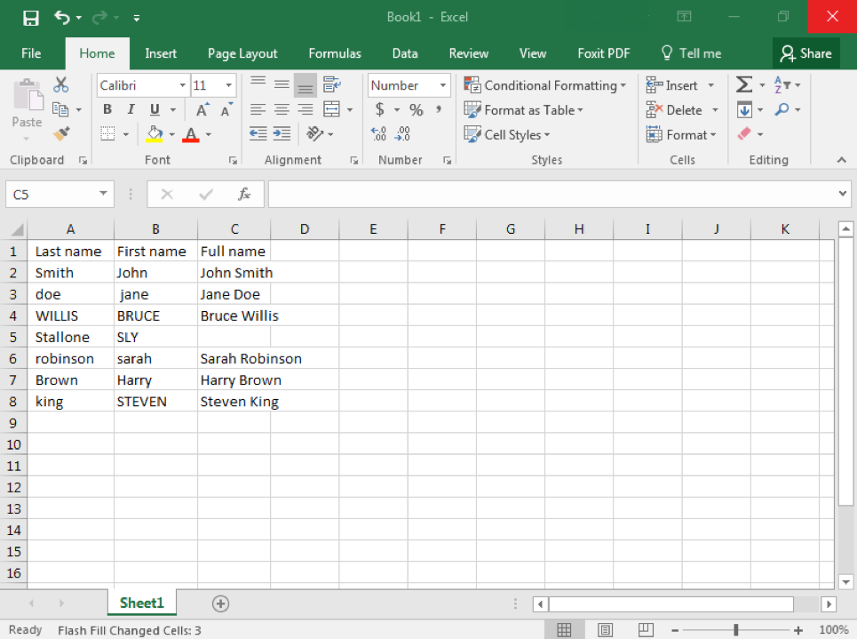
Flash Fill is especially helpful if your data is initially in different forms but you want the final information to display in the same fashion. For example, in our attendee list, some of the names were capitalized, in all caps, or had no capitalization. Sometimes you may need to manually update more than one option but Excel will detect your pattern.
Flash Fill should automatically be turned on in Excel but if it is not, you can turn it on using the File > Options > Advanced menus. You can also turn Flash Fill on or off using the shortcut Ctrl+E. Be aware that the Mac version of Excel does not have Flash Fill.
SUM Data
One of the main uses for Excel is to organize and manipulate numerical data. Often you may wish to add up all the numbers in a column or row. Excel has formulas and commands to automatically add your data, and the easiest way to use this feature is the AutoSum button.
- Once your numbers are organized in either a row or column, click on the cell where you would like the total sum to display. In the screenshot below this was A13.
- Click on the AutoSum button from the Editing group of the ribbon.
- Excel will highlight the cells that it is adding up and will apply the SUM formula.
- Hit Enter to accept the highlighted cells and see the total value of your data.
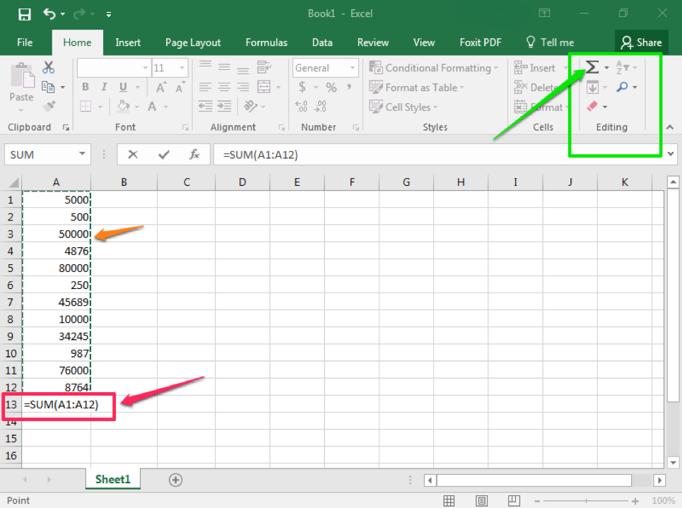
Note that it is possible to SUM several columns (or rows) at once. Select all the cells you wish to display a SUM and click AutoSum. Excel will individually add up the columns.
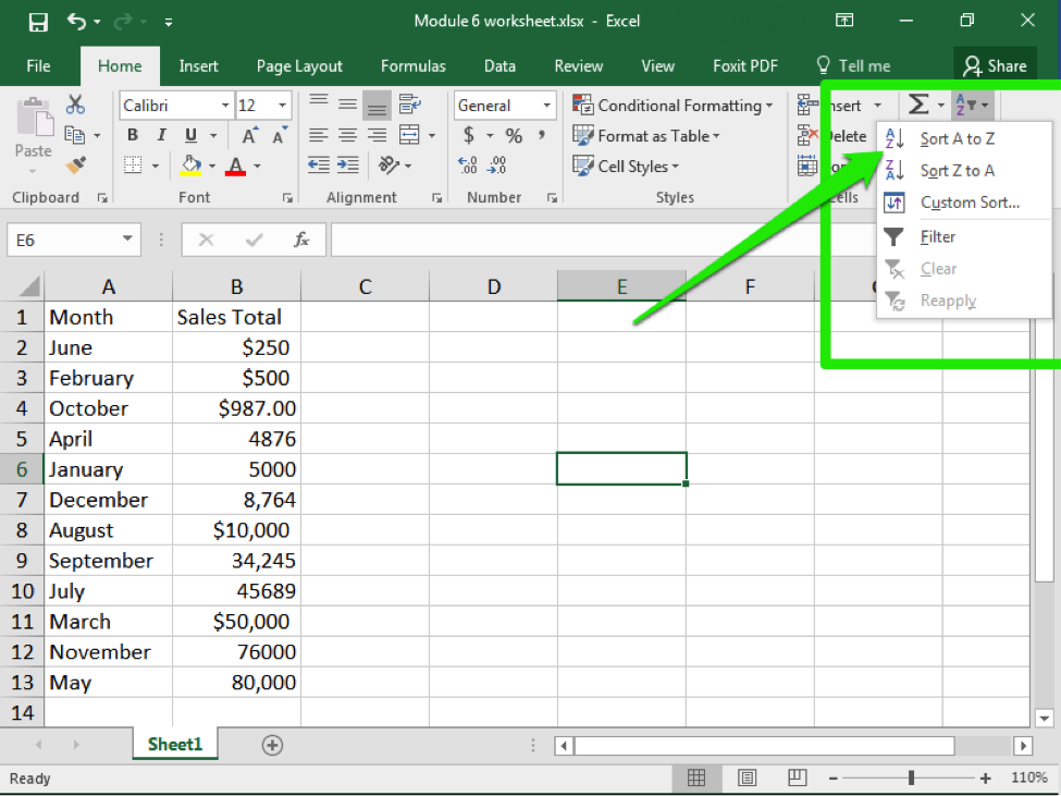
Sorting Data
- Select the column or row you wish to sort.
- From the Sort & Filter button in the Editing group in the ribbon, click the Sort button.
- From the menu, choose how you would like to sort the data. For example, A to Z or Z to A. Note that A to Z is equivalent to Smallest to Largest and Z to A is equivalent to Largest to Smallest.
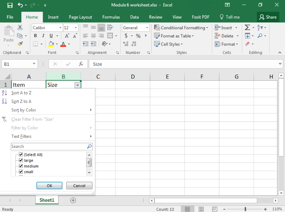
Filtering Data
After entering data in Excel, it is also possible to filter, or hide some parts of the data, based on user-indicated categories. When using the Filter option, no data is lost; it is just hidden from view.
- Select the column or row you wish to sort.
- From the Sort & Filter button in the Editing group in the ribbon, click the Filter button.
- When the Filter menu appears, you can choose which categories of data to hide and deselect the appropriate buttons. For example, you can deselect the button next to large and you will no longer see the large cells in your table.
Functions
Excel can perform a variety of really nice data analysis features for you. We’ve already touched upon how you can filter data. But you can also look for other connections, or screen large numbers of cells to determine how often something occurs.
COUNTIF
COUNTIF is a way for you to ask Excel to count how many times a certain piece of information appears in your worksheet. For example, perhaps you want to know how often “shirt” appear in an inventory list. All you need to do is ask Excel to count the number of cells that contain the word “shirt.”
- Determine which cells you want Excel to look at. In our example, we will look at A2 though A13.
- Click on the cell you wish your count to be displayed in.
- Type the formula for a count
=COUNTIF(A2:A13, “shirt”)
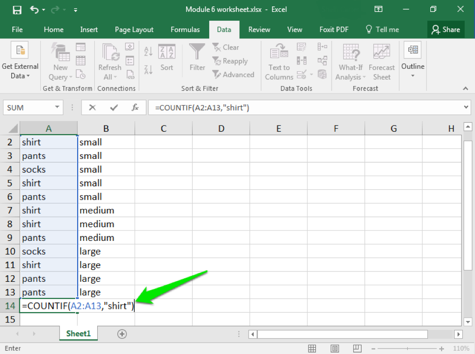
Here you are telling Excel which cells to examine—A2 through A13—and what to look for: “shirt.” Note that your text must match exactly what is typed in the cells, and if you are looking for a specific word it needs to be enclosed in quotation marks (so “shirt” instead of shirt).
- Hit enter and your results will appear.
IF
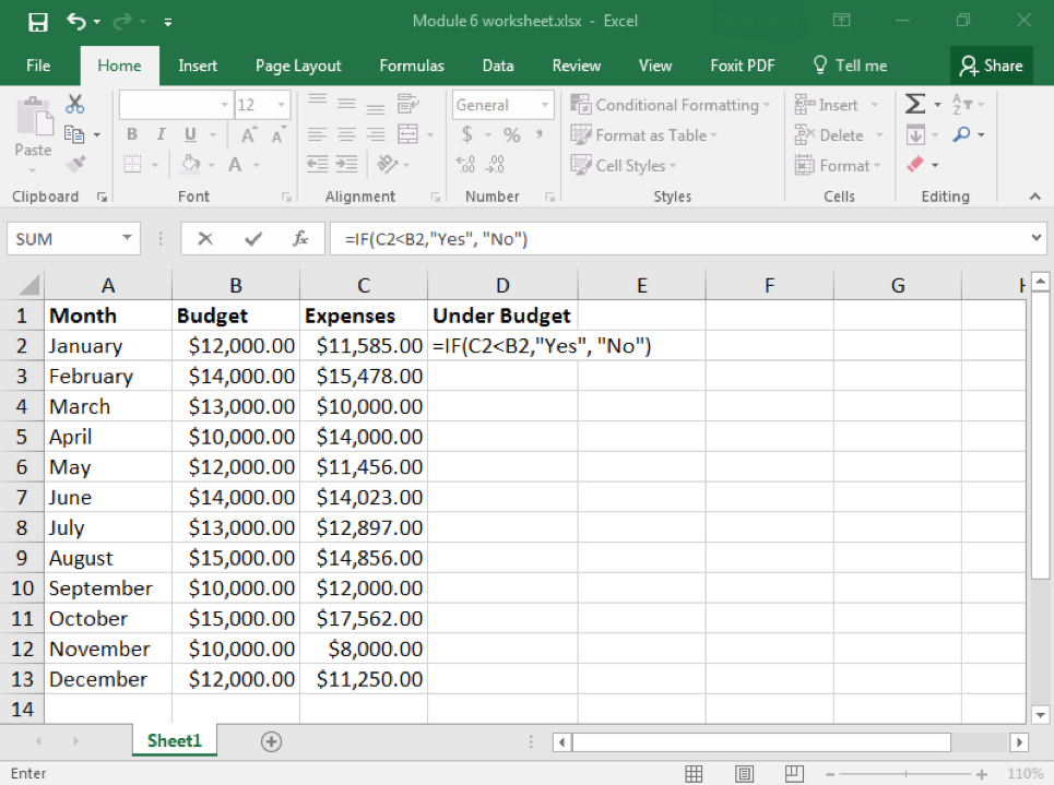
Another commonly used function in Excel is the “IF” function. In this case, you are asking Excel to look for something and then tell you if that something occurred. For example, perhaps you want to compare whether your monthly expenses were under your monthly budget. That is the scenario we will look at in our example.
In this case, let us just ask for a simple “yes” or “no” answer. Looking at the screenshot below, you can see how the worksheet has all the data at hand. We are looking for whether the information in the C column is less than the information in the B column. We would like the D column to display the answer (yes or no).
- Click on D2 and enter the “IF” function for what you want Excel to compare and do.
=IF(C2<B2, “Yes”,”No”)
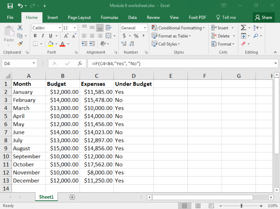
- You do not have to manually reenter the formula into the other cells in D. Instead you can copy and paste the formula from D2 into D3, D4, and so on. Each time you do this, the formula should automatically update with the correct cell number to compare.
As you can see, the D cells begin to display “Yes” or “No.” “Yes” means that the expenses in the C column were less than the monthly budget entered into the B column. “No” means that expenses were higher than the budget. Just as in the COUNTIF function, you need to enclose text in quotation marks.
Practice Questions
Clustered Column Charts
Excel is not just used for organizing and processing data and formulas. It also can be used to visually represent data in the form of charts and graphs. In this page, we will work on creating a basic chart, the clustered column chart, and then modifying a chart style.
A clustered column chart is sometimes called a bar graph, because it shows data organized in solid shapes like pillars. A clustered column chart organizes these pillars up and down, so they are “columns.” On the other hand, a clustered bar graph organizes these pillars left to right, so they are “bars.” Bar graphs are useful charts when looking at changes from month to month or across employees.
The first step to creating any chart is to organize your data. It is definitely a good idea to include headers in the first cell of each column. By default, a clustered column chart will cluster the data by the columns in your table, so try to keep that in mind when setting up the worksheet.
- After organizing your data, select the cells you wish to include in the chart. This should be at least two columns.
- Click on the Insert tab and find the Charts group of the ribbon.
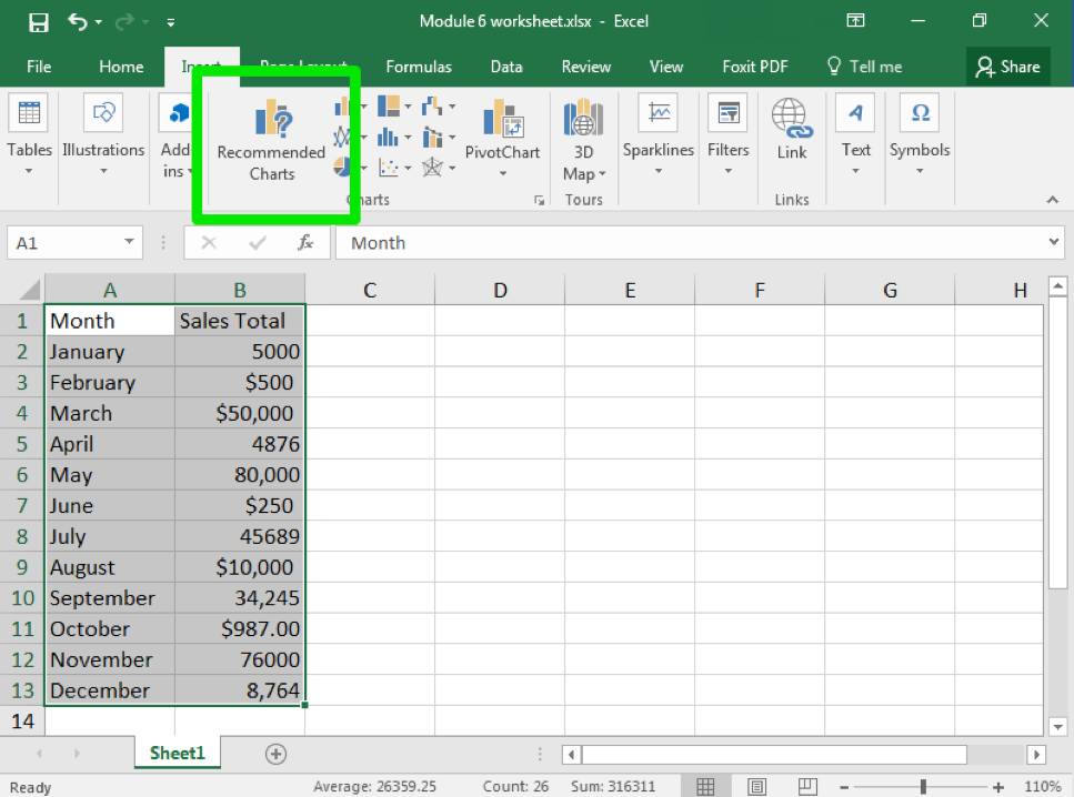
- “Clustered column chart” is actually a recommended chart. Click on that chart.
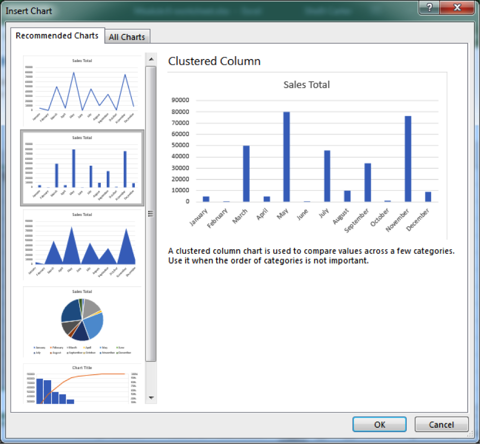
- When you select the chart, you will see colored boxes surrounding the data that connect to the different categories of the chart.
Practice Question
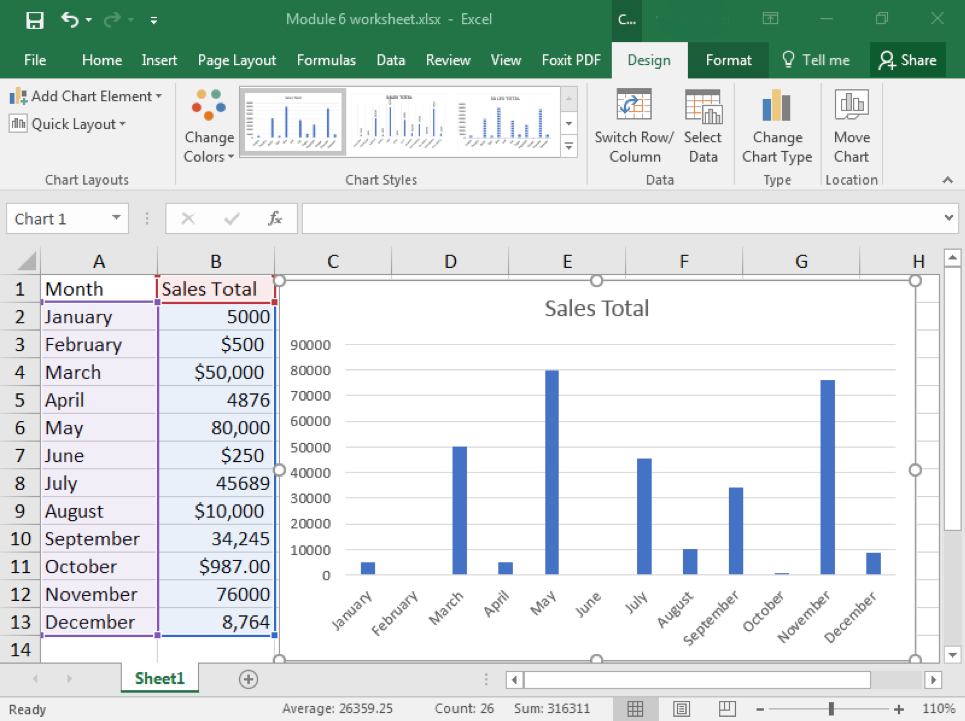
Chart Styles
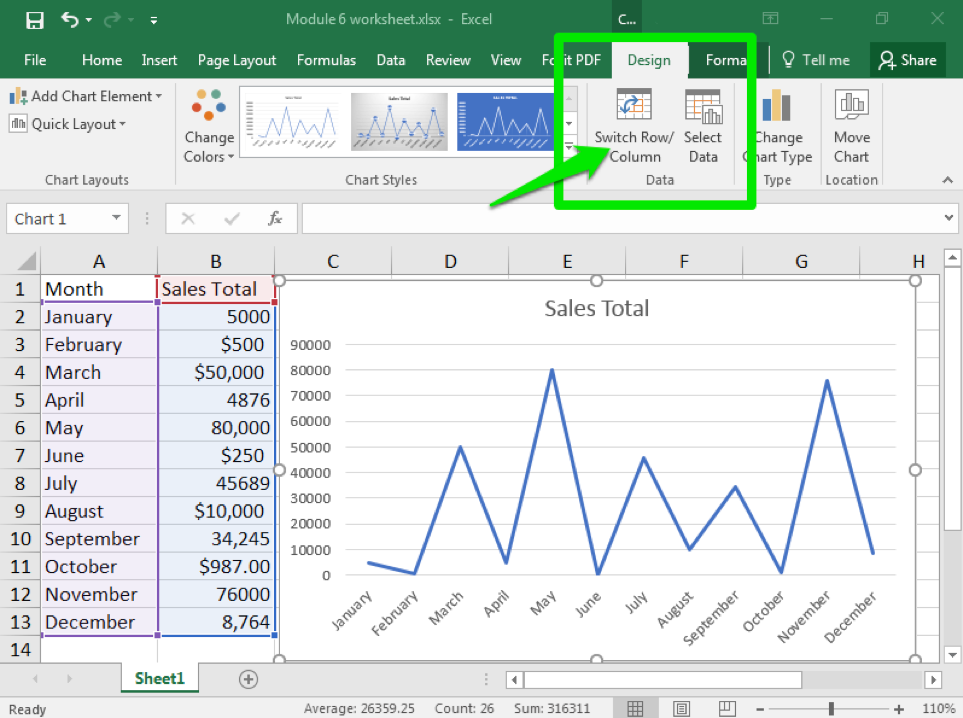
Once you have created a chart, or if you are given a worksheet that contains a chart, it is very easy to change the chart style.
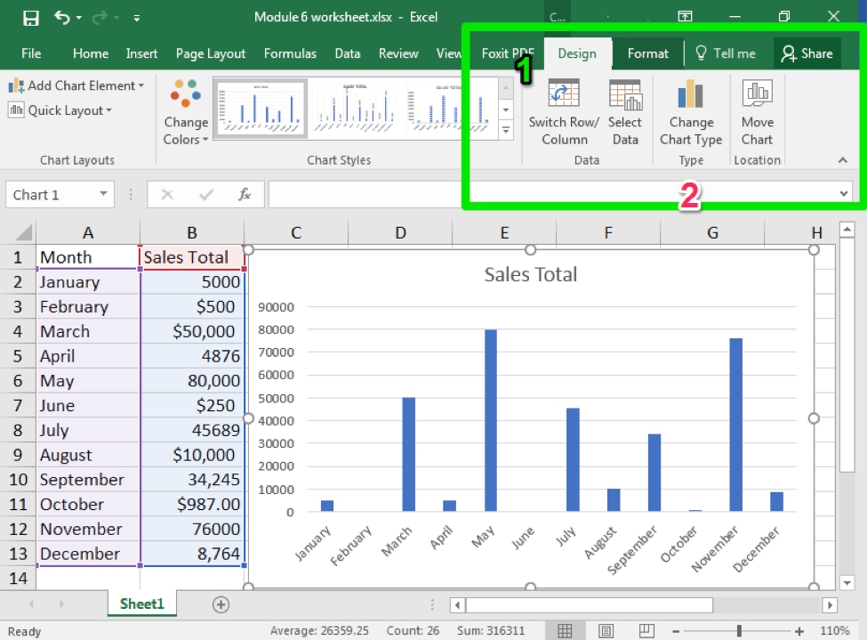
- Click on the chart you wish to change. The Design tab should appear in the ribbon area.
- Click on Change Chart Type button
- Click on the type of chart you would like.
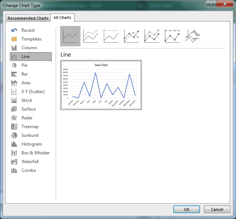
From this same window, you can also switch the data that is being charted. For example, you can switch which data from a row to a column or change which data is arranged on the x- or y-axis.
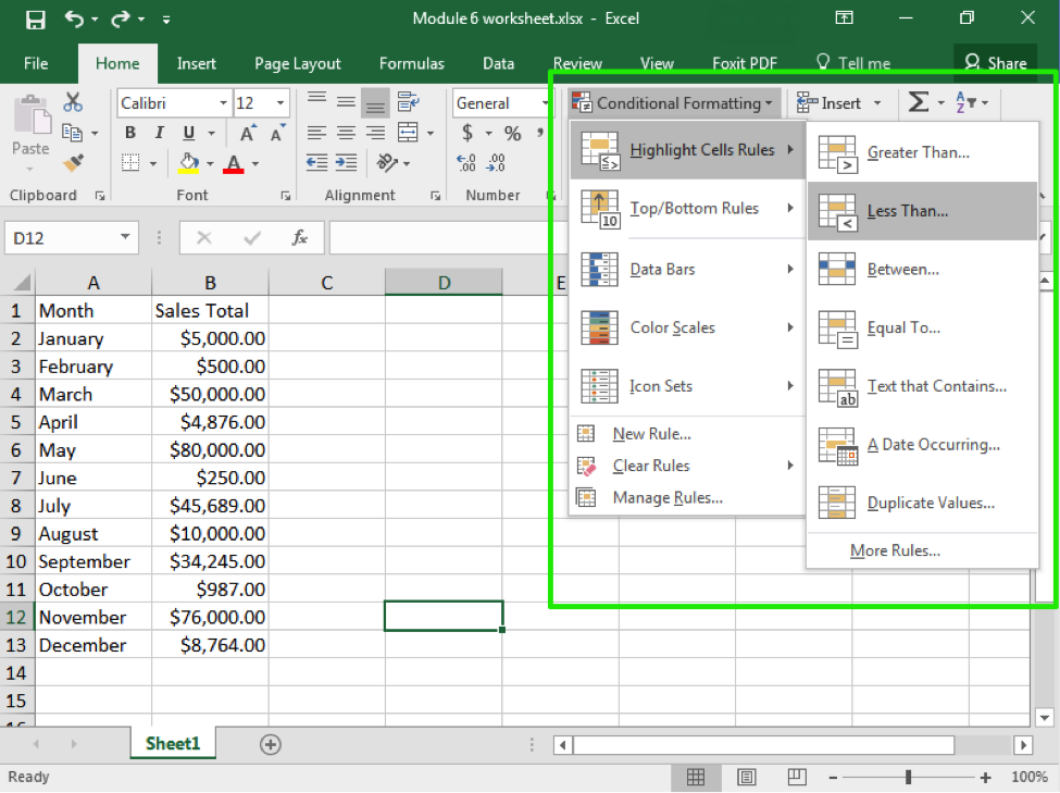
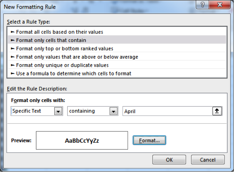
Conditional Formatting
As we have learned so far, Excel has a wide variety of easy to use tools for organizing, sorting, and otherwise marking information. Think back to when we applied styles to a cell to indicate good information or information that needs to be verified. Excel also has the ability to automatically apply such markings through conditional formatting.
With conditional formatting, you provide Excel with a rule, such as “less than 10,” and the program will scan through your data and highlight all the cells that meet that rule. There are several rules already available, but you can also create and apply your own rules and visual clues.
- Select the cells, rows, or columns you wish to have conditional formatting.
- From the Styles group, click on the Conditional Formatting button
- Select the style of formatting you would like. Here we have Highlight Cell Rules.
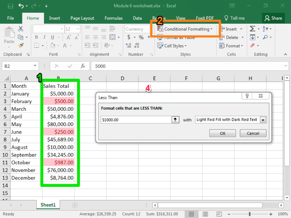
- Select the specific type of rule you would like to use and then apply your target value. Here we have selected Less Than.
- The formatting will appear automatically so you can see what it will look like. Note that Excel will automatically provide a value, but you can manually change it.
- Hit OK if you wish to apply the formatting. Otherwise, when you leave the formatting menu, it will disappear.
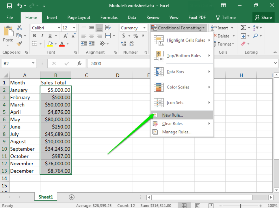
One important tool to keep in mind is the ability to enter your own rules. This can include applying formatting to specific date ranges, to specific text (like names), or even cells that are blank. In this case, you also set the format, so instead of highlighting cells you can choose to strikethrough text or change the font, change the size, or bold the text.
Practice Question
Candela Citations
- Microsoft Excel. Authored by: Shelli Carter. Provided by: Lumen Learning. Located at: https://courses.lumenlearning.com/wmopen-compapp/chapter/why-it-matters-microsoft-excel-part-1/. License: CC BY: Attribution